Showing posts with label Michael. Show all posts

Wednesday, September 25, 2013

For Predictive Modeling, Big Data Is No Big Deal

That is what I will be speaking about when I give a keynote talk a the Predictive Analytics World conference on Monday, September 30th in Boston.
For one thing, data has always been big. Big is a relative concept and data has always been big relative to the computational power, storage capacity, and I/O bandwidth available to process it. I now spend less time worrying about data size than I did in 1980. For another, data size as measured in bytes may or may not matter depending on what you want to do with it. If your problem can be expressed as a completely data parallel algorithm, you can process any amount of data in constant time simply by adding more processors and disks.
This session looks at various ways that size can be measured such as number of nodes and edges in a social network graph, number of records, number of bytes, or number of distinct outcomes, and how the importance of size varies by task. I will pay particular attention to the importance or unimportance of data size to predictive analytics and conclude that for this application, data is powerfully predictive, whether big or relatively small. For predictive modeling, you soon reach a point where doubling the size of the training data has no effect on your favorite measure of model goodness. Once you pass that point, there is no reason to increase your sample size. In short, big data is no big deal.

Sunday, October 21, 2012

Catch our Webcast on November 15

Gordon and I rarely find ourselves in the same city these days, but on November 15 we will be in Cary, North Carolina with our friends at JMP for a webcast with Anne Milley.  The format will be kind of like the first presidential debate with Anne as the moderator, and kind of like the second one with questions from you, the audience.  Sign up here.

Tuesday, September 11, 2012

Upcoming Speaking Engagements

After taking a break from speaking at conferences for a while, I will be speaking at two in the next month. Both events are here in Boston.

This Friday (9/14)  I will be at Big Data Innovation talking about how Tripadvisor for Business models subscriber happiness and what we can do to improve a subscriber's probability of renewal.

On October 1 and 2 I will be at Predictive Analytics World in Boston. This has become my favorite data mining conference. On the Monday, I will be visiting with my friends at JMP and giving a sponsored talk about how we use JMP for cannibalization analysis at Tripadvisor for Business. On Tuesday, I will go into the details of that analysis in more detail in a regular conference talk.

Saturday, October 1, 2011

The Average Hotel Does Not Get The Average Rating

The millions of travelers who review hotels, restaurants, and other attractions on TripAdvisor also supply a numeric rating by clicking one of five circles ranging from 1 for "terrible" to 5 for "excellent." On the whole, travelers are pretty kind.The average review rating for hotels and other lodgings is over 3.9. The median score is 4 and since that middle review is lost somewhere in a huge pile of 4-ratings, well over half of hotel reviews give a 4 or 5 rating.

So with such kind reviewers, most hotels must have a rating over 4 and hoteliers must all love us, right? Actually, no. The average of all hotel ratings is 3.6. Here's why: some large, frequently-reviewed hotels have thousands of reviews. It is hardly surprising that the Bellagio in Las Vegas has about 250 times more reviews than say, the Cambridge Gateway Inn, an unloved motel in Cambridge, Massachusetts. It may or may not be surprising that these oft-reviewed properties tend to be well-liked by our reviewers. Surprising or not, it's true: the hotels with the most reviews have a higher average rating than the long tail of hotels, motels, B&Bs, and Inns with only a handful of reviews each.

The chart compares the distribution of user review scores with the distribution of hotel average scores.

For the curious, here are the top 10 hotels on TripAdvisor by number of reviews:


Luxor Las Vegas
Majestic Colonial Punta Cana
Bellagio Las Vegas
MGM Grand Hotel and Casino
Excellence Punta Cana
Flamingo Hotel & Casino
Venetian Resort Hotel Casino
Hotel Pennsylvania New York
Excalibur Hotel & Casino
Treasure Island - TI Hotel & Casino

Not all of these are beloved by TripAdvisor users. The Hotel Pennsylvania drags the average down since it receives more ones than any other score. Despite that, as a group these hotels have a higher than average score. The moral of the story is that you can't extrapolate from one level of aggregation to another without knowing how much weight to give each unit. In the last US presidential election, the average state voted Republican, but the average voter voted Democrat.

Tuesday, August 23, 2011

Common Table Expressions

It's been a while since I posted. My new role at TripAdvisor has been keeping me pretty busy! My first post after a long absence is about a feature of SQL that I have recently fallen in love with. Usually, I leave it to Gordon to write about SQL since he is an expert in that field, but this particular feature is one that he doe not  write about in Data Analysis Using SQL and Excel. The feature is called common table expressions or, more simply, the WITH statement.

Common table expressions allow you to name a bunch of useful subquerries before using them in your main query. I think of the common table expressions as subquerries because that is what they usually replace in my code, but they are actually a lot more convenient than subquerries because they aren't "sub". They are there at the top level so your main query can refer to them as many times as you like anywhere in the query. In that way, they are more like temporary tables or views. Unlike tables and views, however, you don't have to be granted permission to create them, and you don't have to remember to clean them up when you are done. Common table expressions last only as long as the query is running.

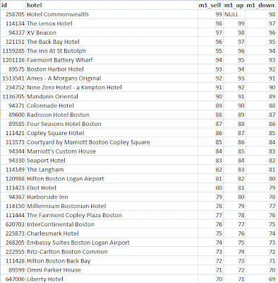
An example will help show why common table expressions are so useful. Suppose (because it happens to be true) that I have a complicated query that returns a list of hotels along with various metrics. These could be as simple as the number of rooms, or the average daily rate, or the average rating by our reviewers, or it could be a complex expression to produce a model score. For this purpose, it doesn't matter what the metric is, what matters is that I want to compare "similar" properties for some definition of similar. The first few rows returned by my complicated query look something like this:


Similar hotels have the same value of feature and similar ranking. In fact, I want to compare each hotel with four others: The one with matching feature that is next above it in rank, the one with matching feature that is next below it in rank, the one with non-matching feature that is next above it in rank, and the one with non-matching feature that is next below it in rank. Of course, for any one hotel, some of these neighbors may not exist. The top ranked hotel has no neighbors above it, for instance.

My final query involves joining the result pictured above with itself four times using non-equi joins, but for simplicity, I'll leave out the matching and non-matching features bit and simply compare each hotel to the one above and below it in rank. The ranking column is dense, so I can use equi joins on ranking=ranking+1 and ranking=ranking-1 to achieve this. Here is the query:

with ranks (id, hotel, ranking, feature, metric1, metric2)
    as(select . . .) /* complicated query to get rankings */
select r0.id, r0.hotel, 
    r0.metric1 as m1_self, r1.metric1 as m1_up, r2.metric1 as m1_down
from ranks r0 /* each hotel */ left join
      ranks r1 on r0.ranking=r1.ranking+1 /* the one above */ left join
      ranks r2 on r0.ranking=r2.ranking-1 /* the one below */
order by r0.ranking

The common table expression gives my complicated query the name ranks. In the main query, ranks appears three times with aliases r0, r1, and r2. The outer joins ensure that I don't lose a hotel just because it is missing a neighbor above or below. The query result looks like this:


The Hotel Commonwealth has the highest score, a 99, so there is nothing above it. In this somewhat contrived example, the hotel below it is the Lenox with a score of 98 and so on down the list. To write this query using subqueries, I would have had to repeat the subquery three times which would not only be ugly, it would risk actually running the subquery three times since the query analyzer might not notice that they are identical.

Sunday, May 22, 2011

JMP Webcast:: Measuring What Matters

On Tuesday, May 24 at 1:00pm Eastern Daylight Time, I will be presenting a webcast on behalf of JMP, a visual data exploration and mining tool.  The main theme of  the talk is that companies tend to manage to metrics, so it is very important that the metrics are well-chosen. I will illustrate this with a small case study from the world on on-line retailing recommendations. A secondary theme is the importance of careful data exploration in preparation for modeling--a task JMP is well-suited to.

-Michael

Register.

Tuesday, May 17, 2011

Michael Berry announces a new position

Hello Readers,

As some of you will already have heard, I have accepted the position of Business Intelligence Director at TripAdvisor for Business--the part of TripAdvsor that sells products and services to businesses rather than consumers. The largest part of T4B as this side of the business is called internally is selling direct links to hotel web sites that appear right next to the hotel reviews on TripAdvisor.com. Subscribers are also able to make special offers ("free parking", "20% off", "a free bottle of wine with your meal", . . .) directly on the TripAdvisor site. Another T4B product is listings for vacation rental properties.  There is a lot of data, and a lot of questions to be answered!

I will continue to contribute to this blog and I will continue to work with Gordon and Brij on the data mining courses that Data Miners produces. TripAdvisor is based in Newton, Massachusetts--not far from my home in Cambridge. It will be novel going home every night after work!

-Michael

Tuesday, March 22, 2011

How to calculate R-squared for a decision tree model

A client recently wrote to us saying that she liked decision tree models, but for a model to be used at her bank, the risk compliance group required an R-squared value for the model and her decision tree software doesn't supply one. How should she fill in the blank? There is more than one possible answer.

Start with the definition of R-squared for regular (ordinary least squares) regression. There are three common ways of describing it. For OLS they all describe the same calculation, but they suggest different ways of extending the definition to other models. The calculation is 1 minus the ratio of the sum of the squared residuals to the sum of the squared differences of the actual values from their average value.

The denominator of this ratio is the variance and the numerator is the variance of the residuals. So one way of describing R-squared is as the proportion of variance explained by the model.

A second way of describing the same ratio is that it shows how much better the model is than the null model which consists of not using any information from the explanatory variables and just predicting the average. (If you are always going to guess the same value, the average is the value that minimizes the squared error.)

Yet a third way of thinking about R-squared is that it is the square of the correlation r between the predicted and actual values. (That, of course, is why it is called R-squared.)

Back to the question about decision trees: When the target variable is continuous (a regression tree), there is no need to change the definition of R-squared. The predicted values are discrete, but everything still works.

When the target is a binary outcome, you have a choice. You can stick with the original formula. In that case, the predicted values are discrete with values between 0 and 1 (as many distinct estimates as the tree has leaves) and the actuals are either 0 or 1. The average of the actuals is the proportion of ones (i.e. the overall probability of being in class 1).  This method is called Efron's pseudo R-squared.

Alternatively, you can say that the job of the model is to classify things.  The null model would be to always predict the most common class. A good pseudo R-squared is how much better does your model do? In other words, the ratio of the proportion correctly classified by your model to the proportion of the most common class.

There are many other pseudo R-squares described on a page put up by the statistical consulting services group at UCLA.

Friday, March 11, 2011

Upcoming talks and classes

Michael will be doing a fair amount of teaching and presenting over the next several weeks:

March 16-18 Data Mining Techniques Theory and Practice at SAS Institute in Chicago.

March 29 Applying Survival Analysis to Forecasting Subscriber Levels at the New England Statistical Association Meeting.

April 7 Predictive Modeling for the Non-Statistician at the TDWI conference in Washington, DC.

Thursday, March 3, 2011

Cluster Silhouettes

The book is done! All 822 pages of the third edition of Data Mining Techniques for Marketing, Sales, and Customer Relationship Management will be hitting bookstore shelves later this month or you can order it now. To celebrate, I am returning to the blog.

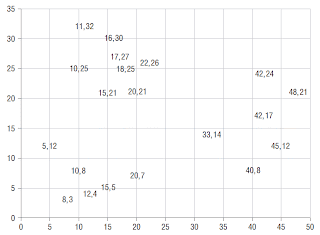
One of the areas where Gordon and I have added a lot of new material is clustering. In this post, I want to share a nice measure of cluster goodness first described by Peter Rousseeuw in 1986. Intuitively, good clusters have the property that cluster members are close to each other and far from members of other clusters. That is what is captured by a cluster's silhouette.

To calculate a cluster’s silhouette, first calculate the average distance within the cluster. Each cluster member has its own average distance from all other members of the same cluster. This is its dissimilarity from its cluster. Cluster members with low dissimilarity are comfortably within the cluster to which they have been assigned. The average dissimilarity for a cluster is a measure of how compact it is. Note that two members of the same cluster may have different neighboring clusters. For points that are close to the boundary between
two clusters, the two dissimilarity scores may be nearly equal.

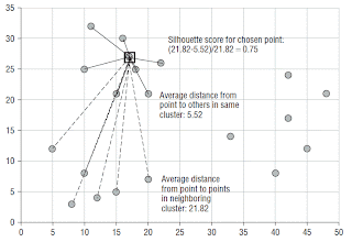
The average distance to fellow cluster members is then compared to the average distance to members of the neighboring cluster. The pictures below show this process for one point (17, 27).

The ratio of a point's dissimilarity to its own cluster to its dissimilarity with its nearest neighboring cluster is its silhouette. The typical range of the score is from zero when a record is right on the boundary of two clusters to one when it is identical to the other records in its own cluster. In theory, the silhouette score can go from negative one to one. A negative value means that the record is more similar to the records of its neighboring
cluster than to other members of its own cluster. To see how this could happen, imagine forming clusters using an agglomerative algorithm and single-linkage distance. Single-linkage says the distance from a point to a cluster is the distance to the nearest member of that cluster.  Suppose the data consists of many records with the value 32 and many others with the value 64 along with a scattering of records with values from 32 to 50. In the first step, all the records at distance zero are combined into two tight clusters. In the next step, records distance one away are combined causing some 33s to be added to the left cluster followed by 34s, 35s, etc. Eventually, the left cluster will swallow records that would feel happier in the right cluster.

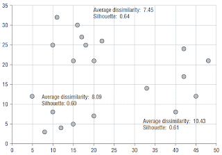
The silhouette score for an entire cluster is calculated as the average of the silhouette scores of its members. This measures the degree of similarity of cluster members. The silhouette of the entire dataset is the average of the silhouette scores of all the individual records. This is a measure of how appropriately the data has been
clustered. What is nice about this measure is that it can be applied at the level of the dataset to determine which clusters are not very good and at the level of a cluster to determine which members do not fit in very well. The silhouette can be used to choose an appropriate value for k in k-means by trying each value of
k in the acceptable range and choosing the one that yields the best silhouette. It can also be used to compare clusters produced by different random seeds.

The final picture shows the silhouette scores for the three clusters in the example.


Tuesday, October 5, 2010

Interview with Michael Berry

We haven't been updating the blog much recently.  Data mining blogger, Ajay Ohri figured out why.  We have been busy working on a new edition of Data Mining Techniques. He asked me about that in this interview for his blog.

Monday, June 21, 2010

Why is the area under the survival curve equal to the average tenure?

Last week, a student in our Applying Survival Analysis to Business Time-to-Event Problems class asked this question. He made clear that he wasn't looking for a mathematical derivation, just an intuitive understanding. Even though I make use of this property all the time (indeed, I referred to it in my previous post where I used it to calculate the one-year truncated mean tenure of subscribers from various industries), I had just sort of accepted it without much thought.  I was unable to come up with a good explanation on the spot, so now that I've had time to think about it, I am answering the question here where others can see it too.

It is really quite simple, but it requires a slight tilt of the head. Instead of thinking about the area under the survival curve, think of the equivalent area to the left of the survival curve. With the discreet-time survival curves we use in our work, I think of the area under the curve as a bunch of vertical bars, one for each time period. Each rectangle has width one and its height is the percentage of customers who have not yet canceled as of that period. Conveniently, this means you can estimate the area under the survival curve by simply adding up the survival values. Looked at this way, it is not particularly clear why this value should be the mean tenure.

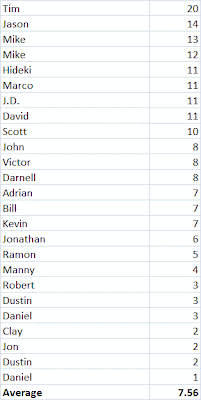
So let's look at it another way, starting with the original data.  Here is a table of some customers with their final tenures. (Since this is not a real example, I haven't bothered with any censored observations; that makes it easy to check our work against the average tenure for these customers which is 7.56.)

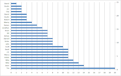
Stack these up like cuisenaire rods with the longest on the bottom and the shortest on the top, and you get something that looks a lot like the survival curve.

If I made the bars fat enough to touch, each would get 1/25 of the height of the stack. The area of each bar would be 1/25 times the tenure. If everyone had tenure of 20, like Tim, the area would be 25*1/25*20=20. If everyone had tenure of 1, like the first of the two Daniels, then the area would be 25*1/25*1=1. Since most customers have tenures somewhere between Tim's and Daniels, the area actually comes out to 7.56-- the average tenure.

In J:
   x
20 14 13 12 11 11 11 11 10 8 8 8 7 7 7 6 5 4 3 3 3 2 2 2 1
   + /x%25  NB. This is J for "the sum of x divided by 25"
7.56
  
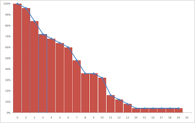
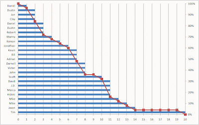
So, the area under (or to the left of) the stack of tenure bars is equal to the average tenure, but the stack of tenure bars is not exactly the survival curve. The survival curve is easily derived from it, however. For each tenure, it is the percentage of bars that stick out past it. At tenure 0, all 25 bars are longer than 0, so survival is 100%. At tenure 1, 24 out of 25 bars stick out past the line, so survival is 96% and so on.

In J:

   i. 21  NB. 0 through 20
0 1 2 3 4 5 6 7 8 9 10 11 12 13 14 15 16 17 18 19 20
   +/"1 (i. 21)
25 24 21 18 17 16 15 12 9 9 8 4 3 2 1 1 1 1 1 1 0

After dividing by 25 to turn the counts into percentages, we can add the survival curve to the chart.

Now, even the vertical view makes sense. The vertical grid lines are spaced one period apart. The number of blue bars between two vertical grid lines says how many customers are going to contribute their 1/25 to the area of the column. This is determined by how many people reached that tenure. At tenure 0, there are 25/25 of a full day.  At tenure 1, there are 24/25, and so on.  Add these up and you get 7.56.

Wednesday, May 26, 2010

Combining Empirical Hazards by the Naïve Bayesian Method

Occasionally one has an idea that seems so obvious and right that it must surely be standard practice and have a well-known name. A few months ago, I had such an idea while sitting in a client’s office in Ottawa. Last week, I wanted to include the idea in a proposal, so I tried to look it up and couldn’t find a reference to it anywhere. Before letting my ego run away with itself and calling it the naïve Berry model, I figured I would share it with our legions of erudite readers so someone can point me to a reference.

Some Context

My client sells fax-to-email and email-to-fax service on a subscription basis. I had done an analysis to quantify the effect of various factors such as industry code, acquisition channel, and type of phone number (local or long distance) on customer value. Since all customers pay the same monthly fee, the crucial factor is longevity. I had analyzed each covariate separately by calculating cancellation hazard probabilities for each stratum and generating survival curves. The area under the first year of each survival curve is the first year truncated mean tenure. Multiplying the first-year mean tenure by the subscription price yields the average first year revenue for a segment. This let me say how much more valuable a realtor is than a trucker; or a Google adwords referral than an MSN referral.

For many purposes, the dollar value was not even important. We used the probability of surviving one year as a way of scoring particular segments. But how should the individual segment scores be combined to give an individual customer a score based on his being a trucker with an 800 number referred by MSN? Or a tax accountant with a local number referred by Google? The standard empirical hazards approach would be to segment the training data by all levels of all variables before estimating the hazards, but that was not practical since there were so many combinations that many would lack sufficient data to make confident hazard estimates. Luckily, there is a standard model for combining the contributions of several independent pieces of evidence—naïve Bayesian models. An excellent description of the relationship between probability, odds, and likelihood and how to use them to implement naïve Bayesian models, can be found in Chapter 10 of Gordon Linoff’s Data Analysis Using SQL and Excel.

Here are the relevant correspondences:

odds = p/(1-p)
p = 1 - (1/(1+odds))
likelihood = (odds|evidence)/overall odds

Statisticians switch from one representation to another as convenient. A familiar example is logistic regression. Since linear regression is inappropriate for modeling probabilities that range only from 0 to 1, they convert the probabilities to log(odds) that vary from negative infinity to positive infinity. Expressing the log odds as a linear regression equation and solving for p, yields the logistic function.

Naïve Bayesian Models

The Naïve Bayesian model says that the odds of surviving one year given the evidence is the overall odds times the product of the likelihoods for each piece of evidence. For concreteness, let’s calculate a score for a general contractor (industry code 1521) with a local number who was referred by a banner ad.
The probability of surviving one year is 54%. Overall survival odds are therefore 0.54/(1-0.54) or 1.17.
One-year survival for industry code 1521 is 74%, considerably better than overall survival. The survival likelihood is defined as the survival odds, 0.74/(1-0.74) divided by the overall survival odds of 1.17. This works out to 2.43.

One-year survival for local phone numbers is 37%, considerably worse than overall survival. Local phone numbers have one-year survival odds of 0.59 and likelihood of 0.50.

Subscribers acquired through banner ads have one-year survival of 0.52, about the same as overall survival. This corresponds to odds of 1.09 and likelihood of 0.91.

Plugging these values into the naïve Bayesian model formula, we estimate one-year survival odds for this customer as 1.17*2.43*0.50*0.91=1.29. Solving 1.29=p/(p-1) for p yields a one-year survival estimate of 56%, a little bit better than overall survival. The positive evidence from the industry code slightly outweighs the negative evidence from the phone number type.

This example does not illustrate another great feature of naïve Bayesian models. If some evidence is missing—if the subscriber works in an industry for which we have no survival curve, for example—you can simply leave out the industry likelihood term.

The Idea

If we are happy to use the naïve Bayesian model to estimate the probability of a subscriber lasting one year, why not do the same for daily hazard probabilities? This is something I’ve been wanting to do since the first time I ever used the empirical hazard estimation method. That first project was for a wireless phone company. There was plenty of data to calculate hazards stratified by market or rate plan or handset type or credit class or acquisition channel or age group or just about any other time-0 covariate of interest. But there wasn’t enough data to estimate hazards for every combination of the above. I knew about naïve Bayesian models back then; I’d used the Evidence Model in SGI’s Mineset many times. But I never made the connection—it’s hard to combine probabilities, but easy to combine likelihoods. There you have it: Freedom from the curse of dimensionality via the naïve assumption of independence. Estimate hazards for as many levels of as many covariates as you please and then combine them with the naïve Bayesian model. I tried it, and the results were pleasing.

An Example

This example uses data from a mobile phone company. The dataset is available on our web site. There are three rate plans, Top, Middle, and Bottom. There are three markets, Gotham, Metropolis, and Smallville. There are four acquisition channels, Dealer, Store, Chain, and Mail. There is plenty of data to make highly confident hazard estimates for any of the above, but some combinations, such as Smallville-Mail-Top are fairly rare. For many tenures, no one with this combination cancels so there are long stretches of 0 hazard punctuated by spikes where one or two customers leave.


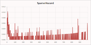
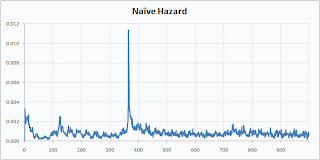
Here are the Smallville-Mail-Top hazard by the Naïve Berry method:


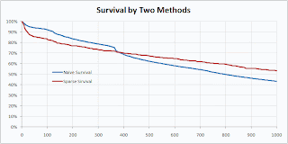
Isn’t that prettier? I think it makes for a prettier survival curve as well.


The naïve method preserves a feature of the original data—the sharp drop at the anniversary when many people coming off one-year contracts quit—that was lost in the sparse calculation.

Sunday, April 4, 2010

Data Mining Techniques now available in Korean

For any of our readers who have been wishing they could read our book Data Mining Techniques for Marketing, Sales, and Customer Relationship Management (2nd Edition) in Korean, now you can! We don't know why the cover pictures someone playing jacks, but then we don't really understand how our publisher chooses our U.S. cover pictures either.

This book was already available in Japanese, and, of course, English. Earlier editions are available in Traditional Chinese and French.

Sunday, March 14, 2010

Bitten by an Unfamiliar Form of Left Truncation

Alternate title: Data Mining Consultant with Egg on Face

Last week I made a client presentation. The project was complete. I was presenting the final results to the client.  The CEO was there. Also the CTO, the CFO, the VPs of Sales and Marketing, and the Marketing Analytics Manager. The client runs a subscription-based business and I had been analyzing their attrition patterns. Among my discoveries was that customers with "blue" subscriptions last longer than customers with "red" subscriptions. By taking the difference of the area under the two survival curves truncated at one year and multiplying by the subscription cost, I calculated the dollar value of the difference. I put forward some hypotheses about why the blue product was stickier and suggested a controlled experiment to determine whether having a blue subscription actually caused longer tenure or was merely correlated with it. Currently, subscribers simply pick blue or red at sign-up. There is no difference in price.  I proposed that half of new customers be given blue by default unless they asked for red and the other half be given red by default unless they asked for blue. We could then look for differences between the two randomly assigned groups.

All this seemed to go over pretty well.  There is only one problem.  The blue customers may not be better after all.  One of the attendees asked me whether the effect I was seeing could just be a result of the fact that blue subscriptions have been around longer than red ones so the oldest blue customers are older than the oldest red customers. I explained that this would not bias my findings because all my calculations were based on the tenure time line, not the calendar time line. We were comparing customers' first years without regard to when they happened. I explained that there would be a problem if the data set suffered from left truncation, but I had tested for that, and it was not a problem because we knew about starts and stops since the beginning of time.

Left truncation is something that creates a bias in many customer databases.  What it means is that there is no record of customers who stopped before some particular date in the past--the left truncation date. The most likely reason is that the company has been in existence longer than its data warehouse. When the warehouse was created, all active customers were loaded in, but customers who had already left were not. Fine, for most applications, but not for survival analysis. Think about customers who started before the warehouse was built.  One (like many thousands of others) stops before the warehouse gets built with a short tenure of two months. Another, who started on the same day as the first, is still around two be loaded into the warehouse with a tenure of two years.  Lots of short-tenure people are missing and long-tenure people are over represented. Average tenure is inflated and retention appears to be better than it really is.

My client's data did not have that problem.  At least, not in the way I am used to looking for it.  Instead, it had a large number of stopped customers for whom the subscription type had been forgotten. I (foolishly) just left these people out of my calculations.  Here is the problem: Although the customer start and stop dates are remembered for ever, certain details, including the subscription type,  are purged after a certain amount of time. For all the people who started back when there were only blue subscriptions and had short or even average tenures, that time had already past. The only ones for whom I could determine the subscription type were those who had unusually long tenures.  Eliminating the subscribers for whom the subscription type had been forgotten had exactly the same effect as left truncation!

If this topic and things related to it sound interesting to you, it is not too late to sign up for a two-day class I will be teaching in New York later this week.  The class is called Survival Analysis for Business Time to Event Problems. It will be held at the offices of SAS Institute in Manhattan this Thursday and Friday, March 18-19.

Wednesday, February 10, 2010

Why there is always a J window open on my desktop

People often ask me what tools I use for data analysis. My usual answer is SQL and I explain that just as Willie Sutton robbed banks because "that's where the money is," I use SQL because that is where the data is. But sometimes, it gets so frustrating trying to figure out how to get SQL to do something as seemingly straight forward as a running total or running maximum, that I let the data escape from the confines of its relational tables and into J where it can be free. I assume that most readers have never heard of J, so I'll give you a little taste of it here.  It's a bit like R only a lot more general and more powerful. It's even more like APL, of which it is a direct descendant, but those of us who remember APL are getting pretty old these days.

The question that sent me to J this time came from a client who had just started collection sales data from a web site and wanted to know how long they would have to wait before being able to make some statistically valid conclusions about whether spending differences between two groups who had received different marketing treatments were statistically significant. One thing I wanted to look at was how much various measures such as average order size and total revenue fluctuate from day to day and how many days does it take before the overall measures settle down near their long-term means. For example, I'd like to calculate the average order size with just one day's worth of purchases, then two day's worth, then three day's worth, and so on. This sort of operation, where a function is applied to successively longer and longer prefixes is called a scan.

A warning: J looks really weird when you first see it. One reason is that many things that are treated as a single token are spelled with two characters. I remember when I first saw Dutch, there were all these impossible looking words with "ij" in them--ijs and rijs, for example. Well, it turns out that in Dutch "ij" is treated like a single letter that makes a sound a bit like the English "eye." So ijs is ice and rijs is rice and the Rijn is a famous big river. In J, the second character of these two-character symbols is usually a '.' or a ':'.

=: is assignment. <. is lesser of. >. is greater of. And so on. You should also know that anything following NB. on a line is comment text.

   x=: ? 100#10                        NB. One hundred random integers between 0 and 9

   +/ x                                      NB. Like putting a + between every pair of x--the sum of x.
424
   <. / x                                    NB. Smallest x
0
   >. / x                                    NB. Largest x
9
   mean x
4.24
   ~. x                                      NB. Nub of x. (Distinct elements.)
3 0 1 4 6 2 8 7 5 9
   # ~. x                                    NB. Number of distinct elements.
10
    x # /. x                                  NB. How many of each distinct element. ( /. is like SQL GROUP BY.)
6 10 15 13 15 9 9 12 6 5
   +/ \ x                                      NB. Running total of x.
3 3 4 8 12 13 19 23 25 33 41 48 54 56 61 67 69 72 73 74 75 . . .
   >./ \ x                                     NB. Running maximum of x.
3 3 3 4 4 4 6 6 6 8 8 8 8 8 8 8 8 8 8 8 8 8 8 8 9 9 9 9 9 . . .
   mean \ x                                  NB. Running mean of x.
3 1.5 1.33333 2 2.4 2.16667 2.71429 2.875 2.77778 3.3 3.72727 . . .
   plot mean \ x                            NB. Plot running mean of x.


   plot var \ x                               NB. Plot running variance of x.


J is available for free from J software. Other than as a fan, I have no relationship with that organization.

Tuesday, January 19, 2010

Oracle load scripts now avalable for Data Analysis Using SQL and Excel

Classes started this week for the spring semester at Boston College where I am teaching a class on marketing analytics to MBA students at the Carroll School of Management.  The class makes heavy use of Gordon's book, Data Analysis Using SQL and Excel and the data that accompanies it. Since the local database is Oracle, I have at long last added Oracle load scripts to the book's companion page.

Due to laziness, my method of creating the Oracle script was to use the existing MySQL script and edit bits that didn't work in Oracle.  As it happens, the MySQL scripts worked pretty much as-is to load the tab-delimited data into Oracle tables using Oracle's sqlldr utility. One case that did not work taught me something about the danger of mixing tab-delimited data with input formats in sqlldr.  Even though it has nothing to do with data mining, as a public service, that will be the topic of my next post.

Preview: Something that works perfectly well when your field delimiter is comma, fails mysteriously when it is tab.

Monday, December 28, 2009

Differential Response or Uplift Modeling

Some time before the holidays, we received the following inquiry from a reader:

Dear Data Miners,


I’ve read interesting arguments for uplift modeling (also called incremental response modeling) [1], but I’m not sure how to implement it. I have responses from a direct mailing with a treatment group and a control group. Now what? Without data mining, I can calculate the uplift between the two groups but not for individual responses. With the data mining techniques I know, I can identify the ‘do not disturbs,’ but there’s more than avoiding mailing that group. How is uplift modeling implemented in general, and how could it be done in R or Weka?


[1] http://www.stochasticsolutions.com/pdf/CrossSell.pdf

I first heard the term "uplift modeling" from Nick Radcliffe, then of Quadstone. I think he may have invented it. In our book, Data Mining Techniques, we use the term "differential response analysis." It turns out that "differential response" has a very specific meaning in the child welfare world, so perhaps we'll switch to "incremental response" or "uplift" in the next edition. But whatever it is called, you can approach this problem in a cell-based fashion without any special tools. Cell-based approaches divide customers into cells or segments in such a way that all members of a cell are similar to one another along some set of dimensions considered to be important for the particular application. You can then measure whatever you wish to optimize (order size, response rate, . . .) by cell and, going forward, treat the cells where treatment has the greatest effect.

Here, the quantity  to measure is the difference in response rate or average order size between treated and untreated groups of otherwise similar customers. Within each cell, we need a randomly selected treatment group and a randomly selected control group; the incremental response or uplift is the difference in average order size (or whatever) between the two. Of course some cells will have higher or lower overall average order size, but that is not the focus of incremental response modeling. The question is not "What is the average order size of women between 40 and 50 who have made more than 2 previous purchases and live in a neighborhood where average household income is two standard deviations above the regional average?" It is "What is the change in order size for this group?"

Ideally, of course, you should design the segmentation and assignment of customers to treatment and control groups before the test, but the reader who submitted the question has already done the direct mailing and tallied the responses. Is it now too late to analyze incremental response?  That depends: If the control group is a true random control group and if it is large enough that it can be partitioned into segments that are still large enough to provide statistically significant differences in order size, it is not too late. You could, for instance, compare the incremental response of male and female responders.

A cell-based approach is only useful if the segment definitions are such that incremental response really does vary across cells. Dividing customers into male and female segments won't help if men and women are equally responsive to the treatment. This is the advantage of the special-purpose uplift modeling software developed by Quadstone (now Portrait Software). This tool builds a decision tree where the splitting criteria is maximizing the difference in incremental response. This automatically leads to segments (the leaves of the tree) characterized by either high or low uplift.  That is a really cool idea, but the lack of such a tool is not a reason to avoid incremental response analysis.

Tuesday, December 22, 2009

Interview with Eric Siegel

This is the first of what may become an occasional series of interviews with people in the data mining field. Eric Siegel is the organizer of the popular  Predictive Analytics World conference series. I asked him a little bit about himself and gave him a chance to plug his conference.  A propos, readers of this blog can get a 15% discount on a two-day conference pass by pasting the code DATAMINER010 into the Promotional Code box on the conference registration page.

Q: Not many kids (one of mine is perhaps the exception that proves the rule) have the thought "when I grow up, I want to be a data miner!"  How did you fall into this line of work?

To many laypeople, the word "data" sounds dry, arcane, meaningless - boring! And number-crunching on it doubly so. But this is actually the whole point. Data is the uninterpreted mass of things that've happened.  Extracting what's up, the means behind the madness, and in so doing modeling and learning about human behavior... well, I feel nothing in science or engineering is more interesting.
In my "previous life" as an academic researcher, I focused on core predictive modeling methods. The ability for a computer to automatically learn from experience (data really is recorded experience, after all), is the best thing since sliced bread. Ever since I realized, as I grew up from childhood, that space travel would in fact be a tremendous, grueling pain in the neck (not fun like "Star Wars"), nothing in science has ever seemed nearly as exciting.


In my current 9-year career as a commercial practitioner, I've found that indeed the ability to analytically "learn" and apply what's been learned turns out to provide plenty of business value, as I imagined back in the lab.  Research science is fun in that you have the luxury of abstraction and are often fairly removed from the need to prove near-term industrial applicability. Applied science is fun for the opposite reason: The tangle of challenges, although some less abstract and in that sense more mundane, are the only thing between you and getting the great ideas of the world to actually work, come to fruition, and deliver an irrefutable impact.


Q: Most conferences happen once a year.  Why does PAW come around so much more frequently?

In fact, many commercial conferences focused the industrial deployment of technology occur multiple times per year, in contrast to research conferences, which usually take place annually.  There's an increasing demand for a more frequent commercial event as predictive analytics continues to "cross chasms" towards more widescale penetration. There's just too much to cover - too many brand-name case studies and too many hot topics - to wait a year before each event.


Q: You use the phrase "predictive analytics" for what I've always called "data mining." Do the terms mean something different, or is it just that fashions change with the times?


"Data mining" is indeed often used synonymously with "predictive analytics", but not always. Data mining's definitions usually entail the discovery of non-trivial, useful patterns/knowledge/insights from data -- if you "dig" enough, you get a "nugget." This is a fairly abstract definition and therefore envelops a wide range of analytical techniques. On the other hand, predictive analytics is basically the commerical deployment of predictive modeling specifically (that is, in academic jargon, supervised learning, i.e., optimizing a statitistical model over labeled/historical cases). In business applications, this basically translates to a model that produces a score for each customer, prospect, or other unit of interest (business/outlet location, SKU, etc), which is roughly the working definition we posted on the Predictive Analytics World website. This would seem to potentially exclude related data mining methods such as forecasting, association mining and clustering (unsupervised learning), but, naturally, we include some sessions at the conference on these topics as well, such as your extremely-well-received session on forecasting October 2009 in DC.


Q: How do you split your time between conference organizing and analytical consulting work?  (That's my polite way of trying to rephrase a question I was once asked: "What's the split between spewing and doing?")

When one starts spewing a lot, there becomes much less time for doing. In the last 2 years, as my 2-day seminar on predictive analytics has become more frequent (both as public and customized on-site training sessions - see http://www.businessprediction.com), and I helped launch Predictive Analytics World, my work in services has become less than half my time, and I now spend very little time doing hands-on, playing a more advisory and supervisory role for clients, alongside other senior consultants who do more hands-on for Prediction Impact services engagements.


Q: I can't help noticing that you have a Ph.D.  As someone without any advanced degrees, I'm pretty good at rationalizing away their importance, but I want to give you a chance to explain what competitive advantage it gives you.

The doctorate is a research-oriented degree, and the Ph.D. dissertation is in a sense a "hazing" process. However, it's become clear to me that the degree is very much net positive for my commercial career. People know it entails a certain degree of discipline and aptitude. And, even if I'm not conducting academic research most of the time, every time one applies analytics there there is an experimental component to the task. On the other hand, many of the best data miners - the "rock star" consultants such as yourself - did not need a doctorate program in order to become great at data mining.


Q: Moving away from the personal, how do you think the move of data and computing power into the cloud is going to change data mining?

I'd say there's a lot of potential in making parallelized deployment more readily available to any and all data miners.  But, of all the hot topics in analytics, I feel this is the one into which I have the least visibility. It does, after all, pertain more to infrastucture and support than to the content, meaning and insights gained from analysis.

But, turning to the relevant experts, be sure to check out Feb PAW's upcoming session, "In-database Vs. In-cloud Analytics: Implications for Deployment" - see http://www.predictiveanalyticsworld.com/sanfrancisco/2010/agenda.php#day2-7


Q: Can you give examples of problems that once seemed like hot analytical challenges that have now become commoditized?

Great question. Hmm... common core analyical methods such as decision trees and logistic regression may be the only true commodities to date in our field. What do you think?

Q: There are some tasks that we used to get hired for 10 or 15 years ago that no one comes to us for these days. Direct mail response models is an example. I think people feel like they know how to do those themselves. Or maybe that is something the data vendors pretty much give away with the data.

Which of today's hot topics in data mining do you see as ripe for commiditization?

UPLIFT (incremental lift) modeling is branching out, with applications going beyond response and churn modeling (see http://www.predictiveanalyticsworld.com/sanfrancisco/2010/agenda.php#day2-2).

Expanding traditional data sets with SOCIAL DATA is continuing to gain traction across a growing range of verticals as analytics pracitioners find great value (read: tremendous increases in model lift) leveraging the simple fact that people behave similarly to those to whom they're socially connected. Just as the healthcare industry has discovered that quitting smoking is "contagious" and that the risk of obesity dramatically increases if you have an obese friend, telecommunications, online social networks and other industries find that "birds of a feather" churn and even commit fraud "together". Is this more because people influence one-another, or because they befriend others more like themselves?  Either way, social connections are hugely predictive of the customer behaviors that matter to business.


Q: There have been several articles in the popular press recently, like this one in the NY Times,  saying that statistics and data mining are the hottest fields a young person could enter right now.  Do you agree?

Well, for the subjective reasons in my answer to your first question above, I would heartily agree. If I recall, that NY Times article focused on the demand for data miners as the career's central appeal. Indeed, it is a very marketable skill these days, which certainly doesn't hurt.

Thursday, December 17, 2009

What do group members have in common?

We received the following question via email.

Hello,

I have a data set which has both numeric and string attributes. It is a data set of our customers doing a particular activity (eg: customers getting one particular loan). We need to find out the pattern in the data or the set of attributes which are very common for all of them.

Classification/regression not possible , because there is only one class
Association rule cannot take my numeric value into consideration
clustering clusters similar people, but not common attributes.


 What is the best method to do this? Any suggestion is greatly appreciated.

The question "what do all the customers with a particular type of loan have in common"  sounds seductively reasonable. In fact, however, the question is not useful at all because the answer is "Almost everything."  The proper question is "What, if anything, do these customers have in common with one another, but not with other people?"  Because people are all pretty much the same, it is the tiny ways they differ that arouse interest and even passion.  Think of two groups of Irishmen, one Catholic and one Protestant. Or two groups of Indians, one Hindu and one Muslim. If you started with members of only one group and started listing things they had in common, you would be unlikely to come up with anything that didn't apply equally to the other group as well.

So, what you really have is a classification task after all.  Take the folks who have the loan in question and an equal numbers of otherwise similar customers who do not. Since you say you have a mix of numeric and string attributes, I would suggest using decision trees. These can split equally well on numeric values ( x>n ) or categorical variables ( model in ('A','B','C') ). If the attributes you have are, in fact, able to distinguish the two groups, you can use the rules that describe leaves that are high in holders of product A as "what holders of product A have in common" but that is really shorthand for "what differentiates holders of product A from the rest of the world."