Showing posts with label statistics. Show all posts

Sunday, May 18, 2014

Armed Bandits: A Statistical Approach

This is a continuation of my previous post on multi-armed bandits.  And, I'm guessing there will be at least one more after this.

The Multi-Armed Bandit problem is a seemingly simple problem.  A gambler is faced with a row of slot machines, each of which returns a different winning.  S/he need to devise a strategy to find the winningest slot machine as quickly as possible and then just play that one.

Most of the strategies for doing this are based on a greedy-algorithm approach.  They are some variation on:  randomly (or round robinly) choose slot machines until some threshold has been reached.  Then continue playing the winningest one.  These actually work pretty well.  But I am interested in applying basic statistics to this.

Before doing that, let me explain why I am interested.  Imagine that I have a web site and I have an ad space to fill.  Here are different things I might put there:

  • A run of network ad that will make some amount of money per impression.
  • A click-through ad that will make some amount of money if someone clicks on it.
  • A partner ad that will make some amount of money if someone signs up for something.
The Multi-Armed Bandit provides an automated means of testing all three of these at once, along with variations that may, or may not, prove better than business-as-usual.   I think of it as automated champion-challenger models.

Here is a "statistical" approach to this problem.  Let me assume that there are N campaigns being run.   Each campaign has a payout distribution.  I can calculate the average payout for each campaign.  In the end, I want to choose the campaign that has the largest average payout.  Note that I'm make assumptions here that the the campaigns perform consistently across time and across the visitor population.  Those are other issues I discussed earlier.  Let's focus on the basic problem here.


By the Central Limit Theorem, we know that we can estimate the average based on a sample of data.  This estimate of the average has an average and a standard deviation, which (once there are enough samples) gets smaller and smaller, meaning that the average is better and better.

The idea is then simple.  At the beginning, give each campaign the same estimate with a wide confidence interval.  The intervals all overlap completely, so the choice of best campaign is random.  Initially, we might want to round-robin the data to get some initial values.  Relatively quickly, though, we should get estimates for each of the campaigns; these will be inaccurate but they will have wide confidence intervals.

At each iteration, we need to update the average and standard deviation.  Fortunately, there are easy incremental algorithms for both, so all the historical data does not need to be saved.  This article discusses various algorithms for calculating variance, and hence standard deviation.

The question is:  if we have multiple averages and standard errors, how do we choose the appropriate campaign at each step.  We can run a fast simulation to get the best campaign.  For each campaign, generate a random number based on the estimated average and standard error.  Choose the campaign that has the largest number.

What happens over time is that the campaign with the best payout should become more and more confident, as well as having the highest average.   Its confidence interval will shift way from the others, further increasing the odds of that campaign being chosen.  This is a positive feedback mechanism.  Note that I am using the term "confidence interval" as an aid to visualizing what is happening; this method is not actually using any p-values generated from the confidence interval.

One nice feature about this method is that it can adapt to the chosen solution getting worse.  If so, the average will decrease (but not the standard error) and other campaigns might be chosen.  Getting this to work involves a bit more effort, because you probably want to keep the sample size fixed -- otherwise the learning rate would be too small.

A note about distributions.  This solution is depending onto the distribution of the sample average, not the distribution of the original payout.  The sample average should (in the limit) have a  normal distribution, characterized by the average and standard error.  This is not a statement about the original data distribution, only about the average.  And, in the end, we want to choose the campaign that has the best average.  This is handy, because the three examples that I gave earlier are very different.  One has a constant (but low) payout and the other two are biased toward zero payouts.

I do believe that this method will produce reasonable results in practice.  However, it does bring up subtle issues about how the underlying distributions of the payouts affect the averages.  On the surface, it seems pretty sound, and it should work pretty well in practice.


Saturday, October 1, 2011

The Average Hotel Does Not Get The Average Rating

The millions of travelers who review hotels, restaurants, and other attractions on TripAdvisor also supply a numeric rating by clicking one of five circles ranging from 1 for "terrible" to 5 for "excellent." On the whole, travelers are pretty kind.The average review rating for hotels and other lodgings is over 3.9. The median score is 4 and since that middle review is lost somewhere in a huge pile of 4-ratings, well over half of hotel reviews give a 4 or 5 rating.

So with such kind reviewers, most hotels must have a rating over 4 and hoteliers must all love us, right? Actually, no. The average of all hotel ratings is 3.6. Here's why: some large, frequently-reviewed hotels have thousands of reviews. It is hardly surprising that the Bellagio in Las Vegas has about 250 times more reviews than say, the Cambridge Gateway Inn, an unloved motel in Cambridge, Massachusetts. It may or may not be surprising that these oft-reviewed properties tend to be well-liked by our reviewers. Surprising or not, it's true: the hotels with the most reviews have a higher average rating than the long tail of hotels, motels, B&Bs, and Inns with only a handful of reviews each.

The chart compares the distribution of user review scores with the distribution of hotel average scores.

For the curious, here are the top 10 hotels on TripAdvisor by number of reviews:


Luxor Las Vegas
Majestic Colonial Punta Cana
Bellagio Las Vegas
MGM Grand Hotel and Casino
Excellence Punta Cana
Flamingo Hotel & Casino
Venetian Resort Hotel Casino
Hotel Pennsylvania New York
Excalibur Hotel & Casino
Treasure Island - TI Hotel & Casino

Not all of these are beloved by TripAdvisor users. The Hotel Pennsylvania drags the average down since it receives more ones than any other score. Despite that, as a group these hotels have a higher than average score. The moral of the story is that you can't extrapolate from one level of aggregation to another without knowing how much weight to give each unit. In the last US presidential election, the average state voted Republican, but the average voter voted Democrat.

Tuesday, March 22, 2011

How to calculate R-squared for a decision tree model

A client recently wrote to us saying that she liked decision tree models, but for a model to be used at her bank, the risk compliance group required an R-squared value for the model and her decision tree software doesn't supply one. How should she fill in the blank? There is more than one possible answer.

Start with the definition of R-squared for regular (ordinary least squares) regression. There are three common ways of describing it. For OLS they all describe the same calculation, but they suggest different ways of extending the definition to other models. The calculation is 1 minus the ratio of the sum of the squared residuals to the sum of the squared differences of the actual values from their average value.

The denominator of this ratio is the variance and the numerator is the variance of the residuals. So one way of describing R-squared is as the proportion of variance explained by the model.

A second way of describing the same ratio is that it shows how much better the model is than the null model which consists of not using any information from the explanatory variables and just predicting the average. (If you are always going to guess the same value, the average is the value that minimizes the squared error.)

Yet a third way of thinking about R-squared is that it is the square of the correlation r between the predicted and actual values. (That, of course, is why it is called R-squared.)

Back to the question about decision trees: When the target variable is continuous (a regression tree), there is no need to change the definition of R-squared. The predicted values are discrete, but everything still works.

When the target is a binary outcome, you have a choice. You can stick with the original formula. In that case, the predicted values are discrete with values between 0 and 1 (as many distinct estimates as the tree has leaves) and the actuals are either 0 or 1. The average of the actuals is the proportion of ones (i.e. the overall probability of being in class 1).  This method is called Efron's pseudo R-squared.

Alternatively, you can say that the job of the model is to classify things.  The null model would be to always predict the most common class. A good pseudo R-squared is how much better does your model do? In other words, the ratio of the proportion correctly classified by your model to the proportion of the most common class.

There are many other pseudo R-squares described on a page put up by the statistical consulting services group at UCLA.

Wednesday, May 26, 2010

Combining Empirical Hazards by the Naïve Bayesian Method

Occasionally one has an idea that seems so obvious and right that it must surely be standard practice and have a well-known name. A few months ago, I had such an idea while sitting in a client’s office in Ottawa. Last week, I wanted to include the idea in a proposal, so I tried to look it up and couldn’t find a reference to it anywhere. Before letting my ego run away with itself and calling it the naïve Berry model, I figured I would share it with our legions of erudite readers so someone can point me to a reference.

Some Context

My client sells fax-to-email and email-to-fax service on a subscription basis. I had done an analysis to quantify the effect of various factors such as industry code, acquisition channel, and type of phone number (local or long distance) on customer value. Since all customers pay the same monthly fee, the crucial factor is longevity. I had analyzed each covariate separately by calculating cancellation hazard probabilities for each stratum and generating survival curves. The area under the first year of each survival curve is the first year truncated mean tenure. Multiplying the first-year mean tenure by the subscription price yields the average first year revenue for a segment. This let me say how much more valuable a realtor is than a trucker; or a Google adwords referral than an MSN referral.

For many purposes, the dollar value was not even important. We used the probability of surviving one year as a way of scoring particular segments. But how should the individual segment scores be combined to give an individual customer a score based on his being a trucker with an 800 number referred by MSN? Or a tax accountant with a local number referred by Google? The standard empirical hazards approach would be to segment the training data by all levels of all variables before estimating the hazards, but that was not practical since there were so many combinations that many would lack sufficient data to make confident hazard estimates. Luckily, there is a standard model for combining the contributions of several independent pieces of evidence—naïve Bayesian models. An excellent description of the relationship between probability, odds, and likelihood and how to use them to implement naïve Bayesian models, can be found in Chapter 10 of Gordon Linoff’s Data Analysis Using SQL and Excel.

Here are the relevant correspondences:

odds = p/(1-p)
p = 1 - (1/(1+odds))
likelihood = (odds|evidence)/overall odds

Statisticians switch from one representation to another as convenient. A familiar example is logistic regression. Since linear regression is inappropriate for modeling probabilities that range only from 0 to 1, they convert the probabilities to log(odds) that vary from negative infinity to positive infinity. Expressing the log odds as a linear regression equation and solving for p, yields the logistic function.

Naïve Bayesian Models

The Naïve Bayesian model says that the odds of surviving one year given the evidence is the overall odds times the product of the likelihoods for each piece of evidence. For concreteness, let’s calculate a score for a general contractor (industry code 1521) with a local number who was referred by a banner ad.
The probability of surviving one year is 54%. Overall survival odds are therefore 0.54/(1-0.54) or 1.17.
One-year survival for industry code 1521 is 74%, considerably better than overall survival. The survival likelihood is defined as the survival odds, 0.74/(1-0.74) divided by the overall survival odds of 1.17. This works out to 2.43.

One-year survival for local phone numbers is 37%, considerably worse than overall survival. Local phone numbers have one-year survival odds of 0.59 and likelihood of 0.50.

Subscribers acquired through banner ads have one-year survival of 0.52, about the same as overall survival. This corresponds to odds of 1.09 and likelihood of 0.91.

Plugging these values into the naïve Bayesian model formula, we estimate one-year survival odds for this customer as 1.17*2.43*0.50*0.91=1.29. Solving 1.29=p/(p-1) for p yields a one-year survival estimate of 56%, a little bit better than overall survival. The positive evidence from the industry code slightly outweighs the negative evidence from the phone number type.

This example does not illustrate another great feature of naïve Bayesian models. If some evidence is missing—if the subscriber works in an industry for which we have no survival curve, for example—you can simply leave out the industry likelihood term.

The Idea

If we are happy to use the naïve Bayesian model to estimate the probability of a subscriber lasting one year, why not do the same for daily hazard probabilities? This is something I’ve been wanting to do since the first time I ever used the empirical hazard estimation method. That first project was for a wireless phone company. There was plenty of data to calculate hazards stratified by market or rate plan or handset type or credit class or acquisition channel or age group or just about any other time-0 covariate of interest. But there wasn’t enough data to estimate hazards for every combination of the above. I knew about naïve Bayesian models back then; I’d used the Evidence Model in SGI’s Mineset many times. But I never made the connection—it’s hard to combine probabilities, but easy to combine likelihoods. There you have it: Freedom from the curse of dimensionality via the naïve assumption of independence. Estimate hazards for as many levels of as many covariates as you please and then combine them with the naïve Bayesian model. I tried it, and the results were pleasing.

An Example

This example uses data from a mobile phone company. The dataset is available on our web site. There are three rate plans, Top, Middle, and Bottom. There are three markets, Gotham, Metropolis, and Smallville. There are four acquisition channels, Dealer, Store, Chain, and Mail. There is plenty of data to make highly confident hazard estimates for any of the above, but some combinations, such as Smallville-Mail-Top are fairly rare. For many tenures, no one with this combination cancels so there are long stretches of 0 hazard punctuated by spikes where one or two customers leave.


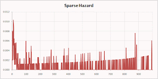
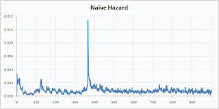
Here are the Smallville-Mail-Top hazard by the Naïve Berry method:


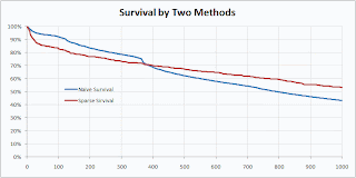
Isn’t that prettier? I think it makes for a prettier survival curve as well.


The naïve method preserves a feature of the original data—the sharp drop at the anniversary when many people coming off one-year contracts quit—that was lost in the sparse calculation.

Thursday, February 25, 2010

Agglomerative Variable Clustering

Lately, I've been thinking about the topic of reducing the number of variables, and how this is a lot like clustering variables (rather than clustering rows). This post is about a method that seems intuitive to me, although I haven't found any references to it. Perhaps a reader will point me to references and a formal name. This method using Pearson correlation and principal components to agglomeratively cluster the variables.

Agglomerative clustering is the process of assigning records to clusters, starting with the records that are closest to each other. This process is repeated, until all records are placed into a single cluster. The advantage of agglomerative clustering is that it creates a structure for the records, and the user can see different numbers of clusters. Divisive clustering, such as implemented by SAS's varclus proc, produces something similar, but from the top-down.

Agglomerative variable clustering works the same way. Two variables are put into the same cluster, based on their proximity. The cluster then needs to be defined in some manner, by combining information in the cluster.

The natural measure for proximity is the square of the (Pearson) correlation between the variables. This is a value between 0 and 1 where 0 is totally uncorrelated and 1 means the values are colinear. For those who are more graphically inclined, this statistic has an easy interpretation when there are two variables. It is the R-square value of the first principal component of the scatter plot.

Combining two variables into a cluster requires creating a single variable to represent the cluster. The natural variable for this is the first principal component.

My proposed clustering method repeatedly does the following:
  1. Finds the two variables with the highest correlation.
  2. Calculates the principal component for these variables and adds it into the data.
  3. Maintains the information that the two variables have been combined.
The attached SAS code (available at sas-var-hierarchical-clustering-v01.sas) does exactly this, although not in the most efficient and robust way. The bulk of the code is a macro, called buildcolumns, that appends the new cluster variables to the data set and maintains another table called columns which has the information about the rows. After I run this code, I can select different numbers of variables using the expression:

proc sql;
....select colname
....from columns
....where counter <= [some number] <>

These variables can then be used for predictive models or visualization purposes.

The inner loop of the code works by doing the following:
  1. Calling proc corr to calculate the correlation of all variables not already in a cluster.
  2. Transposing the correlations into a table with three columns, two for the variables and one for the correlation using proc transpose.
  3. Finding the pair of variables with the largest correlation.
  4. Calculating the first principal component for these variables.
  5. Appending this principal component to the data set.
  6. Updating the columns data set with information about the new cluster.
The data set referred to in the code comes from the companion site for Data Analysis Using SQL and Excel. The code will fail (by running an infinite loop) if any variables are missing or if two variables are exactly correlated.

Tuesday, February 2, 2010

Simpson's Paradox and Marketing

A reader asked the following question:

Hi Michael/Gordon,
In campaign measurements, it's possible to get a larger lift at the overall level compared to all the individual decile level lifts or vice versa, because of the differences in sample size across the deciles, and across Test & Control.
According to wikipedia, it's known as Simpson's paradox (or the Yule-Simpson effect) and is explained as an apparent paradox in which the successes in different groups seem to be reversed when the groups are combined.
In such scenarios, how do you calculate the overall lift? Which methods are commonly used in the industry?
Thanks,
Datalligence
http://datalligence.blogspot.com/

Simpson's Paradox is an interesting phenomenon, where results about subgroups of a population do not generalize to the overall population. I think the simplest version that I've heard is an old joke . . . "I heard you moved from Minnesota to Iowa, raising the IQ of both states."

How could this happen? For the joke to work, the average IQ in Minnesota must be higher than the average IQ in Iowa. And, the person who moves must have an IQ between these two values. Voila, you can get the paradox that the averages in both states go up, although they are based on exactly the same population.

I didn't realize that this paradox has a name (or, if I did, then I had forgotten). Wikipedia has a very good article on Simpson's Paradox, which includes real world examples from baseball, medical studies, and an interesting discussion of a gender discrimination lawsuit at Berkeley. In the gender discrimination lawsuit, women were accepted at a much lower rate than men overall. However, department by department, women were typically accepted at a higher rate than men. The difference is that women applied to more competitive departments than men. These departments have lower rates of acceptance, lowering the overall rate for women.

Simpson's Paradox arises when we are taking weighted averages of evidence from different groups. Different weightings can produce very different, even counter-intuitive results. The results become much less paradoxical when we see the actual counts rather than just the percentages.

The specific question is how to relate this paradox to lift, and understanding marketing campaigns. Assume there is a marketing campaign, where one group receives a particular treatment and another group does not. The ratio of performance between these two groups is the lift of the marketing campaign.

To avoid Simpson's paradox, you need to ensure that the groups are as similar as possible, except for what's being tested. If the test is for the marketing message, there is no problem, both groups can be pulled from the same population. If, instead, the test is for the marketing group itself (say high value customers), then Simpson's Paradox is not an issue, since we care about how the group performs rather than how the entire population performs.

As a final comment, I could imagine finding marketing results where Simpson's Paradox has surfaced, because the original groups were not well chosen. Simpson's Paradox arises because the sizes of the test groups are not proportional to their sizes in the overall population. In this case, I would be tempted to weight the results from each group based on the expected size in the overall population to calculate the overall response and lift.

Monday, June 8, 2009

Confidence in Logistic Regression Coefficients

I work in the marketing team of a telecom company and I recently encountered an annoying problem with an upsell model. Since the monthly sale rate is less than 1% of our customer base, I used oversampling as you mentioned in your book ‘Mastering data mining’ with data over the last 3 sales months so that I had a ratio of about 15% buyers and 85% non-buyers (sample size of about 20K). Using alpha=5%, I got parameter estimates which were from a business perspective entirely explicable. However, when I then re-estimated the model on the total customer base to obtain the ‘true’ parameter estimates which I will use for my monthly scoring two effects were suddenly insignificant at alpha=5%.

I never encountered this and was wondering what to do with these effects: should I kick them out of the model or not ? I decided to keep them in since they did have some business meaning and concluded that they must have become insignificant since it is only a micro-segment in your entire population.
To your opinion, did I interpret this correctly ? . . .
Many thanks in advance for your advice,
Wendy


Michael responds:

Hi Wendy,

This question has come up on the blog before. The short answer is that with a logistic regression model trained at one concentration of responders, it is a bit tricky to adjust the model to reflect the actual probability of response on the true population. I suggest you look at some papers by Gary King on this topic.


Gordon responds:

Wendy, I am not sure that Prof. King deals directly with your issue, of changing confidence in the coefficients estimates. To be honest, I have never considered this issue. Since you bring it up, though, I am not surprised that it may happen.

My first comment is that the results seem usable, since they are explainable. Sometimes statistical modeling stumbles on relationships in the data that make sense, although they may not be fully statistically significant. Similarly, some relationships may be statistically significant, but have no meaning in the real world. So, use the variables!

Second, if I do a regresson on a set of data, and then duplicate the data (to make it twice as big) and run it again, I'll get the same estimates as on the orignal data. However, the confidence in the coefficients will increase. I suspect that something similar is happening on your data.

If you want to fix that particular problem, then use a tool (such as SAS Enterprise Miner and probably proc logistic) that supports a frequency option on each row. Set the frequency to one for the more common events and to an appropriate value less than one for more common events. I do this as a matter of habit, because it works best for decision trees. You have pointed out that the confidence in the coefficients is also affected by the frequencies, so this is a good habit with regressions as well.


Sunday, May 10, 2009

Not Enough Data

An article in yesterday's New York Times reminded me of examples of "bad" examples of data mining. By bad examples, I mean that spurious correlations are given credence -- enough credence to make it into a well-reputed national newspaper.

The article, entitled "Eat Quickly, for the Economy's State" is about a leisure time report from the OECD that shows a correlation between the following two variables:
  • Change in real GNP in 2008; and,
  • Amount of time people spend eating and drinking in a given day.
The study is based on surveys from 17 countries (for more information on the survey, you can check this out).

The highlight is a few charts that shows that countries such as Mexico, Canada, and the United States have the lowest time spent eating (under 75 minutes per day) versus countries such as New Zealand, France, and Japan (over 110 minutes per day). The first group of countries have higher growth rates, both in 2008 and for the past few years.

My first problem with the analysis is one of granularity. Leisure time is measured per person, but GNP is measured over everyone. One big component of GNP growth is population growth, and different countries have very different patterns of population growth. The correct measure would be per capital GNP. Taking this into account would dampen the GNP growth figures for growing countries such as Mexico and the United States, and increase the GNP growth figures for lesser growing (or shrinking countries) such as Italy, Germany, and Japan.

Also, the countries where people eat more leisurely have other characteristics in common. In particular, they tend to have older populations and lower (or even negative) rates of population growth. One wonders if speed eating is a characteristic of younger people and leisurely eating is a characteristic of older people.

The biggest problem, though, is that this is, in all likelihood, a spurious correlation. One of the original definitions of data mining, which may still be used in the ecoonomics and political world, is a negative one: data mining is looking for data to support a conclusion. The OECD surveys were done in 17 different countries. The specific result in the NYT article is "Counties in which people eat and drink less than 100 minutes per day grow 0.9% faster -- on average -- than countries in which people each and drink more than 100 minutes per day".

In other words, the 17 countries were divided into two groups, and the growth rates were then measured for each group. Let's look at this in more detail.

How many ways are there to divide 17 countries into 2 groups? The answer is 2^17 = 131,072 different ways (any particular country could be in either group). So, if we had 131,072 yes-or-no survey questions, then would would expect any combination to arise, including the combinations where all the high growth countries are in one group and all the low growth countries in the other. (I admit the exact figure is a bit more than 131,072 but that is unimportant to illustrate my point.)

The situation actually gets worse. The results are not yes-or-no; they are numeric measurements which are then used to split the countries into two groups. The splits could be at any value of the measure. So, any given measurement results in 17-1=16 different possible splits (the first group having the country with the lowest measurement, with the two lowest, and so on). Now we only need about 8,192 uncorrelated measurements to get all possibilities.

However, we do not need all possibilities. A glance at the NYT article shows that the country with the worst 2008 growth is Poland, yet it is in the fast-eating group. And Spain -- in the slow eating group -- is the third fastest growing economy (okay, its GNP actually shrank but less than most others). So, we only need an approximation of a split, where the two groups look different. And then, voila! we get a news article.

The problem is that the OECD was able to measure dozens or hundreds of different things in their survey. My guess is that measures such as "weekly hours of work in main job," "time spent retired," and "time spent sleeping" -- just a few of the many possibilities -- did not result in interesting splits. Eventually, though, a measure such as "time spent eating and drinking" results in a split where the different groups look "statistically significant" but they probably are not. If the measure is interesting enough, then it can become an article in the New York Times.

This is probably a problem with statistical significance. The challenge is that a p-value of 0.01 means that something has only a 1% chance of happening at random. However, if we look at 100 different measures, then there is a really, really good chance that one of them will have a p-value of 0.01 or less. By the way, there is a statistical adjustment called the Bonferroni correction to take this into account (this as well as others are described in the Wikipeida).

Fortunately, neither the OECD nor the New York Times talk about this discovery as an example of data mining. It is just poor data analysis, but poor data analysis that can re-enforce lessons in good data analysis. Lately, I have been noticing more examples of articles such as this, where researchers -- or perhaps just journalists -- extrapolate from very small samples to make unsupported conclusions. These are particularly grating when they appear in respected newspapers, magazines, and journals.

Data mining is not about finding spurious correlations and claiming some great discovery. It is about extracting valuable information from large quantities of data, information that is stable and useful. Smaller amounts of data often contain many correlations. Often, these correlations are going to be spurious. And without further testing, or at least a mechanism to explain the correlation, the results should not be mentioned at all.

Saturday, April 25, 2009

When There Is Not Enough Data

I have a dataset where the target (continuous variable) variable that has to be estimated. However, in the given dataset, values for target are preset only for 2% while rest of 98% do not have values. The 98% are empty values. I need to score a dataset and give values for the target for all 2500 records. Can I use the 2% and replicate it several times and use that dataset to build a model? The ASE is too high if I use the 2% data alone. Any suggestions how to handle it, please?
Thanks,
Sneha

Sneha,

The short answer to your question is "Yes, you can replicate the 2% and use it to build a model." BUT DO NOT DO THIS! Just because a tool or technique is possible to implement does not mean that it is a good idea. Replicating observations "confuses" models, often by making the model appear overconfident in its results.

Given the way that ASE (average squared error) is calculated, I don't think that replicating data is going to change the value. We can imagine adding a weight or frequency on each observation instead of replicating them. When the weights are all the same, they cancel out in the ASE formula.

What does change is confidence in the model. So, if you are doing a regression and looking at the regression coefficients, each has a confidence interval. By replicating the data, the resulting model would have smaller confidence intervals. However, these are false, because the replicated data has no more information than the original data.

The problem that you are facing is that the modeling technique you are using is simply not powerful enough to represent the 50 observations that you have. Perhaps a different modeling technique would work better, although you are working with a small amount of data. For instance, perhaps some sort of nearest neighbor approach would work well and be easy to implement.

You do not say why you are using ASE (average squared error) as the preferred measure of model fitness. I can speculate that you are trying to predict a number, perhaps using a regression. One challenge is that the numbers being predicted often fall into a particular range (such as positive numbers for dollar values or ranging between 0 and 1 for a percentage). However, regressions produce numbers that run the gamut of values. In this case, transforming the target variable can sometimes improve results.

In our class on data mining (Data Mining Techniques: Theory and Practice), Michael and I introduce the idea of oversamping rare data using weights in order to get a balanced model set. For instance, if you were predicting whether someone was in the 2% group, you might give each of them a weight of 49 and all the unknowns a weight of 1. The result would be a balanced model set. However, we strongly advise that the maximum weight be 1. So, the weights would be 1/49 for the common cases and 1 for the rare ones. For regressions, this is important because it prevents any coefficients from having too-narrow confidence intervals.


Friday, January 9, 2009

Multidimensional Chi-Square, Expected Values, Independence, and All That, Part 3

This post is a continuation of my previous post on extending the chi-square test to more than two dimensions. The standard, two-dimensional chi-square test is explained in Chapter 3 of my book Data Analysis Using SQL and Excel.

This post explains how to implement a multidimensional chi-square test using SQL queries by calculating the chi-square value.

For the purpose of demonstrating this, I will use data derived from the companion web site for Data Analysis Using SQL and Excel. The following query produces data with three dimensions:

CREATE TABLE d3 as
..SELECT paymenttype, MONTH(orderdate) as mon,

.........LEFT(zipcode, 1) as zip1, COUNT(*) as cnt
..FROM orders
..GROUP BY 1, 2, 3


The table d3 simply contains three dimensions: the payment type, the month of the order date, and the first digit of the zip code. These dimensions are for illustration purposes.

The formula for the expected values is ratio of the following quantities:
  • The product of the sum of the counts along each dimension.
  • The total sum of the counts to the power of the number of dimensions minus 1.
These quantities can be calculated using basic SQL commands. The following query calculates all the expected values:

SELECT paymenttype, mon, zip1,
.......(dim1.cnt * dim2.cnt * dim3.cnt)/(dimall.cnt*dimall.cnt) as expected
FROM (SELECT paymenttype, SUM(cnt) as cnt

......FROM d3
......GROUP BY paymenttype) dim1 CROSS JOIN
.....(SELECT mon, SUM(cnt) as cnt
......FROM d3
......GROUP BY mon) dim2 CROSS JOIN
.....(SELECT zip1, SUM(cnt) as cnt
......FROM d3
......GROUP BY zip1) dim3 CROSS JOIN
.....(SELECT SUM(cnt) as cnt
......FROM d3) dimall


This query consists of four subqueries, one for each dimension and one for the total count. Each subquery calculates the appropriate sums along one (or no) dimensions. The results themselves are combined using CROSS JOIN, to ensure that the query returns results for all possible combinations of dimensions -- even those combinations that do not appear in the original data.
This latter point is an important point. Expected values are produced even for combinations not in the original data.

The previous query calculates the expected values. However, the chi-square calculation requires a bit more work. One approach is to join the above query to the original table, using a LEFT OUTER JOIN to ensure that no expected values are missing. The following approach uses simple JOINs and assumes that the original table has all combinations of the dimensions.

SELECT paymenttype, mon, zip1, expected, dev,
.......dev*dev/expected as chi_square
FROM (SELECT d3.paymenttype, d3.mon, d3.zip1,
.............(dim1.cnt * dim2.cnt * dim3.cnt)/(dimall.cnt*dimall.cnt) as expected,
.............d3.cnt-(dim1.cnt * dim2.cnt * dim3.cnt)/(dimall.cnt*dimall.cnt) as dev
......FROM d3 JOIN
.....(SELECT paymenttype, SUM(cnt) as cnt
......FROM d3
......GROUP BY paymenttype) dim1
.....ON d3.paymenttype = dim1.paymenttype JOIN
.....(SELECT mon, SUM(cnt) as cnt
......FROM d3
......GROUP BY mon) dim2
.....ON d3.mon = dim2.mon JOIN
.....(SELECT zip1, SUM(cnt) as cnt
......FROM d3
......GROUP BY zip1) dim3
.....ON d3.zip1 = dim3.zip1 CROSS JOIN
.....(SELECT SUM(cnt) as cnt
......FROM d3) dimall) a


This query joins in each of the subtotals along the dimensions, rather than using the CROSS JOIN to create all combinations. I suspect that in many databases, this approach has a more efficient execution plan (particularly if there are indexes on the dimensions). Note that the overall total is included using CROSS JOIN. I find this a convenient way to include constants in queries.

This query produces the chi-square value for each cell. The overall chi-square is the sum of these values. To interpret this value, we need the number of degrees of freedom, which is the product of the number of different values on each dimension minus one:

SELECT (COUNT(DISTINCT paymenttype) - 1)*
.......(COUNT(DISTINCT mon) - 1) *
.......(COUNT(DISTINCT zip1) - 1) as dof
FROM d3


Interpreting the value itself requires going outside the world of SQL, since there is no function that converts the chi-square value into a p-value within SQL. However, Excel does have such a function, CHIDIST().

It should be obvious how to extend these queries for larger numbers of dimensions. As discussed earlier, though, the chi-square test becomes less useful in multiple dimensions, especially since there need to be counts for all combinations of dimensions for best results (the heuristic rule is a minimum expected value of 5 in all cells). Nevertheless, doing the calculation in multiple dimensions is not difficult, and most of the work can be accomplished using basic SQL queries.

Sunday, December 28, 2008

Multidimensional Chi-Square, Expected Values, Independence, and All That, Part 2

This post is a continuation of my previous post on extending the chi-square test to more than two dimensions. The standard, two-dimensional chi-square test is explained in Chapter 3 of my book Data Analysis Using SQL and Excel.

This post explains what it means to extend chi-square to three dimensions and then to additional dimensions. The key idea in extending the chi-square test is calculating the expected values. The next post discusses how to do the calculations using SQL.

Expected Values
Assume that we have data that takes on a numeric value (typically a count) and has various dimensions, such as the following with dimensions A, B, and C:


A=0 B=0 C=0 1

A=0 B=0 C=1 2

A=0 B=1 C=0 3

A=0 B=1 C=1 4

A=1 B=0 C=0 5

A=1 B=0 C=1 6

A=1 B=1 C=0 7

A=1 B=1 C=1 8

The question that the chi-square test answers is: how expected or unexpected is this data?

What does this question even mean? Well, it means that we have to make some assumptions about the process generating the data -- some reasonable but simple assumptions -- and then measure how well this data matches those expected values.

One possible process is that each cell is independent of all the others. In this case, each cell would, on average, get the same count. To get a total count of 36, each cell would have, on average, a count of 4.5=36/8. Such a uniform distribution does not seem useful, because it does not take into account the structure of the data. "Structure" here means that the data has three dimensions.

The assumption used for chi-square takes this structure into account. It assumes that the process generates values independently along each dimension independently (rather than for each cell or for some arbitrary combination of dimension values). This assumption has some implications.

In the original data, there were ten things in the cells where A=0 (10 =1+2+3+4). The expected values have the same relationship -- the sum of the expected values where A=0 should also be 10. This is true for each of the values along each of the dimensions. Note, though, that it is not true for combinations of dimensions. So, the sum of the expected values where A=0 and B=0 is different (in general) for the expected values and the observed values.

There is a second implication. The distribution of values within each layer (or subcube) is the same, for all layers along the dimension. The following picture illustrates this in three dimensions:
The three shaded layers each have the property that the sums of the expected values are the same as the sums of the original data. In addition, the distributions are the same. This means that the highlighted cell in each layer has the same proportion for all the layers.

This latter condition is actually quite a strong condition, because it imposes structure between all the cells in different layers.

Calculating Expected Values
There is actually a simple formula for calulating the expected values. The calculation starts with the sums of the values of the cells in each possible layer. The above diagram shows three layers, but this is only along one dimension. There are an additional three layers (or subcubes) along each of the other two dimensions. (The choice of 3 here is totally arbitrary; there could be any number along each dimension.)

The expected value for a cell is the ratio of two numbers:
  • The product of the sum of the values along each dimension, divided by
  • The sum in the entire table raised to the power of the number of dimensions minus one.
Let us return to the initial data in a table, with three dimensions, A, B, and C and the counts 1 through 8. What is the expected value for cell A=0, B=0, C=0?

First, we need to calculate the sums for the three layers:
  • Asum is the cells where A=0: 10=1+2+3+4
  • Bsum is the cells where B=0: 14=1+2+5+6
  • Csum is the cells where C=0: 16=1+3+5+7
  • The product is 2,240.
Second, we need the sum for the whole table, which is 36. The number of dimensions is 3, so the expected value for the cell is 2,240/36^2 = 1.73.

The other cells have similar calculations. The following shows the table with the expected values:

A B C Value Expected

0 0 0 1 1.73

0 0 1 2 2.16

0 1 0 3 2.72

0 1 1 4 3.40

1 0 0 5 4.49

1 0 1 6 5.62

1 1 0 7 7.06

1 1 1 8 8.83

Here the expected values are pretty close to the original values. This calculation is available in the accompanying spreadsheet (chi-square-blog.xls).

The calculation also readily extends to more than two dimensions. However, the condition that the distrubutions are the same along parallel subcubes becomes more and more restrictive. In two dimensions, the expected values make intuitive sense. However, as the number of dimensions grows. they may not be as intuitive. Also, by combining values along dimensions, it is possible to reduce a multidimensional case to a two-dimensional case (although some information is lost in the process).

From Expected Values to Chi-Square
The chi-square calculation itself follows the same procedure as in the two dimensional case. The chi-square for each cell is the difference between the observed and expected value squared, divided by the expected value. The chi-square for the whole table is the sum of all the chi-square values.

The degrees of freedom is calculated in a way similar to the two-dimensional case. It is the product of the size of each dimension minus 1. So, in the 2X2X2 case, the degrees of freedom is 1. In the 3X3X3X3 case, it is 16 (2*2*2*2).

The next posting will explain how to calculate the expected value using SQL.


Sunday, December 14, 2008

Multidimensional Chi-Square, Expected Values, Independence, and All That, Part 1

When I speak about data mining, I often refer to the chi-square test as my favorite statistical test. I should be more specific, though, because I am really refering to the two-dimensional chi-square test. This is described in detail in Chapter 3 of Data Analysis Using SQL and Excel, a book that I do heartily recommend and is the starting point for many ideas that I write about here.

The chi-square test can be applied to more than two dimensions. However, the multi-dimensional chi-square behaves a bit differently from the two-dimensional case. This posting describes why. The next posting describes the calculation for the multi-dimensional chi-square. And the third posting in this series will describe how to do the calculations using SQL.

Fast Overview of Chi-Square

The Chi-Square test is used when we have two or more categorical variables and counts of how often each combination appears. For instance, the following is a simple set of data in two dimensions:


A=0 B=0 1

A=0 B=1 2

A=1 B=0 3

A=1 B=1 4

This data is summarized from ten observations. The first row says that in one data record, both A and B are zero. The last row says that in four of them, both A and B are 1. In practice, when using the chi-square test, we would want higher counts -- and we would get them, because these are counts of customers (say, responders and non-responders by gender).

In two dimensions, a contingency table is perhaps a better way of looking at the counts:


B=0 B=1

A=0 1 2

A=1 3 4

The chi-square test then asks the question . . . What is the probability that the counts are produced randomly, assuming that both the A and B are independent? To answer this question, we need the expected values assuming independence between A and B. The following table shows the expected values:


B=0 B=1

A=0 1.2 1.8

A=1 2.8 4.2

The expected values have two important properties. First, the row sums and column sums are the same as the original data. So, 1+2 = 1.2+1.8 = 3, and so on for both rows and both columns.

The second property is a little more subtle, but it says that the ratios of values in any column or any row are the same. So, 1.2/1.8 = 2.8/4.2 = 2/3, and so on. Of all possible 2X2 matrices, there is only one that has both these properties.

Now, the chi-square value for any cell is the square of the difference between the actual value and the expected value divided by the expected value. The chi-square for the matrix is the sum of the chi-square values for all the cells. These follow a chi-square distribution with one degree of freedom, and this gives us a enough information to determine whether the original counts are likely due to chance.

Calculating expected values is easy. The expected value for any cell is the product of the row sum times the column sum divided by the total in the table. For example, for A=0, B=0, the row sum is 3 and the column sum is 4. The product is 12, so the expected value is 1.2 = 12/10.

Treating Three Dimensions As Two Dimensions
Now, let's assume that the data has three dimensions rather than two. For example:

A=0 B=0 C=0 1

A=0 B=0 C=1 2

A=0 B=1 C=0 3

A=0 B=1 C=1 4

A=1 B=0 C=0 5

A=1 B=0 C=1 6

A=1 B=1 C=0 7

A=1 B=1 C=1 8

We can treat this as a contingency table in two dimensions:


C=0 C=1

A=0,B=0 1 5

A=0,B=1 2 6

A=1,B=0 3 7

A=1,B=1 4 8

And from this we can readily calculate the expected values:


C=0 C=1

A=0,B=0 1.67 4.33

A=0,B=1 2.22 5.78

A=1,B=0 2.78 7.22

A=1,B=1 3.33 8.67

The chi-square calculation follows as in the earlier case. The chi-square value for each cell is the actual count minus the expected value squared divided by the expected value. The chi-square value for the entire table is the sum of all the chi-square values for each cell.

The only difference here is that there are three degrees of freedom. This affects how to transform the chi-square value into a probability, but it does not affect the computation.

Which Are the Right Expected Values?
There are actually two other continency tables that we might produce from the original 2X2X2 data, depending on which dimension we use for the columns:


B=0 B=1

A=0,C=0 1 2

A=0,C=1 5 6

A=1,C=0 3 4

A=1,C=1 7 8

and


A=0 A=1

B=0,C=0 1 3

B=0,C=1 5 7

B=1,C=0 2 4

B=1,C=1 6 8

Following the same procedure, we can calcualte the expected values for each of these.


B=0 B=1

A=0,C=0 1.33 1.67

A=0,C=1 4.89 6.11

A=1,C=0 3.11 3.89

A=1,C=1 6.67 8.33

and


B=0 B=1

A=0,C=0 1.78 2.22

A=0,C=1 5.33 6.67

A=1,C=0 2.67 3.33

A=1,C=1 6.22 7.78

Oops!. The three sets of expected values are different from each other. Which do we use for the 2X2X2 chi-square calculation?

Why Independence is a Strong Condition
The answer is none of these. For the three dimensional data (and higher dimensional as well), the three contingency tables are almost always going to be different, because they mean different things. This is perhaps best viewed geometrically:


In this cube, the front face corresponds to C=0 and the hidden face to C=1. The A values go horizontally and the B's vertically. The three different contingency tables are formed by cutting the cube in half and then pasting the halves together. These tables are different.

For instance, the front face and the back facee are each 2X2 contingency tables. The expected values for these can be determined just from the information on each face. We do not need the information along the C dimension for this calculation. Worse, we cannot even use this information -- so there is no way to ensure that the sums along the "C" dimension add up to the same values in the original data and for the expected values.

The problem is that the sums along each dimension overspecify the problem. A given value has three adjacent values along three dimensions. However, only two of the dimensions are needed to calcualte an expected value, assuming independence along those two dimensions. The information along the third dimension cannot be incorporated into the calculation.

The reason? Independence is a very strong condition. Remember, it says not only that the sums are the same but also that the ratios within each row (or column or layer) are the same. Normally, we might think "independent" variables are providing as much flexibility as possible. However, that is not the case. In fact, the original counts are the only ones that meet the all the conditions of independence at the level of every row, colum, and level.

When I think of this situation, I think of a paradox related to the random distribution of stars. We actually perceive a random distribution as more ordered. Check out this site for an example. Similarly, our intuition is that independence among variables is a weak condition. In fact, it can be quite a strong condition.

The next posting will explain how expected values work in three and more dimensions. For now, it is worth explaining that converting a three-dimensional problem into two dimensions is often feasible and reasonable. This is particularly true when one of the dimensions is a "response" characteristic and the rest are input dimensions. However, such a 2X2 table is really an approximation.