Michael will be doing a fair amount of teaching and presenting over the next several weeks:
March 16-18 Data Mining Techniques Theory and Practice at SAS Institute in Chicago.
March 29 Applying Survival Analysis to Forecasting Subscriber Levels at the New England Statistical Association Meeting.
April 7 Predictive Modeling for the Non-Statistician at the TDWI conference in Washington, DC.
Friday, March 11, 2011
Thursday, March 3, 2011
Cluster Silhouettes
The book is done! All 822 pages of the third edition of Data Mining Techniques for Marketing, Sales, and Customer Relationship Management will be hitting bookstore shelves later this month or you can order it now. To celebrate, I am returning to the blog.
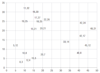
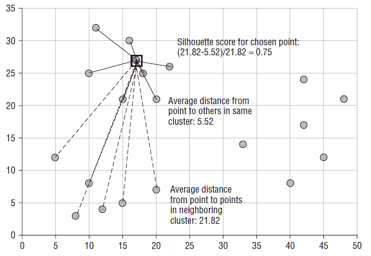
One of the areas where Gordon and I have added a lot of new material is clustering. In this post, I want to share a nice measure of cluster goodness first described by Peter Rousseeuw in 1986. Intuitively, good clusters have the property that cluster members are close to each other and far from members of other clusters. That is what is captured by a cluster's silhouette.
To calculate a cluster’s silhouette, first calculate the average distance within the cluster. Each cluster member has its own average distance from all other members of the same cluster. This is its dissimilarity from its cluster. Cluster members with low dissimilarity are comfortably within the cluster to which they have been assigned. The average dissimilarity for a cluster is a measure of how compact it is. Note that two members of the same cluster may have different neighboring clusters. For points that are close to the boundary between
two clusters, the two dissimilarity scores may be nearly equal.
The average distance to fellow cluster members is then compared to the average distance to members of the neighboring cluster. The pictures below show this process for one point (17, 27).
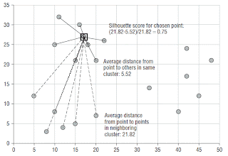
The ratio of a point's dissimilarity to its own cluster to its dissimilarity with its nearest neighboring cluster is its silhouette. The typical range of the score is from zero when a record is right on the boundary of two clusters to one when it is identical to the other records in its own cluster. In theory, the silhouette score can go from negative one to one. A negative value means that the record is more similar to the records of its neighboring
cluster than to other members of its own cluster. To see how this could happen, imagine forming clusters using an agglomerative algorithm and single-linkage distance. Single-linkage says the distance from a point to a cluster is the distance to the nearest member of that cluster. Suppose the data consists of many records with the value 32 and many others with the value 64 along with a scattering of records with values from 32 to 50. In the first step, all the records at distance zero are combined into two tight clusters. In the next step, records distance one away are combined causing some 33s to be added to the left cluster followed by 34s, 35s, etc. Eventually, the left cluster will swallow records that would feel happier in the right cluster.
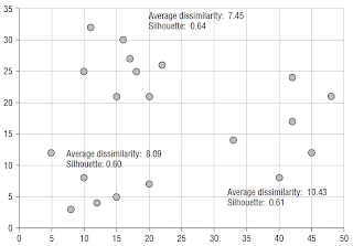
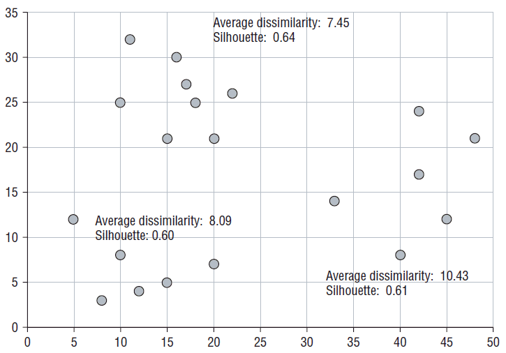
The silhouette score for an entire cluster is calculated as the average of the silhouette scores of its members. This measures the degree of similarity of cluster members. The silhouette of the entire dataset is the average of the silhouette scores of all the individual records. This is a measure of how appropriately the data has been
clustered. What is nice about this measure is that it can be applied at the level of the dataset to determine which clusters are not very good and at the level of a cluster to determine which members do not fit in very well. The silhouette can be used to choose an appropriate value for k in k-means by trying each value of
k in the acceptable range and choosing the one that yields the best silhouette. It can also be used to compare clusters produced by different random seeds.
The final picture shows the silhouette scores for the three clusters in the example.
One of the areas where Gordon and I have added a lot of new material is clustering. In this post, I want to share a nice measure of cluster goodness first described by Peter Rousseeuw in 1986. Intuitively, good clusters have the property that cluster members are close to each other and far from members of other clusters. That is what is captured by a cluster's silhouette.
To calculate a cluster’s silhouette, first calculate the average distance within the cluster. Each cluster member has its own average distance from all other members of the same cluster. This is its dissimilarity from its cluster. Cluster members with low dissimilarity are comfortably within the cluster to which they have been assigned. The average dissimilarity for a cluster is a measure of how compact it is. Note that two members of the same cluster may have different neighboring clusters. For points that are close to the boundary between
two clusters, the two dissimilarity scores may be nearly equal.
The average distance to fellow cluster members is then compared to the average distance to members of the neighboring cluster. The pictures below show this process for one point (17, 27).
The ratio of a point's dissimilarity to its own cluster to its dissimilarity with its nearest neighboring cluster is its silhouette. The typical range of the score is from zero when a record is right on the boundary of two clusters to one when it is identical to the other records in its own cluster. In theory, the silhouette score can go from negative one to one. A negative value means that the record is more similar to the records of its neighboring
cluster than to other members of its own cluster. To see how this could happen, imagine forming clusters using an agglomerative algorithm and single-linkage distance. Single-linkage says the distance from a point to a cluster is the distance to the nearest member of that cluster. Suppose the data consists of many records with the value 32 and many others with the value 64 along with a scattering of records with values from 32 to 50. In the first step, all the records at distance zero are combined into two tight clusters. In the next step, records distance one away are combined causing some 33s to be added to the left cluster followed by 34s, 35s, etc. Eventually, the left cluster will swallow records that would feel happier in the right cluster.
The silhouette score for an entire cluster is calculated as the average of the silhouette scores of its members. This measures the degree of similarity of cluster members. The silhouette of the entire dataset is the average of the silhouette scores of all the individual records. This is a measure of how appropriately the data has been
clustered. What is nice about this measure is that it can be applied at the level of the dataset to determine which clusters are not very good and at the level of a cluster to determine which members do not fit in very well. The silhouette can be used to choose an appropriate value for k in k-means by trying each value of
k in the acceptable range and choosing the one that yields the best silhouette. It can also be used to compare clusters produced by different random seeds.
The final picture shows the silhouette scores for the three clusters in the example.
Tuesday, October 5, 2010
Interview with Michael Berry
We haven't been updating the blog much recently. Data mining blogger, Ajay Ohri figured out why. We have been busy working on a new edition of Data Mining Techniques. He asked me about that in this interview for his blog.
Monday, June 21, 2010
Why is the area under the survival curve equal to the average tenure?
Last week, a student in our Applying Survival Analysis to Business Time-to-Event Problems class asked this question. He made clear that he wasn't looking for a mathematical derivation, just an intuitive understanding. Even though I make use of this property all the time (indeed, I referred to it in my previous post where I used it to calculate the one-year truncated mean tenure of subscribers from various industries), I had just sort of accepted it without much thought. I was unable to come up with a good explanation on the spot, so now that I've had time to think about it, I am answering the question here where others can see it too.
It is really quite simple, but it requires a slight tilt of the head. Instead of thinking about the area under the survival curve, think of the equivalent area to the left of the survival curve. With the discreet-time survival curves we use in our work, I think of the area under the curve as a bunch of vertical bars, one for each time period. Each rectangle has width one and its height is the percentage of customers who have not yet canceled as of that period. Conveniently, this means you can estimate the area under the survival curve by simply adding up the survival values. Looked at this way, it is not particularly clear why this value should be the mean tenure.
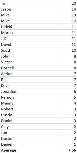
So let's look at it another way, starting with the original data. Here is a table of some customers with their final tenures. (Since this is not a real example, I haven't bothered with any censored observations; that makes it easy to check our work against the average tenure for these customers which is 7.56.)

Stack these up like cuisenaire rods with the longest on the bottom and the shortest on the top, and you get something that looks a lot like the survival curve.
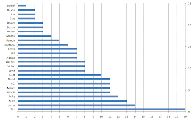
If I made the bars fat enough to touch, each would get 1/25 of the height of the stack. The area of each bar would be 1/25 times the tenure. If everyone had tenure of 20, like Tim, the area would be 25*1/25*20=20. If everyone had tenure of 1, like the first of the two Daniels, then the area would be 25*1/25*1=1. Since most customers have tenures somewhere between Tim's and Daniels, the area actually comes out to 7.56-- the average tenure.
In J:
x
20 14 13 12 11 11 11 11 10 8 8 8 7 7 7 6 5 4 3 3 3 2 2 2 1
+ /x%25 NB. This is J for "the sum of x divided by 25"
7.56
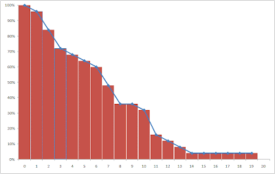
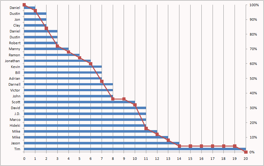
So, the area under (or to the left of) the stack of tenure bars is equal to the average tenure, but the stack of tenure bars is not exactly the survival curve. The survival curve is easily derived from it, however. For each tenure, it is the percentage of bars that stick out past it. At tenure 0, all 25 bars are longer than 0, so survival is 100%. At tenure 1, 24 out of 25 bars stick out past the line, so survival is 96% and so on.
In J:
i. 21 NB. 0 through 20
0 1 2 3 4 5 6 7 8 9 10 11 12 13 14 15 16 17 18 19 20
+/"1 (i. 21)
25 24 21 18 17 16 15 12 9 9 8 4 3 2 1 1 1 1 1 1 0
After dividing by 25 to turn the counts into percentages, we can add the survival curve to the chart.
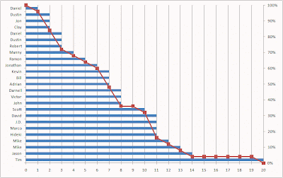
Now, even the vertical view makes sense. The vertical grid lines are spaced one period apart. The number of blue bars between two vertical grid lines says how many customers are going to contribute their 1/25 to the area of the column. This is determined by how many people reached that tenure. At tenure 0, there are 25/25 of a full day. At tenure 1, there are 24/25, and so on. Add these up and you get 7.56.
It is really quite simple, but it requires a slight tilt of the head. Instead of thinking about the area under the survival curve, think of the equivalent area to the left of the survival curve. With the discreet-time survival curves we use in our work, I think of the area under the curve as a bunch of vertical bars, one for each time period. Each rectangle has width one and its height is the percentage of customers who have not yet canceled as of that period. Conveniently, this means you can estimate the area under the survival curve by simply adding up the survival values. Looked at this way, it is not particularly clear why this value should be the mean tenure.

So let's look at it another way, starting with the original data. Here is a table of some customers with their final tenures. (Since this is not a real example, I haven't bothered with any censored observations; that makes it easy to check our work against the average tenure for these customers which is 7.56.)
Stack these up like cuisenaire rods with the longest on the bottom and the shortest on the top, and you get something that looks a lot like the survival curve.

If I made the bars fat enough to touch, each would get 1/25 of the height of the stack. The area of each bar would be 1/25 times the tenure. If everyone had tenure of 20, like Tim, the area would be 25*1/25*20=20. If everyone had tenure of 1, like the first of the two Daniels, then the area would be 25*1/25*1=1. Since most customers have tenures somewhere between Tim's and Daniels, the area actually comes out to 7.56-- the average tenure.
In J:
x
20 14 13 12 11 11 11 11 10 8 8 8 7 7 7 6 5 4 3 3 3 2 2 2 1
+ /x%25 NB. This is J for "the sum of x divided by 25"
7.56
So, the area under (or to the left of) the stack of tenure bars is equal to the average tenure, but the stack of tenure bars is not exactly the survival curve. The survival curve is easily derived from it, however. For each tenure, it is the percentage of bars that stick out past it. At tenure 0, all 25 bars are longer than 0, so survival is 100%. At tenure 1, 24 out of 25 bars stick out past the line, so survival is 96% and so on.
In J:
i. 21 NB. 0 through 20
0 1 2 3 4 5 6 7 8 9 10 11 12 13 14 15 16 17 18 19 20
+/"1 (i. 21)
25 24 21 18 17 16 15 12 9 9 8 4 3 2 1 1 1 1 1 1 0
After dividing by 25 to turn the counts into percentages, we can add the survival curve to the chart.
Now, even the vertical view makes sense. The vertical grid lines are spaced one period apart. The number of blue bars between two vertical grid lines says how many customers are going to contribute their 1/25 to the area of the column. This is determined by how many people reached that tenure. At tenure 0, there are 25/25 of a full day. At tenure 1, there are 24/25, and so on. Add these up and you get 7.56.
Wednesday, May 26, 2010
Combining Empirical Hazards by the Naïve Bayesian Method
Occasionally one has an idea that seems so obvious and right that it must surely be standard practice and have a well-known name. A few months ago, I had such an idea while sitting in a client’s office in Ottawa. Last week, I wanted to include the idea in a proposal, so I tried to look it up and couldn’t find a reference to it anywhere. Before letting my ego run away with itself and calling it the naïve Berry model, I figured I would share it with our legions of erudite readers so someone can point me to a reference.
Some Context
My client sells fax-to-email and email-to-fax service on a subscription basis. I had done an analysis to quantify the effect of various factors such as industry code, acquisition channel, and type of phone number (local or long distance) on customer value. Since all customers pay the same monthly fee, the crucial factor is longevity. I had analyzed each covariate separately by calculating cancellation hazard probabilities for each stratum and generating survival curves. The area under the first year of each survival curve is the first year truncated mean tenure. Multiplying the first-year mean tenure by the subscription price yields the average first year revenue for a segment. This let me say how much more valuable a realtor is than a trucker; or a Google adwords referral than an MSN referral.
For many purposes, the dollar value was not even important. We used the probability of surviving one year as a way of scoring particular segments. But how should the individual segment scores be combined to give an individual customer a score based on his being a trucker with an 800 number referred by MSN? Or a tax accountant with a local number referred by Google? The standard empirical hazards approach would be to segment the training data by all levels of all variables before estimating the hazards, but that was not practical since there were so many combinations that many would lack sufficient data to make confident hazard estimates. Luckily, there is a standard model for combining the contributions of several independent pieces of evidence—naïve Bayesian models. An excellent description of the relationship between probability, odds, and likelihood and how to use them to implement naïve Bayesian models, can be found in Chapter 10 of Gordon Linoff’s.
Here are the relevant correspondences:
Statisticians switch from one representation to another as convenient. A familiar example is logistic regression. Since linear regression is inappropriate for modeling probabilities that range only from 0 to 1, they convert the probabilities to log(odds) that vary from negative infinity to positive infinity. Expressing the log odds as a linear regression equation and solving for p, yields the logistic function.
Naïve Bayesian Models
The Naïve Bayesian model says that the odds of surviving one year given the evidence is the overall odds times the product of the likelihoods for each piece of evidence. For concreteness, let’s calculate a score for a general contractor (industry code 1521) with a local number who was referred by a banner ad.
The probability of surviving one year is 54%. Overall survival odds are therefore 0.54/(1-0.54) or 1.17.
One-year survival for industry code 1521 is 74%, considerably better than overall survival. The survival likelihood is defined as the survival odds, 0.74/(1-0.74) divided by the overall survival odds of 1.17. This works out to 2.43.
One-year survival for local phone numbers is 37%, considerably worse than overall survival. Local phone numbers have one-year survival odds of 0.59 and likelihood of 0.50.
Subscribers acquired through banner ads have one-year survival of 0.52, about the same as overall survival. This corresponds to odds of 1.09 and likelihood of 0.91.
Plugging these values into the naïve Bayesian model formula, we estimate one-year survival odds for this customer as 1.17*2.43*0.50*0.91=1.29. Solving 1.29=p/(p-1) for p yields a one-year survival estimate of 56%, a little bit better than overall survival. The positive evidence from the industry code slightly outweighs the negative evidence from the phone number type.
This example does not illustrate another great feature of naïve Bayesian models. If some evidence is missing—if the subscriber works in an industry for which we have no survival curve, for example—you can simply leave out the industry likelihood term.
The Idea
If we are happy to use the naïve Bayesian model to estimate the probability of a subscriber lasting one year, why not do the same for daily hazard probabilities? This is something I’ve been wanting to do since the first time I ever used the empirical hazard estimation method. That first project was for a wireless phone company. There was plenty of data to calculate hazards stratified by market or rate plan or handset type or credit class or acquisition channel or age group or just about any other time-0 covariate of interest. But there wasn’t enough data to estimate hazards for every combination of the above. I knew about naïve Bayesian models back then; I’d used the Evidence Model in SGI’s Mineset many times. But I never made the connection—it’s hard to combine probabilities, but easy to combine likelihoods. There you have it: Freedom from the curse of dimensionality via the naïve assumption of independence. Estimate hazards for as many levels of as many covariates as you please and then combine them with the naïve Bayesian model. I tried it, and the results were pleasing.
An Example
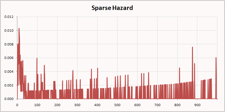
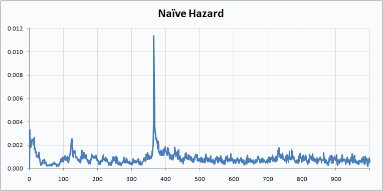
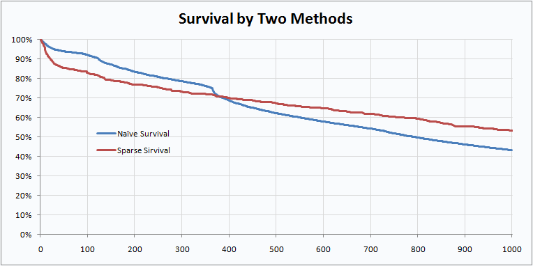
This example uses data from a mobile phone company. The dataset is available on our web site. There are three rate plans, Top, Middle, and Bottom. There are three markets, Gotham, Metropolis, and Smallville. There are four acquisition channels, Dealer, Store, Chain, and Mail. There is plenty of data to make highly confident hazard estimates for any of the above, but some combinations, such as Smallville-Mail-Top are fairly rare. For many tenures, no one with this combination cancels so there are long stretches of 0 hazard punctuated by spikes where one or two customers leave.
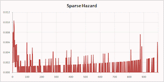
Here are the Smallville-Mail-Top hazard by the Naïve Berry method:
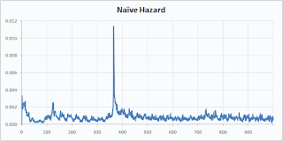
Isn’t that prettier? I think it makes for a prettier survival curve as well.
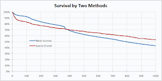
The naïve method preserves a feature of the original data—the sharp drop at the anniversary when many people coming off one-year contracts quit—that was lost in the sparse calculation.
Some Context
My client sells fax-to-email and email-to-fax service on a subscription basis. I had done an analysis to quantify the effect of various factors such as industry code, acquisition channel, and type of phone number (local or long distance) on customer value. Since all customers pay the same monthly fee, the crucial factor is longevity. I had analyzed each covariate separately by calculating cancellation hazard probabilities for each stratum and generating survival curves. The area under the first year of each survival curve is the first year truncated mean tenure. Multiplying the first-year mean tenure by the subscription price yields the average first year revenue for a segment. This let me say how much more valuable a realtor is than a trucker; or a Google adwords referral than an MSN referral.
For many purposes, the dollar value was not even important. We used the probability of surviving one year as a way of scoring particular segments. But how should the individual segment scores be combined to give an individual customer a score based on his being a trucker with an 800 number referred by MSN? Or a tax accountant with a local number referred by Google? The standard empirical hazards approach would be to segment the training data by all levels of all variables before estimating the hazards, but that was not practical since there were so many combinations that many would lack sufficient data to make confident hazard estimates. Luckily, there is a standard model for combining the contributions of several independent pieces of evidence—naïve Bayesian models. An excellent description of the relationship between probability, odds, and likelihood and how to use them to implement naïve Bayesian models, can be found in Chapter 10 of Gordon Linoff’s.
Here are the relevant correspondences:
odds = p/(1-p)
p = 1 - (1/(1+odds))
likelihood = (odds|evidence)/overall odds
Statisticians switch from one representation to another as convenient. A familiar example is logistic regression. Since linear regression is inappropriate for modeling probabilities that range only from 0 to 1, they convert the probabilities to log(odds) that vary from negative infinity to positive infinity. Expressing the log odds as a linear regression equation and solving for p, yields the logistic function.
Naïve Bayesian Models
The Naïve Bayesian model says that the odds of surviving one year given the evidence is the overall odds times the product of the likelihoods for each piece of evidence. For concreteness, let’s calculate a score for a general contractor (industry code 1521) with a local number who was referred by a banner ad.
The probability of surviving one year is 54%. Overall survival odds are therefore 0.54/(1-0.54) or 1.17.
One-year survival for industry code 1521 is 74%, considerably better than overall survival. The survival likelihood is defined as the survival odds, 0.74/(1-0.74) divided by the overall survival odds of 1.17. This works out to 2.43.
One-year survival for local phone numbers is 37%, considerably worse than overall survival. Local phone numbers have one-year survival odds of 0.59 and likelihood of 0.50.
Subscribers acquired through banner ads have one-year survival of 0.52, about the same as overall survival. This corresponds to odds of 1.09 and likelihood of 0.91.
Plugging these values into the naïve Bayesian model formula, we estimate one-year survival odds for this customer as 1.17*2.43*0.50*0.91=1.29. Solving 1.29=p/(p-1) for p yields a one-year survival estimate of 56%, a little bit better than overall survival. The positive evidence from the industry code slightly outweighs the negative evidence from the phone number type.
This example does not illustrate another great feature of naïve Bayesian models. If some evidence is missing—if the subscriber works in an industry for which we have no survival curve, for example—you can simply leave out the industry likelihood term.
The Idea
If we are happy to use the naïve Bayesian model to estimate the probability of a subscriber lasting one year, why not do the same for daily hazard probabilities? This is something I’ve been wanting to do since the first time I ever used the empirical hazard estimation method. That first project was for a wireless phone company. There was plenty of data to calculate hazards stratified by market or rate plan or handset type or credit class or acquisition channel or age group or just about any other time-0 covariate of interest. But there wasn’t enough data to estimate hazards for every combination of the above. I knew about naïve Bayesian models back then; I’d used the Evidence Model in SGI’s Mineset many times. But I never made the connection—it’s hard to combine probabilities, but easy to combine likelihoods. There you have it: Freedom from the curse of dimensionality via the naïve assumption of independence. Estimate hazards for as many levels of as many covariates as you please and then combine them with the naïve Bayesian model. I tried it, and the results were pleasing.
An Example
This example uses data from a mobile phone company. The dataset is available on our web site. There are three rate plans, Top, Middle, and Bottom. There are three markets, Gotham, Metropolis, and Smallville. There are four acquisition channels, Dealer, Store, Chain, and Mail. There is plenty of data to make highly confident hazard estimates for any of the above, but some combinations, such as Smallville-Mail-Top are fairly rare. For many tenures, no one with this combination cancels so there are long stretches of 0 hazard punctuated by spikes where one or two customers leave.
Here are the Smallville-Mail-Top hazard by the Naïve Berry method:
Isn’t that prettier? I think it makes for a prettier survival curve as well.
The naïve method preserves a feature of the original data—the sharp drop at the anniversary when many people coming off one-year contracts quit—that was lost in the sparse calculation.
Sunday, April 4, 2010
Data Mining Techniques now available in Korean

This book was already available in Japanese, and, of course, English. Earlier editions are available in Traditional Chinese and French.
Sunday, March 14, 2010
Bitten by an Unfamiliar Form of Left Truncation
Alternate title: Data Mining Consultant with Egg on Face
Last week I made a client presentation. The project was complete. I was presenting the final results to the client. The CEO was there. Also the CTO, the CFO, the VPs of Sales and Marketing, and the Marketing Analytics Manager. The client runs a subscription-based business and I had been analyzing their attrition patterns. Among my discoveries was that customers with "blue" subscriptions last longer than customers with "red" subscriptions. By taking the difference of the area under the two survival curves truncated at one year and multiplying by the subscription cost, I calculated the dollar value of the difference. I put forward some hypotheses about why the blue product was stickier and suggested a controlled experiment to determine whether having a blue subscription actually caused longer tenure or was merely correlated with it. Currently, subscribers simply pick blue or red at sign-up. There is no difference in price. I proposed that half of new customers be given blue by default unless they asked for red and the other half be given red by default unless they asked for blue. We could then look for differences between the two randomly assigned groups.
All this seemed to go over pretty well. There is only one problem. The blue customers may not be better after all. One of the attendees asked me whether the effect I was seeing could just be a result of the fact that blue subscriptions have been around longer than red ones so the oldest blue customers are older than the oldest red customers. I explained that this would not bias my findings because all my calculations were based on the tenure time line, not the calendar time line. We were comparing customers' first years without regard to when they happened. I explained that there would be a problem if the data set suffered from left truncation, but I had tested for that, and it was not a problem because we knew about starts and stops since the beginning of time.
Left truncation is something that creates a bias in many customer databases. What it means is that there is no record of customers who stopped before some particular date in the past--the left truncation date. The most likely reason is that the company has been in existence longer than its data warehouse. When the warehouse was created, all active customers were loaded in, but customers who had already left were not. Fine, for most applications, but not for survival analysis. Think about customers who started before the warehouse was built. One (like many thousands of others) stops before the warehouse gets built with a short tenure of two months. Another, who started on the same day as the first, is still around two be loaded into the warehouse with a tenure of two years. Lots of short-tenure people are missing and long-tenure people are over represented. Average tenure is inflated and retention appears to be better than it really is.
My client's data did not have that problem. At least, not in the way I am used to looking for it. Instead, it had a large number of stopped customers for whom the subscription type had been forgotten. I (foolishly) just left these people out of my calculations. Here is the problem: Although the customer start and stop dates are remembered for ever, certain details, including the subscription type, are purged after a certain amount of time. For all the people who started back when there were only blue subscriptions and had short or even average tenures, that time had already past. The only ones for whom I could determine the subscription type were those who had unusually long tenures. Eliminating the subscribers for whom the subscription type had been forgotten had exactly the same effect as left truncation!
If this topic and things related to it sound interesting to you, it is not too late to sign up for a two-day class I will be teaching in New York later this week. The class is called Survival Analysis for Business Time to Event Problems. It will be held at the offices of SAS Institute in Manhattan this Thursday and Friday, March 18-19.
Subscribe to:
Posts (Atom)


