Occasionally one has an idea that seems so obvious and right that it must surely be standard practice and have a well-known name. A few months ago, I had such an idea while sitting in a client’s office in Ottawa. Last week, I wanted to include the idea in a proposal, so I tried to look it up and couldn’t find a reference to it anywhere. Before letting my ego run away with itself and calling it the
naïve Berry model, I figured I would share it with our legions of erudite readers so someone can point me to a reference.
Some Context
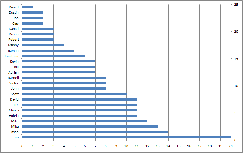
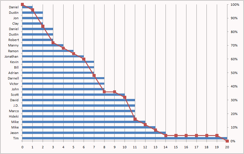
My client sells fax-to-email and email-to-fax service on a subscription basis. I had done an analysis to quantify the effect of various factors such as industry code, acquisition channel, and type of phone number (local or long distance) on customer value. Since all customers pay the same monthly fee, the crucial factor is longevity. I had analyzed each covariate separately by calculating cancellation hazard probabilities for each stratum and generating survival curves. The area under the first year of each survival curve is the first year truncated mean tenure. Multiplying the first-year mean tenure by the subscription price yields the average first year revenue for a segment. This let me say how much more valuable a realtor is than a trucker; or a Google adwords referral than an MSN referral.
For many purposes, the dollar value was not even important. We used the probability of surviving one year as a way of scoring particular segments. But how should the individual segment scores be combined to give an individual customer a score based on his being a trucker with an 800 number referred by MSN? Or a tax accountant with a local number referred by Google? The standard empirical hazards approach would be to segment the training data by all levels of all variables before estimating the hazards, but that was not practical since there were so many combinations that many would lack sufficient data to make confident hazard estimates. Luckily, there is a standard model for combining the contributions of several independent pieces of evidence—naïve Bayesian models. An excellent description of the relationship between probability, odds, and likelihood and how to use them to implement naïve Bayesian models, can be found in Chapter 10 of Gordon Linoff’s.
Here are the relevant correspondences:
odds = p/(1-p)
p = 1 - (1/(1+odds))
likelihood = (odds|evidence)/overall odds
Statisticians switch from one representation to another as convenient. A familiar example is logistic regression. Since linear regression is inappropriate for modeling probabilities that range only from 0 to 1, they convert the probabilities to log(odds) that vary from negative infinity to positive infinity. Expressing the log odds as a linear regression equation and solving for p, yields the logistic function.
Naïve Bayesian Models
The Naïve Bayesian model says that the odds of surviving one year given the evidence is the overall odds times the product of the likelihoods for each piece of evidence. For concreteness, let’s calculate a score for a general contractor (industry code 1521) with a local number who was referred by a banner ad.
The probability of surviving one year is 54%. Overall survival odds are therefore 0.54/(1-0.54) or 1.17.
One-year survival for industry code 1521 is 74%, considerably better than overall survival. The survival likelihood is defined as the survival odds, 0.74/(1-0.74) divided by the overall survival odds of 1.17. This works out to 2.43.
One-year survival for local phone numbers is 37%, considerably worse than overall survival. Local phone numbers have one-year survival odds of 0.59 and likelihood of 0.50.
Subscribers acquired through banner ads have one-year survival of 0.52, about the same as overall survival. This corresponds to odds of 1.09 and likelihood of 0.91.
Plugging these values into the naïve Bayesian model formula, we estimate one-year survival odds for this customer as 1.17*2.43*0.50*0.91=1.29. Solving 1.29=p/(p-1) for p yields a one-year survival estimate of 56%, a little bit better than overall survival. The positive evidence from the industry code slightly outweighs the negative evidence from the phone number type.
This example does not illustrate another great feature of naïve Bayesian models. If some evidence is missing—if the subscriber works in an industry for which we have no survival curve, for example—you can simply leave out the industry likelihood term.
The Idea
If we are happy to use the naïve Bayesian model to estimate the probability of a subscriber lasting one year, why not do the same for daily hazard probabilities? This is something I’ve been wanting to do since the first time I ever used the empirical hazard estimation method. That first project was for a wireless phone company. There was plenty of data to calculate hazards stratified by market or rate plan or handset type or credit class or acquisition channel or age group or just about any other time-0 covariate of interest. But there wasn’t enough data to estimate hazards for every combination of the above. I knew about naïve Bayesian models back then; I’d used the Evidence Model in SGI’s Mineset many times. But I never made the connection—it’s hard to combine probabilities, but easy to combine likelihoods. There you have it: Freedom from the curse of dimensionality via the naïve assumption of independence. Estimate hazards for as many levels of as many covariates as you please and then combine them with the naïve Bayesian model. I tried it, and the results were pleasing.
An Example
This example uses data from a mobile phone company. The dataset is available on
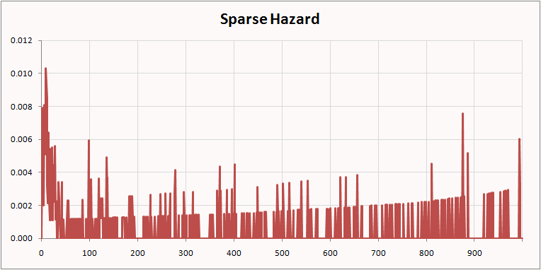
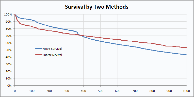
our web site. There are three rate plans, Top, Middle, and Bottom. There are three markets, Gotham, Metropolis, and Smallville. There are four acquisition channels, Dealer, Store, Chain, and Mail. There is plenty of data to make highly confident hazard estimates for any of the above, but some combinations, such as Smallville-Mail-Top are fairly rare. For many tenures, no one with this combination cancels so there are long stretches of 0 hazard punctuated by spikes where one or two customers leave.
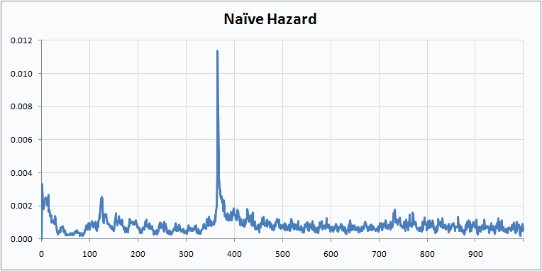
Here are the Smallville-Mail-Top hazard by the Naïve Berry method:
Isn’t that prettier? I think it makes for a prettier survival curve as well.
The naïve method preserves a feature of the original data—the sharp drop at the anniversary when many people coming off one-year contracts quit—that was lost in the sparse calculation.


