Wednesday, November 12, 2008

Creating Accurate Venn Diagrams in Excel, Part 2

This post is an extention of an earlier post. If you are interested in this, you may be interested in my book Data Analysis Using SQL and Excel.

This post is about creating a Venn diagram using two circles. A Venn diagram is used to explain data such as:
  • Group A has 81 members.
  • Group B has 25 members.
  • There are 15 members in both groups A and B.
The above data is shown as a Venn diagram as:


Unfortunately, creating a simple Venn diagram is not built into Excel, so we need to create one manually. This is another example that shows off the power of Excel charting to do unexpected things.

Specifically, creating the above diagram requires the following capabilities:
  1. We need to draw a circle with a given radius and a center at any point.
  2. We need to fill in the circle with appropriate shading.
  3. We need to calculate the appropriate centers and radii given data.
  4. We need to annotate the chart with text.
Each of these are explained below. All of the charts and formulas are available in the accompanying Excel file.
Drawing a Circle Using Scatter Plots

To create the circle, we start with a bunch of points, that when connected with smoothed lines will look like a circle. To get the points, we'll create a table with values from 0 to 360 degrees, and borrow some formulas from trigonometry. These say:

  • X = radius*sin() + X-offset
  • Y = radius*cos() + Y-offset
The only slight complication is that the functions SIN() and COS() take their arguments in something called radian rather than degrees. This makes the formula look like:
  • X = radius*sin(*2*PI/360) + X-offset
  • Y = radius*cos(*2*PI/360) + Y-offset
The following shows the formulas:


Degrees X-Value Y-Value

0 =$E$4+SIN(2*PI()*B11/360)*$D$4 =$F$4+COS(2*PI()*B11/360)*$D$4

5 =$E$4+SIN(2*PI()*B12/360)*$D$4 =$F$4+COS(2*PI()*B12/360)*$D$4

10 =$E$4+SIN(2*PI()*B13/360)*$D$4 =$F$4+COS(2*PI()*B13/360)*$D$4

15 =$E$4+SIN(2*PI()*B14/360)*$D$4 =$F$4+COS(2*PI()*B14/360)*$D$4

20 =$E$4+SIN(2*PI()*B15/360)*$D$4 =$F$4+COS(2*PI()*B15/360)*$D$4

25 =$E$4+SIN(2*PI()*B16/360)*$D$4 =$F$4+COS(2*PI()*B16/360)*$D$4

30 =$E$4+SIN(2*PI()*B17/360)*$D$4 =$F$4+COS(2*PI()*B17/360)*$D$4

Where E4 contains the X-offset; F4 contains the Y-offset; and D4 contains the radius.

The degree values need to extend all the way to 360 to get a full circle, which can then be plotted as a scatter plot. When choosing which variety of the scatter plot, choose the option of points connected with smoothed lines.

The following chart shows the resulting circle with the points highlighted, along with axis labels and grid lines (which should be removed before creating the final version):


Creating a second circle is as easy as creating one, by just adding a second set of series onto the chart.


Filling in the Circle with Appropriate Shading

Unfortunately, to Excel, the circle is really just a collection of points, and we cannot fill it with shading. However, with a clever idea of using error bars, we can put in a pattern, such as:


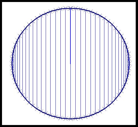
The idea is to create X error bars for horizontal lines and Y error bars for vertical lines. To do this. right click on the circle and choose "Format Data Series". Then go to the "X Error Bars" or "Y Error Bars" tab (whichever is appropriate). Put 101 in the "Percent" box.

This adds the error bars. To format then, double click on one of them. You can set the color for them and also remove the little line at the edge.

You will notice that these bars are not evenly spaced. The spacing is related to the degrees. With the proper choice of degrees, the points would be evenly spaced. However, I do not mind the uneven spacing, and have not bothered to figure out a better set of points for even spacing.


Calculating Where the Circles Should Be

Given the area of a circle, calculating the radius is a simple matter of reversing the area formula. So, we have:
  • radius = SQRT(area/PI())
So, getting the radii for the two circles is easy. The questions is: where should the second circle be place to get the right overlap?

Unfortunately, there is no easy solution. First, we have to apply some complicated arithmetic to calculate the overlap between two circles, given a width of the overlap. Then we have to find the overlap that gives the correct area.

The first part is solved by finding the area of overlap between two circules, at a site such as Wolfram Math World.

The second is solved by using the "Goal Seek" functionality under the tools bar. We simple set up a worksheet that calculates the area of the overlap, given the width of the overlap and the two radii. One of the cells has the difference between this value and the area that we want. We then use Goal Seek to set this value to 0.

Annotating the Chart with Text
The final step is annotating the chart with text, such as "A Only: 65". First, we put this string in a cell, using a formula such as:
  • ="A Only: "&C4-C6
Then, we inlcude this text in the chart by selecting the chart, and typing "=" and followed by the cell address (or using the mouse).
Publish Post

In the end, we are able to create an accurate Venn diagram with two circles, of any size and overlap.


venn-20080112.xls

Saturday, November 1, 2008

Should model scores be rescaled?

Here’s a quick question for your blog;

- background -

I work in a small team of data miners for a telecommunications company. We usually do ‘typical’ customer churn and mobile (cell-phone) related analysis using call detail records (CDR’s)

We often use neural nets to create a decimal range score between zero and one (0.0 - 1.0), where zero equals no churn and maximum 1.0 equals highest likelihood of churn. Another dept then simply sorts an output table in descending order and runs the marketing campaigns using the first 5% (or whatever mailing size they want) of ranked customers.

- problem -

We have differing preferences in the distribution of our prediction score for churn. Churn occurs infrequently, lets say 2% (it is voluntary churn of good fare paying customers) per month. So 98% of customers have a score of 0.0 and 2% have a score of 1.0.

When I build my predictive model I try to mimic this distribution. My view that is most of the churn prediction scores would be skewed toward 0.1 or 0.2, say 95% of all predicted customers, and from 0.3 to 1.0 of the churn score would apply to maybe 5% of the customer base.

Some of my colleagues re-scale the prediction score so that there are an equal number of customers spread throughout.

- question -

What are your views/preferences on this?


I see no reason to rescale the scores. Of course, if the only use of the scores is to mail the top 5% of the list it makes no difference since the transformation preserves the ordering, but for other applications you want the score to be an estimate of the actual probability of cancellation.

In general, scores that represent the probability of an event are more useful than scores which only order a list in descending order by probability of the event. For example, in a campaign response model, you can multiply the probability that a particular prospect will respond by the value of that response to get an expected value of making the offer. If the expected value is greater than the cost, the offer should not be made. Gordon and I discuss this and related issues in our book Mastering Data Mining.

This issue often comes up when stratified sampling is used to create a balanced model set of 50% responders and 50% non-responders. For some modeling techniques--notably, decision trees--a balanced model set will produce more and better rules. However, the proportion of responders at each leaf is no longer an estimate of the actual probability of response. The solution is simple: simply apply the model to a test set that has the correct distribution of responders to get correct estimates of the response probability.

-Michael

Tuesday, October 28, 2008

Random Samples in SQL

Hi,

How would recommend getting a random sample from a table in SQL? Thank you!

Adam


This is a good question. Unfortunately, there is not a good answer, because the concept of a random sample does not really exist in relational algebra (which SQL -- to a greater or lesser extent -- is based on). There are, however, ways of to arrive at the solution. This discussion is based partly on the Appendix in Data Analysis Using SQL and Excel.

The basic idea is assume that there is a function that returns a random number, say uniformly between 0 and 1. If such a function exists, the SQL code for a random sample might look like:

....SELECT *
....FROM table t
....WHERE rand() <>

The function rand() does actually exist in many databases, such as IBM UDB, Microsoft SQL, and Mysql.

Does this really work for these databases? That depends on whether rand() is a deterministic or non-deterministic function. A deterministic function is essentially evaluated once, when the query is parsed. If this is the case, then all rows would have the same value, and the query would not return a 10% random sample. It would return either 0 rows or all of them.

Fortunately, for these databases, the designers were smart and rand() is non-deterministic, so the above code works as written.

Oracle has a totally different approach. It supports the SAMPLE clause. Using it, the above query would be written as:

....SELECT *
....FROM table t
....SAMPLE (10)

Another approach in Oracle is to use a pseudo-random number generator and ROWNUM. This approach works in any database that has something similar to ROWNUM.

If you happen to be using SAS proc SQL, then you can do something similar to the first example. The only difference is that the function is RAND('UNIFORM') rather than just RAND().

Friday, October 24, 2008

Creating Accurate Venn Diagrams in Excel, Part 1

This post (and the next) are about creating accurate Venn diagrams using Excel charts. If you are interested in this, you may be interested in my book Data Analysis Using SQL and Excel.

Recently, I had occasion to analyze prescriber data for a project at a pharmaceutical company. On of the things we wanted to do was to compare visually the prescribing habits of psychiatrists, by places them into three groups: those who only prescribe drug A; those who only prescriber drug B; and those who prescribe both. The resulting chart is:


This chart is an example of a Venn diagram. Unfortunately, Excel does not have a built-in Venn diagram creator. And, if you do a google search, you will get many examples, where the circles are placed manually. Perhaps it is my background in data analysis, but I often prefer accuracy to laziness. So, I developed a method to create simple but accurate Venn diagrams in Excel.

Creating such diagrams is, fundamentally, rather simple. However, there is some math involved. To simplify the math, this post first describes how to create a Venn diagram where the two shapes are squares. In the next post, I'll extend the ideas to using circles.

Creating a Venn diagram requires understanding the following:
  1. Creating shapes in Excel.
  2. Calculating the correct overlap of the shapes.
  3. Putting it all together.
This post discusses each of these.

Creating a Shape in Excel

How does one create a shape using Excel charts. The simple answer here is using the scatter plot. If we want to make a square, we can simply plot the four corners of the square and connect them using lines, as in the following example:


Here the square has an area of 81, so each side is exactly nine units long. It is created using five data points:


X-Value Y-Value

-4.50 -4.50

-4.50 4.50

4.50 4.50

4.50 -4.50

-4.50 -4.50

Notice that the first point is repeated twice. Otherwise, there would be four points, but only three sides.

A small challenge in doing this is making the chart look like a square instead of a rectangle. Unfortunately, Excel does not make it easy to adjust the size of a chart, say by right clicking and just entering the width and height.

One way to make the chart square is to place it in a single cell and then adjust the row height and column height to be equal. My prefered method is just to eye-ball it. The above chart has a width of six columns and a height of 21 rows.

In this case, the square is centered on the origin. There is a reason for this. The temptation is to have the square be positioned at the origin and then pass through the points (0,9), (9,9), and (9,0). However, I find that when Excel draws the square, the axes interfere with the sides of the square, so some are shaded heavier than others. This happens even when I remove the axes.

As an aside here, you can imagine creating many different types of shapes in Excel besides squares. However, Excel only understands these as lines connecting a scatter plot. In particular, this means that you cannot color the interior of the shape.


Calculating the Overlaps

Assume that we have two squares that overlap, one square has an area of 100 (side is 10) and the other 25 (side is 5). What is the overlap between them?

There is not enough information to answer this question. It is clearly between 0 (if the squares do not overlap) and 25 (the size of the smaller square). If the overlap is 10, how big is the overlap? In the following picture, the area of C is 10.


What are the dimensions of C? The height is the height of the smaller square -- 5. So the width must be 2 (=10/5).

Putting It Together

To put this together for a Venn diagram using squares, we simply need to position two squares given the following information:
  • The sizes of the two squares.
  • The overlap between them.
Consider the original diagram at the top of this posting. The sizes of the two regions are 13,941 and 11,175 respectively. The overlap is 9,783.

The first thing to calculate is the side length for the two squares:
  • 118.07 for the first square (=sqrt(13,941)).
  • 105.71 for the second (=sqrt(11,175)).
Then, we need to calculate the width of the overlapping region (we already know its height and area):
  • 92.54 = 9,783 / 105.71
Now we need to calculate the points for the two squares. The way that I do the calculation is to place square at the origin, and then to add X- and Y- offsets to shift it around the plane. So, the general formula for the points are:
  • (0 + X-offset, 0 + Y-offset)
  • (side + X-offset, 0 + Y-offset)
  • (side + X-offset, side + Y-offset)
  • (0 + X-offset, side + Y-offset)
  • (0 + X-offset, 0 + Y-offset)
Since we know the side lengths of the two squares, I only need to calculate the offset values. The first square is centered at the origin (rather than starting there), so the offset is - side/2 for both X and Y.

The second square is centered vertically, so its Y-offset is also - side/2. The X-offset is the bigger challenge. In order to get the correct overlap, it is:
  • (side-first - X-offset-first) - overlap-width
The attached spreadsheet has these calculations. The data table on the spreadsheet looks like:


Area Side X Offset Y Offset

Left 13,941 118.07 -59.04 -59.04

Right 11,175 105.71 -33.51 52.86

Overlap 9,783 92.54


big square little square

-59.04 -59.04 72.20 52.86

-59.04 59.04 -33.51 52.86

59.04 59.04 -33.51 -52.86

59.04 -59.04 72.20 -52.86

-59.04 -59.04 72.20 52.86


The points are listed under "big square" and "little square". The first column is the X value for the big square, the second is the Y value; the third is the X value for the little square and the fourth is the Y value.

After creating the chart, you need to beautify it. I remove the axes and axis' labels, thicken the lines around the squares, and adjust the height and width to make the shape look like a square.

The attached .xls file (venn-20081025.xls) contains all the examples in this post.

The next post extends these ideas to creating Venn diagrams with circles, which are the more typical shape for them. It also shows one way to put some color in the shapes to highlight the different regions.

Sunday, October 19, 2008

Rolling and Unrolling Correlated Subqueries in SQL

The subject of correlated subqueries arose recently in a data mining class I was teaching. A student inquired about improving the performance of a particular query, which happened to have a correlated subquery. This posting discusses unrolling correlated subqueries to improve performance as well as the rarer need to use correlated subqueries to increase performance.

Correlated subqueries are SQL queries that contain a nested subquery, where the nested query refers to one or more outside tables. The definition sounds complicated, but an example is worth a thousand words.

My book Data Analysis Using SQL and Excel includes a database of customers, orders, and transactions (which can be downloaded). From such data, we might ask a question such as "What products did customer X order on her or his earliest order date?" A typical way to answer this is with a corrrelated subquery.

SELECT ol.ProductID
FROM orders o JOIN
.....orderline ol
.....ON o.OrderID = ol.OrderID AND
.....o.CustomerID = X
WHERE o.OrderDate = (SELECT MIN(OrderDate)
.....................FROM orders o2
.....................WHERE o2.CustomerID = o.CustomerID)


Since this is standard SQL, all reasonable relational databases should support this syntax. One syntax note: the subquery could optionally contain a "GROUP BY o2.CustomerID" clause.

What is the query doing? It is joining two tables together (orders and orderline) and then restricting the results to a single customer. However, the query is about the products in a particular order, so the WHERE clause selects the particular order -- as the one with the smallest OrderDate. Voila. The query answers the question.

The correlated subquery is in the WHERE clause, buried in the subquery in the line o.OrderID = o2.OrderID. This is placing a restriction on the values in the subquery based on the results of an outer query. Do note that if the WHERE clause were instead o.CustomerID = , then the subquery would not be correlated, since there would be no connection to the outer tables.

So far so good. When we think of how the query runs, we think of iterating through every row in the o2 table and looking to match it to the current value in the o table. If there is an index, so much the better because the query engine can use the index to access the o2 table.

This conceptual approach is, in fact, how most (if not all) query engines optimize such a query. For now, I'm leaving open the question of whether this is a good thing, in order to present the idea of unrolling the subquery.

There are other ways to answer the original question ("What products did Customer X order on his or her earliest order date?"). The following query shows an alternative approach:

SELECT ProductID
FROM orders o JOIN
.....orderlines ol
.....ON o.OrderID = ol.OrderID JOIN
.....(SELECT CustomerID, MIN(OrderDate) as minOrderDate
......FROM orders
......GROUP BY CustomerID) omin

.....ON o.OrderDate = omin.minOrderDate AND
........o.CustomerID = omin.CustomerID
WHERE o.CustomerID = X

This version of the query unrolls the subquery, by creating a summary table with the earliest order date for all customers. The link to the other table is made through an explicit join condition between this summary table and the orders table.

Note that in this particular query, the WHERE clause that chooses the customer could be in the subquery, because the columns in the WHERE clause are in the subquery. However, in the general case, the filter could be using columns not available in the subquery -- such as getting all products that start with the letter "A".

There is a big difference in how this query gets executed versus the earlier version. The big difference is that now the orders need to be grouped to find the earliest order date for all orders. The correlated subquery could use an index and only look at the handful of rows for a given customer. So, the correlated subquery seems to be more efficient.

If the correlated subquery is more efficient, then why do I personally avoid using them? One reason is the explicitness of the joins. I find it much easier to understand the unrolled version. However, ease of understanding is less important than performance. In many cases, the unrolled version does execute faster.

Notice that both these queries are looking for data about one particular customer -- a small subset of the overall data. For queries that are looking for such needles in the haystack, then correlated subqueries are fine.

However, decision support queries are usually looking to sift through the whole haystack and not look for just the needle. If we changed the question to "What products are ordered on the earliest order date?" then the queries lose the restrictive clause limiting them to one customer. Now what happens?

In the case of the correlated subquery, query engines essentially execute the joins in one of two ways: (1) by repeatedly looping through one table (typically the one in the inner join) or (2) using indexes. In terms of join algorithms, these are nested loop joins and index-based joins -- two perfectly good join algorithms. But, I might add, two out of many algorithms that could be used.

On the other hand, doing the explicit join as in the second example allows the query engine to execute the different steps it needs to execute, and then to decide on the best strategies. In particular, when the data is partitioned for simultaneous access on multiple processors, most query engines would forget the parallel possibilities and simply execute the correlated subquery on a single processor.

On the other hand, most parallel query engines would correctly parallelize the second version of the query. The GROUP BY would execute in parallel, as would the rest of the joins. The query optimizer would use table statistics to generate the best query plan.

Correlated subqueries are a tool used when designing queries. In all cases, though, the subqueries can be unrolled using more traditional aggregation and join operations. However, query optimizers generally do not perform this operation.

Correlated subqueries are often the most efficient approach when looking for a few rows from a table, particularly when the optimizer can use indexes for the join. On the other hand, unrolling the subqueries is often more efficient when there is a large amount of data, because the optimizer can do full query optimization, making use of parallelism and table statistics.

Currently, most query optimizers do not know how to unrolls correlated subqueries -- or how to roll them back up. So, we need to make such decisions when writing the queries ourselves.

Thursday, October 2, 2008

Decision Trees and Clustering


Hi,

I started to write my master thesis and i chose a data mining topic.What I have to do is to analyze the bookings of an airline company and to observe for which markets,time periods and clients the bookings can be trusted and for which not.(The bookings can anytime be canceled or modified ).

I decided to use the decision trees as a classification method but I somehow wonder if clustering would have been more appropriate in this situation.

Thanks and best regards,
Iuliana


When choosing between decision trees and clustering, remember that decision trees are themselves a clustering method. The leaves of a decision tree contain clusters of records that are similar to one another and dissimilar from records in other leaves. The difference between the clusters found with a decision tree and the clusters found using other methods such as K-means, agglomerative algorithms, or self-organizing maps is that decision trees are directed while the other techniques I mentioned are undirected. Decision trees are appropriate when there is a target variable for which all records in a cluster should have a similar value. Records in a cluster will also be similar in other ways since they are all described by the same set of rules, but the target variable drives the process. People often use undirected clustering techniques when a directed technique would be more appropriate. In your case, I think you made the correct choice because you can easily come up with a target variable such as the percentage cancelations, alterations and no-shows in a market.

You can make a model set that has one row per market. One column, the target, will be the percentage of reservations that get changed or cancelled. The other columns will contain everything you know about the market--number of flights, number of connections, ratio of business to leasure travelers, number of carriers, ratio of transit passengers to origin or destination passengers, percentage of same day bookings, same week bookings, same month bookings, and whatever else comes to mind. A decision tree will produce some leaves with trustworthy bookings and some with untrustworthy bookings and the paths from the root to these leaves will be descriptions of the clusters.

Tuesday, September 30, 2008

A question about decision trees

Hi,
In your experience with decision trees, do you prefer to use a small set of core variables in order to make the model more elegant and/or understandable? At what point do you feel a tree has grown too large and complicated? What are the indicators that typically tell you that you need to do some pruning?
Thank you!
-Adam


Elegance and ease of understanding may or may not be important depending on your model's intended purpose. There are certainly times when it is important to come up with a small set of simple rules. In our book Mastering Data Mining we give an example of a decision tree model used to produce rules that were printed on a poster next to a printing press so the press operators could avoid a particular printing defect. When a decision tree is used for customer segmentation, it is unlikely that your marketing department is equipped to handle more than a handful of segments and the segments should be described in terms of a few famiar variables. In both of these cases, the decision tree is meant to be descriptive.

On the other hand, many (I would guess most) decision trees are not intended as descriptions; they are intended to produce scores of some kind. If the point of the model is to give each prospect a probability of response, then I see no reason to be concerned about having hundreds or even thousands of leaves so long as each one receives sufficient training records that the proportion of responders at the leaf is a statistically confident estimate of the response probability. A very nice feature of decision tree models is that one need not grok the entire tree in order to interpret any particular rule it generates. Even in a very complex tree, the path from the root to a particular leaf of interest gives a fairly simple description of records contained in that leaf.

For trees used to estimate some continuous quantity, an abundance of leaves is very desirable. As estimators, regression trees have the desirable quality of never making truly unreasonable estimates (as a linear regression, for example, might do) because every estimate is an average of a large number of actual observed values. The downside is that it cannot produce any more distinct values than it has leaves. So, the more leaves the better.

The need for pruning usually arises when leaves are allowed to become too small. This leads to splits that are not statistically significant. Apply each split rule to your training set and a validation set drawn from the same population. You should see the same distribution of target classes in both training and validation data. If you do not, your model has overfit the training data. Many software tools have absurdly low default minimum leaf sizes--probably because they were developed on toy datasets such as the ubiquitous irises. I routinely set the minimum leaf size to something like 500 so overfitting is not an issue and pruning is unnecesary.

I have focused on the number of leaves rather than the number of variables since I think that is a better measure of tree complexity. You actually asked about the number of variables. I recommend a two-stage approach. In the first stage, do not worry about how many variables there are or which variable from each family of related variables gets picked by the model. One of the great uses for a decision tree is to pick a small subset of useful variables out of hundreds or thousands of candidates. At a later stage, look at the variables that were picked and think about what concept each of them is getting at. Then pick a set of variables that express those concepts neatly and perhaps even elegantly. You might find, for example, that the customer ID is a good predictor and appears in many rules because customer IDs were assigned serially and long-time customers behave differently than recent customers. Even though this makes perfect sense, it would be hard to explain so you would replace it with a more transparent indication of customer tenure such as "months since first purchase."