Sunday, January 18, 2009

Thoughts on Understanding Neural Networks

Lately, I've been thinking quite a bit about neural networks. In particular, I've been wondering whether it is actually possible to understand them. As a note, this posting assumes that the reader has some understanding of neural networks. Of course, we at Data Miners, heartily recommend our book Data Mining Techniques for Marketing, Sales, and Customer Relationship Management for introducing neural networks (as well as a plethora of other data mining algorithms).

Let me start with a picture of a neural network. The following is a simple network that takes three inputs and has two nodes in the hidden layer:

Note that this structure of the network explains what is really happening. The "input layer" (the first layer connected to the inputs) standardizes the inputs. The "output layer" (connect to the output) is doing a regression or logistic regression, depending on whether the target is numeric or binary. The hidden layers are actually doing a mathematical operation as well. This could be the logistic function; more typically, though it is the hyperbolic tangent. All of the lines in the diagram have weights on them. Setting these weights -- plus a few others not shown -- is the process of training the neural network.

The topology of the neural network is specifically how SAS Enterprise Miner implements the network. Other tools have similar capabilities. Here, I am using SAS EM for three reasons. First, because we teach a class using this tool, I have pre-built neural network diagrams. Second, the neural network node allows me to score the hidden units. And third, the graphics provide a data-colored scatter plot, which I use to describe what's happening.

There are several ways to understand this neural network. The most basic way is "it's a black box and we don't need to understand it." In many respects, this is the standard data mining viewpoint. Neural networks often work well. However, if you want a technique that let's you undersand what it is doing, then choose another technique, such as regression or decision trees or nearest neighbor.

A related viewpoint is to write down the equation for what the network is doing. Then point out that this equation *is* the network. The problem is not that the network cannot explain what it is doing. The problem is that we human beings cannot understand what it is saying.

I am going to propose two other ways of looking at the network. One is geometrically. The inputs are projected onto the outputs of the hidden layer. The results of this projection are then combined to form the output. The other method is, for lack of a better term, "clustering". The hidden nodes actually identify patterns in the original data, and one hidden node usually dominates the output within a cluster.

Let me start with the geometric interpretation. For the network above, there are three dimensions of inputs and two hidden nodes. So, three dimensions are projected down to two dimensions.

I do need to emphasize that these projections are not the linear projections. This means that they are not described by simple matrices. These are non-linear projections. In particular, a given dimension could be stretched non-uniformly, which further complicates the situation.

I chose two nodes in the hidden layer on purpose, simply because two dimensions are pretty easy to visualize. Then I went and I tried it on a small neural network, using Enterprise Miner. The next couple of pictures are scatter plots made with EM. It has the nice feature that I can color the points based on data -- a feature sadly lacking from Excel.

The following scatter plot shows the original data points (about 2,700 of them). The positions are determined by the outputs of the hidden layers. The colors show the output of the network itself (blue being close to 0 and red being close to 1). The network is predicting a value of 0 or 1 based on a balanced training set and three inputs.

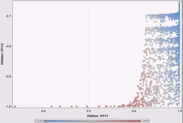
Hmm, the overall output is pretty much related to the H1 output rather than the H2 output. We see this becasuse the color changes primarily as we move horizontally across the scatter plot and not vertically. This is interesting. It means that H2 is contributing little to the network prediction. Under these particular circumstances, we can explain the output of the neural network by explaining what is happening at H1. And what is happening at H1 is a lot like a logistic regression, where we can determine the weights of different variables going in.

Note that this is an approximation, because H2 does make some contribution. But it is a close approximation, because for almost all input data points, H1 is the dominant node.

This pattern is a consequence of the distribution of the input data. Note that H2 is always negative and close to -1, whereas H1 varies from -1 to 1 (as we would expect, given the transfer function). This is because the inputs are always positive and in a particular range. The inputs do not result in the full range of values for each hidden node. This fact, in turn, provides a clue to what the neural network is doing. Also, this is close to a degenerate case because one hidden unit is almost always ignored. It does illustrate that looking at the outputs of the hidden layers are useful.

This suggests another approach. Imagine the space of H1 and H2 values, and further that any combination of them might exist (do remember that because of the transfer function, the values actually are limited to the range -1 to 1). Within this space, which node dominates the calculation of the output of the network?

To answer this question, I had to come up with some reasonable way to compare the following values:
  • Network output: exp(bias + a1*H1 + a2*H2)
  • H1 only: exp(bias + a1*H1)
  • H2 only: exp(bias + a2*H2)
Let me give an example with numbers. For the network above, we have the following when H1 and H2 are both -1:
  • Network output: 0.9994
  • H1 only output: 0.9926
  • H2 only output: 0.9749
To calculate the contribution of H1, I use the ratio of the sums of the squares of the differences, as in the following example for H1:
  • H1 contribution: (0.9994 - 0.9926)^2 / ((0.9994 - 0.9926)^2 + (0.9994 - 0.9749)^2)
The following scatter plot shows the regions where H1 dominates the overall prediction of the network using this metric (red is H1 is dominant; blue is H2 is dominant):


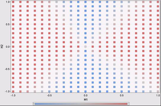
There are four regions in this scatter plot, defined essentially by the intersection of two lines. In fact, each hidden node is going to add another line on this chart, generating more regions. Within each region, one node is going to dominate. The boundaries are fuzzy. Sometimes this makes no difference, because the output on either side is the same; sometimes it does make a difference.

Note that this scatter plot assumes that the inputs can generate all combinations of values from the hidden units. However, in practice, this is not true, as shown on the previous scatter plot, which essentially covers only the lowest eights of this one.

With the contribution metric, we can then say that for different regions in the hidden unit space, different hidden units dominate the output. This is essentially saying that in different areas, we only need one hidden unit to determine the outcome of the network. Within each region, then, we can identify the variables used by the hidden units and say that they are determining the outcome of the network.

This idea leads to a way to start to understand standard multilayer perceptron neural networks, at least in the space of the hidden units. We can identify the regions where particular hidden units dominate the output of the network. Within each region, we can identify which variables dominate the output of that hidden unit. Perhaps this explains what is happening in the network, because the input ranges limit the outputs only to one region.

More likely, we have to return to the original inputs to determine which hidden unit dominates for a given combination of inputs. I've only just started thinking about this idea, so perhaps I'll follow up in a later post.

--gordon

Wednesday, January 14, 2009

Neural Network Training Methods

Scott asks . . .

Dear Ask a Data Miner,


I am using SPSS Clementine 12. The Neural Network node in Clementine allows users to choose from six different training methods for building neural network models:

• Quick. This method uses rules of thumb and characteristics of the data to choose an appropriate shape (topology) for the network.

• Dynamic. This method creates an initial topology but modifies the topology by adding and/or removing hidden units as training progresses.

• Multiple. This method creates several networks of different topologies (the exact number depends on the training data). These networks are then trained in a pseudo-parallel fashion. At the end of training, the model with the lowest RMS error is presented as the final model.

• Prune. This method starts with a large network and removes (prunes) the weakest units in the hidden and input layers as training proceeds. This method is usually slow, but it often yields better results than other methods.

• RBFN. The radial basis function network (RBFN) uses a technique similar to k-means clustering to partition the data based on values of the target field.

• Exhaustive prune. This method is related to the Prune method. It starts with a large network and prunes the weakest units in the hidden and input layers as training proceeds. With Exhaustive Prune, network training parameters are chosen to ensure a very thorough search of the space of possible models to find the best one. This method is usually the slowest, but it often yields the best results. Note that this method can take a long time to train, especially with large datasets.

Which is your preferred training method? How about for a lot of data - (a high number of cases AND a high number of input variables)? How about for a relatively small amount of data?


Scott,

Our general attitude with respect to fancy algorithms is that they provide incremental value. However, focusing on data usually provides more scope for improving results. This is particularly true of neural networks, because stable neural networks should have few inputs.

Before addressing your question, there are a few things that you should keep in mind when using neural networks:

(1) Standardize all the inputs (that is, subtract the average and divide by the standard deviation). This puts all numeric inputs into a particular range.

(2) Avoid categorical inputs! These should be replaced by appropriate numeric descriptors. Neural network tools, such as Clementine, handle categorical inputs using something called n-1 coding, which converts one variable into many flag variables, which, in turn, multiplies the number of weights in the network that need to be optimized.

(3) Avoid variables that are highly collinear. These cause "multidimensional ridges" in the space of neural network weights, which can confuse the training algorithms.

To return to your question in more detail. Try out lots of the different approaches to determine which is best! There is no rule that says that you have to decide on one approach initially and stick with it. To test the approaches use a separate partition of the data to see which works best.

For instance, the Quick method is probably very useful in getting results back in a reasonable amount of time. Examine the topology, though, to see if it makes sense (no hidden units or too many hidden units). Most of the others are all about adding or removing units, which can be valuable. However, always test the methods on a test set that is not used for training. The topology of the network may depend on the training set, so that provides an opportunity for overfitting.

These methods are focusing more on the topology than on the input parameters. If the prune method really does remove inputs, then that would be powerful functionality. For the methods that are comparing results, ensure that the results are compared on a validation set, separate from the test set used to calculate the weights. It can be easy to overfit neural networks, particularly as the number of weights increases.

A comment about the radial basis function approach. Make sure that Clementine is using normalized radial basis functions. Standard neural networks use an s-shaped function that starts low and goes high (or vice versa), meaning that the area under the curve is unbounded. RBFs start low, go high, and then go low again, meaning that the area under the curve is finite. Normalizing the RBFs ensures that the basis functions do not get too small.

My personal favorite approach to neural networks these days is to use principal components as inputs into the network. To work effectively, this requires some background in principal components to choose the right number as inputs into the network.

--gordon

Friday, January 9, 2009

Multidimensional Chi-Square, Expected Values, Independence, and All That, Part 3

This post is a continuation of my previous post on extending the chi-square test to more than two dimensions. The standard, two-dimensional chi-square test is explained in Chapter 3 of my book Data Analysis Using SQL and Excel.

This post explains how to implement a multidimensional chi-square test using SQL queries by calculating the chi-square value.

For the purpose of demonstrating this, I will use data derived from the companion web site for Data Analysis Using SQL and Excel. The following query produces data with three dimensions:

CREATE TABLE d3 as
..SELECT paymenttype, MONTH(orderdate) as mon,

.........LEFT(zipcode, 1) as zip1, COUNT(*) as cnt
..FROM orders
..GROUP BY 1, 2, 3


The table d3 simply contains three dimensions: the payment type, the month of the order date, and the first digit of the zip code. These dimensions are for illustration purposes.

The formula for the expected values is ratio of the following quantities:
  • The product of the sum of the counts along each dimension.
  • The total sum of the counts to the power of the number of dimensions minus 1.
These quantities can be calculated using basic SQL commands. The following query calculates all the expected values:

SELECT paymenttype, mon, zip1,
.......(dim1.cnt * dim2.cnt * dim3.cnt)/(dimall.cnt*dimall.cnt) as expected
FROM (SELECT paymenttype, SUM(cnt) as cnt

......FROM d3
......GROUP BY paymenttype) dim1 CROSS JOIN
.....(SELECT mon, SUM(cnt) as cnt
......FROM d3
......GROUP BY mon) dim2 CROSS JOIN
.....(SELECT zip1, SUM(cnt) as cnt
......FROM d3
......GROUP BY zip1) dim3 CROSS JOIN
.....(SELECT SUM(cnt) as cnt
......FROM d3) dimall


This query consists of four subqueries, one for each dimension and one for the total count. Each subquery calculates the appropriate sums along one (or no) dimensions. The results themselves are combined using CROSS JOIN, to ensure that the query returns results for all possible combinations of dimensions -- even those combinations that do not appear in the original data.
This latter point is an important point. Expected values are produced even for combinations not in the original data.

The previous query calculates the expected values. However, the chi-square calculation requires a bit more work. One approach is to join the above query to the original table, using a LEFT OUTER JOIN to ensure that no expected values are missing. The following approach uses simple JOINs and assumes that the original table has all combinations of the dimensions.

SELECT paymenttype, mon, zip1, expected, dev,
.......dev*dev/expected as chi_square
FROM (SELECT d3.paymenttype, d3.mon, d3.zip1,
.............(dim1.cnt * dim2.cnt * dim3.cnt)/(dimall.cnt*dimall.cnt) as expected,
.............d3.cnt-(dim1.cnt * dim2.cnt * dim3.cnt)/(dimall.cnt*dimall.cnt) as dev
......FROM d3 JOIN
.....(SELECT paymenttype, SUM(cnt) as cnt
......FROM d3
......GROUP BY paymenttype) dim1
.....ON d3.paymenttype = dim1.paymenttype JOIN
.....(SELECT mon, SUM(cnt) as cnt
......FROM d3
......GROUP BY mon) dim2
.....ON d3.mon = dim2.mon JOIN
.....(SELECT zip1, SUM(cnt) as cnt
......FROM d3
......GROUP BY zip1) dim3
.....ON d3.zip1 = dim3.zip1 CROSS JOIN
.....(SELECT SUM(cnt) as cnt
......FROM d3) dimall) a


This query joins in each of the subtotals along the dimensions, rather than using the CROSS JOIN to create all combinations. I suspect that in many databases, this approach has a more efficient execution plan (particularly if there are indexes on the dimensions). Note that the overall total is included using CROSS JOIN. I find this a convenient way to include constants in queries.

This query produces the chi-square value for each cell. The overall chi-square is the sum of these values. To interpret this value, we need the number of degrees of freedom, which is the product of the number of different values on each dimension minus one:

SELECT (COUNT(DISTINCT paymenttype) - 1)*
.......(COUNT(DISTINCT mon) - 1) *
.......(COUNT(DISTINCT zip1) - 1) as dof
FROM d3


Interpreting the value itself requires going outside the world of SQL, since there is no function that converts the chi-square value into a p-value within SQL. However, Excel does have such a function, CHIDIST().

It should be obvious how to extend these queries for larger numbers of dimensions. As discussed earlier, though, the chi-square test becomes less useful in multiple dimensions, especially since there need to be counts for all combinations of dimensions for best results (the heuristic rule is a minimum expected value of 5 in all cells). Nevertheless, doing the calculation in multiple dimensions is not difficult, and most of the work can be accomplished using basic SQL queries.

Sunday, December 28, 2008

Multidimensional Chi-Square, Expected Values, Independence, and All That, Part 2

This post is a continuation of my previous post on extending the chi-square test to more than two dimensions. The standard, two-dimensional chi-square test is explained in Chapter 3 of my book Data Analysis Using SQL and Excel.

This post explains what it means to extend chi-square to three dimensions and then to additional dimensions. The key idea in extending the chi-square test is calculating the expected values. The next post discusses how to do the calculations using SQL.

Expected Values
Assume that we have data that takes on a numeric value (typically a count) and has various dimensions, such as the following with dimensions A, B, and C:


A=0 B=0 C=0 1

A=0 B=0 C=1 2

A=0 B=1 C=0 3

A=0 B=1 C=1 4

A=1 B=0 C=0 5

A=1 B=0 C=1 6

A=1 B=1 C=0 7

A=1 B=1 C=1 8

The question that the chi-square test answers is: how expected or unexpected is this data?

What does this question even mean? Well, it means that we have to make some assumptions about the process generating the data -- some reasonable but simple assumptions -- and then measure how well this data matches those expected values.

One possible process is that each cell is independent of all the others. In this case, each cell would, on average, get the same count. To get a total count of 36, each cell would have, on average, a count of 4.5=36/8. Such a uniform distribution does not seem useful, because it does not take into account the structure of the data. "Structure" here means that the data has three dimensions.

The assumption used for chi-square takes this structure into account. It assumes that the process generates values independently along each dimension independently (rather than for each cell or for some arbitrary combination of dimension values). This assumption has some implications.

In the original data, there were ten things in the cells where A=0 (10 =1+2+3+4). The expected values have the same relationship -- the sum of the expected values where A=0 should also be 10. This is true for each of the values along each of the dimensions. Note, though, that it is not true for combinations of dimensions. So, the sum of the expected values where A=0 and B=0 is different (in general) for the expected values and the observed values.

There is a second implication. The distribution of values within each layer (or subcube) is the same, for all layers along the dimension. The following picture illustrates this in three dimensions:
The three shaded layers each have the property that the sums of the expected values are the same as the sums of the original data. In addition, the distributions are the same. This means that the highlighted cell in each layer has the same proportion for all the layers.

This latter condition is actually quite a strong condition, because it imposes structure between all the cells in different layers.

Calculating Expected Values
There is actually a simple formula for calulating the expected values. The calculation starts with the sums of the values of the cells in each possible layer. The above diagram shows three layers, but this is only along one dimension. There are an additional three layers (or subcubes) along each of the other two dimensions. (The choice of 3 here is totally arbitrary; there could be any number along each dimension.)

The expected value for a cell is the ratio of two numbers:
  • The product of the sum of the values along each dimension, divided by
  • The sum in the entire table raised to the power of the number of dimensions minus one.
Let us return to the initial data in a table, with three dimensions, A, B, and C and the counts 1 through 8. What is the expected value for cell A=0, B=0, C=0?

First, we need to calculate the sums for the three layers:
  • Asum is the cells where A=0: 10=1+2+3+4
  • Bsum is the cells where B=0: 14=1+2+5+6
  • Csum is the cells where C=0: 16=1+3+5+7
  • The product is 2,240.
Second, we need the sum for the whole table, which is 36. The number of dimensions is 3, so the expected value for the cell is 2,240/36^2 = 1.73.

The other cells have similar calculations. The following shows the table with the expected values:

A B C Value Expected

0 0 0 1 1.73

0 0 1 2 2.16

0 1 0 3 2.72

0 1 1 4 3.40

1 0 0 5 4.49

1 0 1 6 5.62

1 1 0 7 7.06

1 1 1 8 8.83

Here the expected values are pretty close to the original values. This calculation is available in the accompanying spreadsheet (chi-square-blog.xls).

The calculation also readily extends to more than two dimensions. However, the condition that the distrubutions are the same along parallel subcubes becomes more and more restrictive. In two dimensions, the expected values make intuitive sense. However, as the number of dimensions grows. they may not be as intuitive. Also, by combining values along dimensions, it is possible to reduce a multidimensional case to a two-dimensional case (although some information is lost in the process).

From Expected Values to Chi-Square
The chi-square calculation itself follows the same procedure as in the two dimensional case. The chi-square for each cell is the difference between the observed and expected value squared, divided by the expected value. The chi-square for the whole table is the sum of all the chi-square values.

The degrees of freedom is calculated in a way similar to the two-dimensional case. It is the product of the size of each dimension minus 1. So, in the 2X2X2 case, the degrees of freedom is 1. In the 3X3X3X3 case, it is 16 (2*2*2*2).

The next posting will explain how to calculate the expected value using SQL.


Sunday, December 14, 2008

Multidimensional Chi-Square, Expected Values, Independence, and All That, Part 1

When I speak about data mining, I often refer to the chi-square test as my favorite statistical test. I should be more specific, though, because I am really refering to the two-dimensional chi-square test. This is described in detail in Chapter 3 of Data Analysis Using SQL and Excel, a book that I do heartily recommend and is the starting point for many ideas that I write about here.

The chi-square test can be applied to more than two dimensions. However, the multi-dimensional chi-square behaves a bit differently from the two-dimensional case. This posting describes why. The next posting describes the calculation for the multi-dimensional chi-square. And the third posting in this series will describe how to do the calculations using SQL.

Fast Overview of Chi-Square

The Chi-Square test is used when we have two or more categorical variables and counts of how often each combination appears. For instance, the following is a simple set of data in two dimensions:


A=0 B=0 1

A=0 B=1 2

A=1 B=0 3

A=1 B=1 4

This data is summarized from ten observations. The first row says that in one data record, both A and B are zero. The last row says that in four of them, both A and B are 1. In practice, when using the chi-square test, we would want higher counts -- and we would get them, because these are counts of customers (say, responders and non-responders by gender).

In two dimensions, a contingency table is perhaps a better way of looking at the counts:


B=0 B=1

A=0 1 2

A=1 3 4

The chi-square test then asks the question . . . What is the probability that the counts are produced randomly, assuming that both the A and B are independent? To answer this question, we need the expected values assuming independence between A and B. The following table shows the expected values:


B=0 B=1

A=0 1.2 1.8

A=1 2.8 4.2

The expected values have two important properties. First, the row sums and column sums are the same as the original data. So, 1+2 = 1.2+1.8 = 3, and so on for both rows and both columns.

The second property is a little more subtle, but it says that the ratios of values in any column or any row are the same. So, 1.2/1.8 = 2.8/4.2 = 2/3, and so on. Of all possible 2X2 matrices, there is only one that has both these properties.

Now, the chi-square value for any cell is the square of the difference between the actual value and the expected value divided by the expected value. The chi-square for the matrix is the sum of the chi-square values for all the cells. These follow a chi-square distribution with one degree of freedom, and this gives us a enough information to determine whether the original counts are likely due to chance.

Calculating expected values is easy. The expected value for any cell is the product of the row sum times the column sum divided by the total in the table. For example, for A=0, B=0, the row sum is 3 and the column sum is 4. The product is 12, so the expected value is 1.2 = 12/10.

Treating Three Dimensions As Two Dimensions
Now, let's assume that the data has three dimensions rather than two. For example:

A=0 B=0 C=0 1

A=0 B=0 C=1 2

A=0 B=1 C=0 3

A=0 B=1 C=1 4

A=1 B=0 C=0 5

A=1 B=0 C=1 6

A=1 B=1 C=0 7

A=1 B=1 C=1 8

We can treat this as a contingency table in two dimensions:


C=0 C=1

A=0,B=0 1 5

A=0,B=1 2 6

A=1,B=0 3 7

A=1,B=1 4 8

And from this we can readily calculate the expected values:


C=0 C=1

A=0,B=0 1.67 4.33

A=0,B=1 2.22 5.78

A=1,B=0 2.78 7.22

A=1,B=1 3.33 8.67

The chi-square calculation follows as in the earlier case. The chi-square value for each cell is the actual count minus the expected value squared divided by the expected value. The chi-square value for the entire table is the sum of all the chi-square values for each cell.

The only difference here is that there are three degrees of freedom. This affects how to transform the chi-square value into a probability, but it does not affect the computation.

Which Are the Right Expected Values?
There are actually two other continency tables that we might produce from the original 2X2X2 data, depending on which dimension we use for the columns:


B=0 B=1

A=0,C=0 1 2

A=0,C=1 5 6

A=1,C=0 3 4

A=1,C=1 7 8

and


A=0 A=1

B=0,C=0 1 3

B=0,C=1 5 7

B=1,C=0 2 4

B=1,C=1 6 8

Following the same procedure, we can calcualte the expected values for each of these.


B=0 B=1

A=0,C=0 1.33 1.67

A=0,C=1 4.89 6.11

A=1,C=0 3.11 3.89

A=1,C=1 6.67 8.33

and


B=0 B=1

A=0,C=0 1.78 2.22

A=0,C=1 5.33 6.67

A=1,C=0 2.67 3.33

A=1,C=1 6.22 7.78

Oops!. The three sets of expected values are different from each other. Which do we use for the 2X2X2 chi-square calculation?

Why Independence is a Strong Condition
The answer is none of these. For the three dimensional data (and higher dimensional as well), the three contingency tables are almost always going to be different, because they mean different things. This is perhaps best viewed geometrically:


In this cube, the front face corresponds to C=0 and the hidden face to C=1. The A values go horizontally and the B's vertically. The three different contingency tables are formed by cutting the cube in half and then pasting the halves together. These tables are different.

For instance, the front face and the back facee are each 2X2 contingency tables. The expected values for these can be determined just from the information on each face. We do not need the information along the C dimension for this calculation. Worse, we cannot even use this information -- so there is no way to ensure that the sums along the "C" dimension add up to the same values in the original data and for the expected values.

The problem is that the sums along each dimension overspecify the problem. A given value has three adjacent values along three dimensions. However, only two of the dimensions are needed to calcualte an expected value, assuming independence along those two dimensions. The information along the third dimension cannot be incorporated into the calculation.

The reason? Independence is a very strong condition. Remember, it says not only that the sums are the same but also that the ratios within each row (or column or layer) are the same. Normally, we might think "independent" variables are providing as much flexibility as possible. However, that is not the case. In fact, the original counts are the only ones that meet the all the conditions of independence at the level of every row, colum, and level.

When I think of this situation, I think of a paradox related to the random distribution of stars. We actually perceive a random distribution as more ordered. Check out this site for an example. Similarly, our intuition is that independence among variables is a weak condition. In fact, it can be quite a strong condition.

The next posting will explain how expected values work in three and more dimensions. For now, it is worth explaining that converting a three-dimensional problem into two dimensions is often feasible and reasonable. This is particularly true when one of the dimensions is a "response" characteristic and the rest are input dimensions. However, such a 2X2 table is really an approximation.

Sunday, December 7, 2008

MapReduce and SQL Aggregations Using Grouping Sets

In an earlier post, I compared MapReduce functionality and and SQL functionality and made the claim that SQL required two passes through the data to calculate the number of customer starts and stops per month. (The data used for this is on the companion web site for my book Data Analysis Using SQL and Excel.)

Two of the comments on this post explained SQL syntax that achieves the goal more efficiently. In particular, the GROUPING SETS keyword, which is part of more recent SQL standards, is an efficient solution that allows SQL to do more of the types of processing made possibly by MapReduce. This functionality is available in SQL Server and Oracle. However, it is not yet available in MySQL.

The following SQL query answers the question at the top of this post using FULL OUTER JOIN (an alternative approach is to use UNION ALL):

SELECT m, ISNULL(numstarts, 0), ISNULL(numstops, 0)
FROM (SELECT MONTH(start_date) as m, COUNT(*) as numstarts
......FROM customer c
......GROUP BY MONTH(start_date)
.....) start FULL OUTER JOIN
.....(SELECT MONTH(stop_date) as m, COUNT(*) as numstops
......FROM customer c
......GROUP BY MONTH(stop_date)
.....) stop
.....ON start.m = stop.m


Although this query is effective, in most databases, it would require two passes through the data.

An alternative approach is to use GROUPING SETS. This keyword is a generalization and imporvement on CUBE functionality. The generalization is more powerful, because it gives more options for the query optimizaer.

GROUPING SET allows a query to return summaries along each grouping dimension, with or without generating the full set of rows that GROUP BY would create. The following query returns a separate row for each combination of start month and stop month:

SELECT MONTH(start_date) as start_month, MONTH(stop_date) as stop_month,
.......COUNT(*) as cnt

FROM customer
GROUP BY MONTH(start_date), MONTH(stop_date)

We could imagine row in the result set as being a cell in a big cross tabulation table, with the start months on the rows and the stop months on the columns. What we really want are the subtotals along the rows and the columns, not the full table. The following query accomplishes this:

SELECT COALESCE(start_month, stop_month) as month,
.......SUM(CASE WHEN stop_month IS NULL THEN cnt ELSE 0 END) as starts,
.......SUM(CASE WHEN start_month IS NULL THEN cnt ELSE 0 END) as stops
FROM (SELECT MONTH(start_date) as start_month, MONTH(stop_date) as stop_month,
.............COUNT(*) as cnt

......FROM customer
......GROUP BY GROUPING SETS (MONTH(start_date), MONTH(stop_date))
.....) a
WHERE start_month IS NOT NULL and stop_month IS NOT NULL

The subquery in this query aggregates the data in a special way. The outer query simply reformats the results to be similar to the earlier query.

The GROUPING SETS keyword specifies that summaries of the data should be returned, rather than the individual aggregated rows. This syntax specifies that groups are created for the start month and stop month. So, the inner query returns rows such as the following:


Start Month Stop Month Count

Jan NULL

Feb NULL

. . .


NULL Jan

NULL Feb

. . .


However, the cross-rows generated by the regular group by are not there. Half the rows have the subtotals for start months; for these the stop month column is NULL. Half have subtotals for the start month, where the stop month is NULL. This syntax does not generate the cross-tabulation data, but it does keep the row and column subtotals.

The GROUPING SETS keyword generates the subtotals for the start months and stop months. In general, the query optimizer will generate the various grouping aggregations in one pass over the data. This makes the syntax and performance much more similar to the MapReduce approach.

However, Map Reduce still has two practical advantages. The first are the limits on the number of groups in the grouping sets. In SQL Server, only 32 groups are allowed. This example only used two. But more complex examples might breach this limit.

The other issue is the flexibility of the SQL language. One of the major uses of MapReduce is to process text. In this case, we would be extracting many potential features from the text, and then doing subsequent aggregations. SQL extensions can be used to create the features. However, such features quickly exceed the limits on the number of groups, limiting the feasbility of this approach.

One warning about the syntax. The parentheses in the GROUPING SETS statement are important. The following version would actually be the equivalant of the regular GROUP BY:

GROUP BY GROUPING SETS ((MONTH(start_date), MONTH(stop_date))

This is because the keyword takes a list of things being grouped. So, in the original version (one set of parentheses), there are two elements in the list -- the totals for start month and stop month. In the second version, there is one element in the list, so the cross-tabulation between start month and stop month are generated instead. This cross-product is the equivalent of the regular group by.

And my final comment is about the CUBE keyword which seems to provide the same functionality. This keyword generates all the regular aggregation rows in the table, along with additional subtotals for all combinations of dimensions. In the above example, it would generate the cross-tab table of start month and end month, as well as the summary rows.

The problem with the CUBE keyword is that the original query does not need all the aggregation rows, so generating them is a waste of time. Whether this is faster or slower than the original version of the query with the FULL OUTER JOIN depends on the environment. However, it could be quite inefficient. In addition, the query optimizer would have a very difficult time determining that these rows are not needed.

I do not feel that the CUBE keyword provides functionality similar to MapReduce. However, the GROUPING SETS keyword does provide functionality similar to MapReduce, because it produces summaries along dimensions without requiring multiple passes through the data and without generates large cross-tabulations. In addition, the GROUPING SETS keyword allows the query optimizer to choose from a variety of algorithms for executing the query, taking advantage of large computer systems using SQL syntax instead of programming.

Saturday, November 22, 2008

Accounting for Variation in Variables Between- and Within- Groups

Recently, I had occasion to learn about fixed effects and random effects models (as well as the larger subject known as hierchical or multi-level modeling) in the context of analyzing patient longitudinal data. This posting is about one particular question that interested me in this work: For a given variable, how much of the variation in the values is due to within-group effects versus how much is due to between-group effects.

For the longitudinal patient data, the groups were repeated measurements on the same individual. For this discussion though, I'll ask questions such as "How much of the variation in zip code population is due to variations within a state versus variations between states?" I leave it to the reader to generalize this to other areas.

The data used is the census data on the companion web site to my book Data Analysis Using SQL and Excel. Also, the spirit of understanding this problem using SQL and charts also comes from the book.

This posting starts with what I consider to be a simple approach to answering the question. It is then going to show how to calculate the result in SQL. Finally, I'm going to discuss the solution Paul Allison prsents in his book, and what I think are its drawbacks.

What Does Within- Versus Between- Group Variation Even Mean?

I first saw this issue in Paul Allison's book Fixed Effects Regression Methods for Longitudinal Data Analysis Using SAS, which became something of a bible on the subject while I was trying to do exactly what the title suggested (and I highly, highly recommend the book for people tackling such problems). On page 40, he has the tantalizing observation "The degree to which the coefficients change under fixed effects estimation as compared with conventional OLS appears to be related to the degree of between- versus within-school variation on the predictor variables."

This suggests that within-group versus between-group variation can be quite interesting. And not just for predictor variables. And not just for schools.

Let's return to the question of how much variation in a zip code's population is due to the state where the zip code resides, and how much is due to variation within the state. To answer this question analytically, we need to phrase it in terms of measures. Or, for this question, how well does the average population of zip codes in a state do at predicting the population of a zip code in the state?

In answering this question, we are replacing the values of individual zip codes with the averaged values at the group (i.e. state) level. By eliminating within group variation, the answer will tell us about between-group variation. We can assume that remaining variation is due to within group variation.

Using Variation to Answer the Question
Variance quantifies the idea that each point -- say the population of each zip code -- differs from the overall average. The following chart shows a scatter plot of all the zip codes with the overall average (by the way, the zip codes here are ordered by the average zip code population in each state).

The grey line is the overall average. We can see that the populations for zip codes are all over the place; there is not much of a pattern. As for the variance calculation, imagine a bar from each point to the horizontal line. The variance is just the sum of the squared distances from each point to the average. This sum is the total variance.

What we want to do is to decompose this variance into two parts, a within-group part and a between-groups part. I think the second is easier to explain, so let me take that route. To eliminate within group variation, we just substitute the average value in the group for the actual value. This means that we are looking at the following chart instead:

The blue slanted line is the average in each state. We see visually that much of the variation has gone away, so we would expect most variation to be within a state rather than between states.

The idea is that we measure the variation using the first approach and we measure the variation using the second approach. The ratio of these two values tells us how much of the variation is due to between-groups changes. The remaining variation must be due to within-group variation. The next section shows the calculation in SQL.

Doing the Calculation in SQL
Expressing this in SQL is simply a matter of calculating the various sums of squared differences. The following SQL statement calculates both the within-group and between-group variation:

SELECT (SUM((g.grpval - a.allval)*(g.grpval - a.allval))/
........SUM((d.val - a.allval)*(d.val - a.allval))
.......) as between_grp,
.......(SUM((d.val - g.grpval)*(d.val - g.grpval)) /
........SUM((d.val - a.allval)*(d.val - a.allval))
.......) as within_grp
FROM (SELECT state as grp, population as val
......FROM censusfiles.zipcensus zc
.....) d JOIN
.....(SELECT state as grp, AVG(population) as grpval
......FROM censusfiles.zipcensus zc
......GROUP BY 1
.....) g
.....ON d.grp = g.grp CROSS JOIN
.....(SELECT AVG(population) as allval
......FROM censusfiles.zipcensus zc
.....) a


First note that I snuck in the calculation for both within- and between- group variation, even though I only explained the latter.

The from clause has three subqueries. Each of these calculates one level of the summary -- the value for each zip, the value for each state, and the overall value. All the queries rename the fields to some canonical name. This means that we can change the field we are looking at and not have to modify the outer SELECT clause -- a convenience that reduces the chance of error.

In addition, the structure of the query makes it fairly easy to use a calculated field rather than just a column. The same calculation would need to be used for all the fields.

And finally, if you are using a database that supports window functions -- such as SQL Server or Oracle -- then the statement for the query can be much simpler.

Discussion of Results
The results for population say that 12.6% of the variation in zip code population is between states and 87.4% is within states. This confirms the observation that using the state averages removed much of the variation in the data. In fact, for most of the census variables, most of the variation is within states.

There are definitely exceptions to this. One interesting exception is latitutude (which specifies how far north or south something is). The within-state variation for latitude is 5.5% and the between-state is 94.5% -- quite a reversal. The scatter plot for latitude looks quite different from the scatter plot for population:


In this scatter plot, we see that the zip code values in light blue all fall quite close to the average for the state -- and in many cases, quite far from the county average. This makes a lot of sense geographically, and we see that fact both in the scatter plot and in the within-group and between-group variation.

Statistical Approach

Finally, it is instructive to go back to Paul Allison's book and look at his method for doing the same calculation in SAS. Although I am going to show SAS code, understanding the idea does not require knowing SAS -- on the other hand, it might require an advanced degree in statistics.

His proposed method is to run the following statement:

proc glm data=censusfiles.zipcensus;
....absorb state;
....model population=;
run;


And, as he states, "the proportion of variation that is between [states] is just the R-squared from this regression."

This statement is called a procedure (or proc for short) in SAS. It is calling the procedure called "glm", which stands for generalized linear model. Okay, now you can see where the advanced statistics might help.

The "absorb" option creates a separate indicator for each state. However, for performance reasons, "abosrb" does not report their values. (There are other ways to do a similar calculation that do report the individual values, but they take longer to run.)

The "model" part of the statement says what model to build. In this case, the model is predicting population, but not using any input variables. Actually, it is using input variables -- the indicators for each state created on the "absorb" line.

Doing the calculation using this method has several shortcomings. First, the results are put into a text file. They cannot easily be captured into a database table or into Excel. You have to search through lots of text to find the right metric. And, you can only run one variable at a time. In the SQL method, adding more variables is just adding more calculations on the SELECT list. And the SQL method seems easier to generalize, which I might bring up in another posting.

However, the biggest shortcoming is conceptual. Understanding variation between-groups and within-groups is not some fancy statistical procedure that requires in-depth knowledge to use correctly. Rather, it is a fundamental way of understanding data, and easy to calculate using tools, such as databases, that can readily manipulate data. The method in SQL should not only perform better on large data sets (particularly using a parallel database), but it requires much less effort to understand.