Sunday, December 28, 2008

Multidimensional Chi-Square, Expected Values, Independence, and All That, Part 2

This post is a continuation of my previous post on extending the chi-square test to more than two dimensions. The standard, two-dimensional chi-square test is explained in Chapter 3 of my book Data Analysis Using SQL and Excel.

This post explains what it means to extend chi-square to three dimensions and then to additional dimensions. The key idea in extending the chi-square test is calculating the expected values. The next post discusses how to do the calculations using SQL.

Expected Values
Assume that we have data that takes on a numeric value (typically a count) and has various dimensions, such as the following with dimensions A, B, and C:


A=0 B=0 C=0 1

A=0 B=0 C=1 2

A=0 B=1 C=0 3

A=0 B=1 C=1 4

A=1 B=0 C=0 5

A=1 B=0 C=1 6

A=1 B=1 C=0 7

A=1 B=1 C=1 8

The question that the chi-square test answers is: how expected or unexpected is this data?

What does this question even mean? Well, it means that we have to make some assumptions about the process generating the data -- some reasonable but simple assumptions -- and then measure how well this data matches those expected values.

One possible process is that each cell is independent of all the others. In this case, each cell would, on average, get the same count. To get a total count of 36, each cell would have, on average, a count of 4.5=36/8. Such a uniform distribution does not seem useful, because it does not take into account the structure of the data. "Structure" here means that the data has three dimensions.

The assumption used for chi-square takes this structure into account. It assumes that the process generates values independently along each dimension independently (rather than for each cell or for some arbitrary combination of dimension values). This assumption has some implications.

In the original data, there were ten things in the cells where A=0 (10 =1+2+3+4). The expected values have the same relationship -- the sum of the expected values where A=0 should also be 10. This is true for each of the values along each of the dimensions. Note, though, that it is not true for combinations of dimensions. So, the sum of the expected values where A=0 and B=0 is different (in general) for the expected values and the observed values.

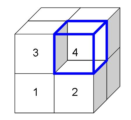
There is a second implication. The distribution of values within each layer (or subcube) is the same, for all layers along the dimension. The following picture illustrates this in three dimensions:
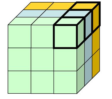
The three shaded layers each have the property that the sums of the expected values are the same as the sums of the original data. In addition, the distributions are the same. This means that the highlighted cell in each layer has the same proportion for all the layers.

This latter condition is actually quite a strong condition, because it imposes structure between all the cells in different layers.

Calculating Expected Values
There is actually a simple formula for calulating the expected values. The calculation starts with the sums of the values of the cells in each possible layer. The above diagram shows three layers, but this is only along one dimension. There are an additional three layers (or subcubes) along each of the other two dimensions. (The choice of 3 here is totally arbitrary; there could be any number along each dimension.)

The expected value for a cell is the ratio of two numbers:
  • The product of the sum of the values along each dimension, divided by
  • The sum in the entire table raised to the power of the number of dimensions minus one.
Let us return to the initial data in a table, with three dimensions, A, B, and C and the counts 1 through 8. What is the expected value for cell A=0, B=0, C=0?

First, we need to calculate the sums for the three layers:
  • Asum is the cells where A=0: 10=1+2+3+4
  • Bsum is the cells where B=0: 14=1+2+5+6
  • Csum is the cells where C=0: 16=1+3+5+7
  • The product is 2,240.
Second, we need the sum for the whole table, which is 36. The number of dimensions is 3, so the expected value for the cell is 2,240/36^2 = 1.73.

The other cells have similar calculations. The following shows the table with the expected values:

A B C Value Expected

0 0 0 1 1.73

0 0 1 2 2.16

0 1 0 3 2.72

0 1 1 4 3.40

1 0 0 5 4.49

1 0 1 6 5.62

1 1 0 7 7.06

1 1 1 8 8.83

Here the expected values are pretty close to the original values. This calculation is available in the accompanying spreadsheet (chi-square-blog.xls).

The calculation also readily extends to more than two dimensions. However, the condition that the distrubutions are the same along parallel subcubes becomes more and more restrictive. In two dimensions, the expected values make intuitive sense. However, as the number of dimensions grows. they may not be as intuitive. Also, by combining values along dimensions, it is possible to reduce a multidimensional case to a two-dimensional case (although some information is lost in the process).

From Expected Values to Chi-Square
The chi-square calculation itself follows the same procedure as in the two dimensional case. The chi-square for each cell is the difference between the observed and expected value squared, divided by the expected value. The chi-square for the whole table is the sum of all the chi-square values.

The degrees of freedom is calculated in a way similar to the two-dimensional case. It is the product of the size of each dimension minus 1. So, in the 2X2X2 case, the degrees of freedom is 1. In the 3X3X3X3 case, it is 16 (2*2*2*2).

The next posting will explain how to calculate the expected value using SQL.


Sunday, December 14, 2008

Multidimensional Chi-Square, Expected Values, Independence, and All That, Part 1

When I speak about data mining, I often refer to the chi-square test as my favorite statistical test. I should be more specific, though, because I am really refering to the two-dimensional chi-square test. This is described in detail in Chapter 3 of Data Analysis Using SQL and Excel, a book that I do heartily recommend and is the starting point for many ideas that I write about here.

The chi-square test can be applied to more than two dimensions. However, the multi-dimensional chi-square behaves a bit differently from the two-dimensional case. This posting describes why. The next posting describes the calculation for the multi-dimensional chi-square. And the third posting in this series will describe how to do the calculations using SQL.

Fast Overview of Chi-Square

The Chi-Square test is used when we have two or more categorical variables and counts of how often each combination appears. For instance, the following is a simple set of data in two dimensions:


A=0 B=0 1

A=0 B=1 2

A=1 B=0 3

A=1 B=1 4

This data is summarized from ten observations. The first row says that in one data record, both A and B are zero. The last row says that in four of them, both A and B are 1. In practice, when using the chi-square test, we would want higher counts -- and we would get them, because these are counts of customers (say, responders and non-responders by gender).

In two dimensions, a contingency table is perhaps a better way of looking at the counts:


B=0 B=1

A=0 1 2

A=1 3 4

The chi-square test then asks the question . . . What is the probability that the counts are produced randomly, assuming that both the A and B are independent? To answer this question, we need the expected values assuming independence between A and B. The following table shows the expected values:


B=0 B=1

A=0 1.2 1.8

A=1 2.8 4.2

The expected values have two important properties. First, the row sums and column sums are the same as the original data. So, 1+2 = 1.2+1.8 = 3, and so on for both rows and both columns.

The second property is a little more subtle, but it says that the ratios of values in any column or any row are the same. So, 1.2/1.8 = 2.8/4.2 = 2/3, and so on. Of all possible 2X2 matrices, there is only one that has both these properties.

Now, the chi-square value for any cell is the square of the difference between the actual value and the expected value divided by the expected value. The chi-square for the matrix is the sum of the chi-square values for all the cells. These follow a chi-square distribution with one degree of freedom, and this gives us a enough information to determine whether the original counts are likely due to chance.

Calculating expected values is easy. The expected value for any cell is the product of the row sum times the column sum divided by the total in the table. For example, for A=0, B=0, the row sum is 3 and the column sum is 4. The product is 12, so the expected value is 1.2 = 12/10.

Treating Three Dimensions As Two Dimensions
Now, let's assume that the data has three dimensions rather than two. For example:

A=0 B=0 C=0 1

A=0 B=0 C=1 2

A=0 B=1 C=0 3

A=0 B=1 C=1 4

A=1 B=0 C=0 5

A=1 B=0 C=1 6

A=1 B=1 C=0 7

A=1 B=1 C=1 8

We can treat this as a contingency table in two dimensions:


C=0 C=1

A=0,B=0 1 5

A=0,B=1 2 6

A=1,B=0 3 7

A=1,B=1 4 8

And from this we can readily calculate the expected values:


C=0 C=1

A=0,B=0 1.67 4.33

A=0,B=1 2.22 5.78

A=1,B=0 2.78 7.22

A=1,B=1 3.33 8.67

The chi-square calculation follows as in the earlier case. The chi-square value for each cell is the actual count minus the expected value squared divided by the expected value. The chi-square value for the entire table is the sum of all the chi-square values for each cell.

The only difference here is that there are three degrees of freedom. This affects how to transform the chi-square value into a probability, but it does not affect the computation.

Which Are the Right Expected Values?
There are actually two other continency tables that we might produce from the original 2X2X2 data, depending on which dimension we use for the columns:


B=0 B=1

A=0,C=0 1 2

A=0,C=1 5 6

A=1,C=0 3 4

A=1,C=1 7 8

and


A=0 A=1

B=0,C=0 1 3

B=0,C=1 5 7

B=1,C=0 2 4

B=1,C=1 6 8

Following the same procedure, we can calcualte the expected values for each of these.


B=0 B=1

A=0,C=0 1.33 1.67

A=0,C=1 4.89 6.11

A=1,C=0 3.11 3.89

A=1,C=1 6.67 8.33

and


B=0 B=1

A=0,C=0 1.78 2.22

A=0,C=1 5.33 6.67

A=1,C=0 2.67 3.33

A=1,C=1 6.22 7.78

Oops!. The three sets of expected values are different from each other. Which do we use for the 2X2X2 chi-square calculation?

Why Independence is a Strong Condition
The answer is none of these. For the three dimensional data (and higher dimensional as well), the three contingency tables are almost always going to be different, because they mean different things. This is perhaps best viewed geometrically:


In this cube, the front face corresponds to C=0 and the hidden face to C=1. The A values go horizontally and the B's vertically. The three different contingency tables are formed by cutting the cube in half and then pasting the halves together. These tables are different.

For instance, the front face and the back facee are each 2X2 contingency tables. The expected values for these can be determined just from the information on each face. We do not need the information along the C dimension for this calculation. Worse, we cannot even use this information -- so there is no way to ensure that the sums along the "C" dimension add up to the same values in the original data and for the expected values.

The problem is that the sums along each dimension overspecify the problem. A given value has three adjacent values along three dimensions. However, only two of the dimensions are needed to calcualte an expected value, assuming independence along those two dimensions. The information along the third dimension cannot be incorporated into the calculation.

The reason? Independence is a very strong condition. Remember, it says not only that the sums are the same but also that the ratios within each row (or column or layer) are the same. Normally, we might think "independent" variables are providing as much flexibility as possible. However, that is not the case. In fact, the original counts are the only ones that meet the all the conditions of independence at the level of every row, colum, and level.

When I think of this situation, I think of a paradox related to the random distribution of stars. We actually perceive a random distribution as more ordered. Check out this site for an example. Similarly, our intuition is that independence among variables is a weak condition. In fact, it can be quite a strong condition.

The next posting will explain how expected values work in three and more dimensions. For now, it is worth explaining that converting a three-dimensional problem into two dimensions is often feasible and reasonable. This is particularly true when one of the dimensions is a "response" characteristic and the rest are input dimensions. However, such a 2X2 table is really an approximation.

Sunday, December 7, 2008

MapReduce and SQL Aggregations Using Grouping Sets

In an earlier post, I compared MapReduce functionality and and SQL functionality and made the claim that SQL required two passes through the data to calculate the number of customer starts and stops per month. (The data used for this is on the companion web site for my book Data Analysis Using SQL and Excel.)

Two of the comments on this post explained SQL syntax that achieves the goal more efficiently. In particular, the GROUPING SETS keyword, which is part of more recent SQL standards, is an efficient solution that allows SQL to do more of the types of processing made possibly by MapReduce. This functionality is available in SQL Server and Oracle. However, it is not yet available in MySQL.

The following SQL query answers the question at the top of this post using FULL OUTER JOIN (an alternative approach is to use UNION ALL):

SELECT m, ISNULL(numstarts, 0), ISNULL(numstops, 0)
FROM (SELECT MONTH(start_date) as m, COUNT(*) as numstarts
......FROM customer c
......GROUP BY MONTH(start_date)
.....) start FULL OUTER JOIN
.....(SELECT MONTH(stop_date) as m, COUNT(*) as numstops
......FROM customer c
......GROUP BY MONTH(stop_date)
.....) stop
.....ON start.m = stop.m


Although this query is effective, in most databases, it would require two passes through the data.

An alternative approach is to use GROUPING SETS. This keyword is a generalization and imporvement on CUBE functionality. The generalization is more powerful, because it gives more options for the query optimizaer.

GROUPING SET allows a query to return summaries along each grouping dimension, with or without generating the full set of rows that GROUP BY would create. The following query returns a separate row for each combination of start month and stop month:

SELECT MONTH(start_date) as start_month, MONTH(stop_date) as stop_month,
.......COUNT(*) as cnt

FROM customer
GROUP BY MONTH(start_date), MONTH(stop_date)

We could imagine row in the result set as being a cell in a big cross tabulation table, with the start months on the rows and the stop months on the columns. What we really want are the subtotals along the rows and the columns, not the full table. The following query accomplishes this:

SELECT COALESCE(start_month, stop_month) as month,
.......SUM(CASE WHEN stop_month IS NULL THEN cnt ELSE 0 END) as starts,
.......SUM(CASE WHEN start_month IS NULL THEN cnt ELSE 0 END) as stops
FROM (SELECT MONTH(start_date) as start_month, MONTH(stop_date) as stop_month,
.............COUNT(*) as cnt

......FROM customer
......GROUP BY GROUPING SETS (MONTH(start_date), MONTH(stop_date))
.....) a
WHERE start_month IS NOT NULL and stop_month IS NOT NULL

The subquery in this query aggregates the data in a special way. The outer query simply reformats the results to be similar to the earlier query.

The GROUPING SETS keyword specifies that summaries of the data should be returned, rather than the individual aggregated rows. This syntax specifies that groups are created for the start month and stop month. So, the inner query returns rows such as the following:


Start Month Stop Month Count

Jan NULL

Feb NULL

. . .


NULL Jan

NULL Feb

. . .


However, the cross-rows generated by the regular group by are not there. Half the rows have the subtotals for start months; for these the stop month column is NULL. Half have subtotals for the start month, where the stop month is NULL. This syntax does not generate the cross-tabulation data, but it does keep the row and column subtotals.

The GROUPING SETS keyword generates the subtotals for the start months and stop months. In general, the query optimizer will generate the various grouping aggregations in one pass over the data. This makes the syntax and performance much more similar to the MapReduce approach.

However, Map Reduce still has two practical advantages. The first are the limits on the number of groups in the grouping sets. In SQL Server, only 32 groups are allowed. This example only used two. But more complex examples might breach this limit.

The other issue is the flexibility of the SQL language. One of the major uses of MapReduce is to process text. In this case, we would be extracting many potential features from the text, and then doing subsequent aggregations. SQL extensions can be used to create the features. However, such features quickly exceed the limits on the number of groups, limiting the feasbility of this approach.

One warning about the syntax. The parentheses in the GROUPING SETS statement are important. The following version would actually be the equivalant of the regular GROUP BY:

GROUP BY GROUPING SETS ((MONTH(start_date), MONTH(stop_date))

This is because the keyword takes a list of things being grouped. So, in the original version (one set of parentheses), there are two elements in the list -- the totals for start month and stop month. In the second version, there is one element in the list, so the cross-tabulation between start month and stop month are generated instead. This cross-product is the equivalent of the regular group by.

And my final comment is about the CUBE keyword which seems to provide the same functionality. This keyword generates all the regular aggregation rows in the table, along with additional subtotals for all combinations of dimensions. In the above example, it would generate the cross-tab table of start month and end month, as well as the summary rows.

The problem with the CUBE keyword is that the original query does not need all the aggregation rows, so generating them is a waste of time. Whether this is faster or slower than the original version of the query with the FULL OUTER JOIN depends on the environment. However, it could be quite inefficient. In addition, the query optimizer would have a very difficult time determining that these rows are not needed.

I do not feel that the CUBE keyword provides functionality similar to MapReduce. However, the GROUPING SETS keyword does provide functionality similar to MapReduce, because it produces summaries along dimensions without requiring multiple passes through the data and without generates large cross-tabulations. In addition, the GROUPING SETS keyword allows the query optimizer to choose from a variety of algorithms for executing the query, taking advantage of large computer systems using SQL syntax instead of programming.

Saturday, November 22, 2008

Accounting for Variation in Variables Between- and Within- Groups

Recently, I had occasion to learn about fixed effects and random effects models (as well as the larger subject known as hierchical or multi-level modeling) in the context of analyzing patient longitudinal data. This posting is about one particular question that interested me in this work: For a given variable, how much of the variation in the values is due to within-group effects versus how much is due to between-group effects.

For the longitudinal patient data, the groups were repeated measurements on the same individual. For this discussion though, I'll ask questions such as "How much of the variation in zip code population is due to variations within a state versus variations between states?" I leave it to the reader to generalize this to other areas.

The data used is the census data on the companion web site to my book Data Analysis Using SQL and Excel. Also, the spirit of understanding this problem using SQL and charts also comes from the book.

This posting starts with what I consider to be a simple approach to answering the question. It is then going to show how to calculate the result in SQL. Finally, I'm going to discuss the solution Paul Allison prsents in his book, and what I think are its drawbacks.

What Does Within- Versus Between- Group Variation Even Mean?

I first saw this issue in Paul Allison's book Fixed Effects Regression Methods for Longitudinal Data Analysis Using SAS, which became something of a bible on the subject while I was trying to do exactly what the title suggested (and I highly, highly recommend the book for people tackling such problems). On page 40, he has the tantalizing observation "The degree to which the coefficients change under fixed effects estimation as compared with conventional OLS appears to be related to the degree of between- versus within-school variation on the predictor variables."

This suggests that within-group versus between-group variation can be quite interesting. And not just for predictor variables. And not just for schools.

Let's return to the question of how much variation in a zip code's population is due to the state where the zip code resides, and how much is due to variation within the state. To answer this question analytically, we need to phrase it in terms of measures. Or, for this question, how well does the average population of zip codes in a state do at predicting the population of a zip code in the state?

In answering this question, we are replacing the values of individual zip codes with the averaged values at the group (i.e. state) level. By eliminating within group variation, the answer will tell us about between-group variation. We can assume that remaining variation is due to within group variation.

Using Variation to Answer the Question
Variance quantifies the idea that each point -- say the population of each zip code -- differs from the overall average. The following chart shows a scatter plot of all the zip codes with the overall average (by the way, the zip codes here are ordered by the average zip code population in each state).

The grey line is the overall average. We can see that the populations for zip codes are all over the place; there is not much of a pattern. As for the variance calculation, imagine a bar from each point to the horizontal line. The variance is just the sum of the squared distances from each point to the average. This sum is the total variance.

What we want to do is to decompose this variance into two parts, a within-group part and a between-groups part. I think the second is easier to explain, so let me take that route. To eliminate within group variation, we just substitute the average value in the group for the actual value. This means that we are looking at the following chart instead:

The blue slanted line is the average in each state. We see visually that much of the variation has gone away, so we would expect most variation to be within a state rather than between states.

The idea is that we measure the variation using the first approach and we measure the variation using the second approach. The ratio of these two values tells us how much of the variation is due to between-groups changes. The remaining variation must be due to within-group variation. The next section shows the calculation in SQL.

Doing the Calculation in SQL
Expressing this in SQL is simply a matter of calculating the various sums of squared differences. The following SQL statement calculates both the within-group and between-group variation:

SELECT (SUM((g.grpval - a.allval)*(g.grpval - a.allval))/
........SUM((d.val - a.allval)*(d.val - a.allval))
.......) as between_grp,
.......(SUM((d.val - g.grpval)*(d.val - g.grpval)) /
........SUM((d.val - a.allval)*(d.val - a.allval))
.......) as within_grp
FROM (SELECT state as grp, population as val
......FROM censusfiles.zipcensus zc
.....) d JOIN
.....(SELECT state as grp, AVG(population) as grpval
......FROM censusfiles.zipcensus zc
......GROUP BY 1
.....) g
.....ON d.grp = g.grp CROSS JOIN
.....(SELECT AVG(population) as allval
......FROM censusfiles.zipcensus zc
.....) a


First note that I snuck in the calculation for both within- and between- group variation, even though I only explained the latter.

The from clause has three subqueries. Each of these calculates one level of the summary -- the value for each zip, the value for each state, and the overall value. All the queries rename the fields to some canonical name. This means that we can change the field we are looking at and not have to modify the outer SELECT clause -- a convenience that reduces the chance of error.

In addition, the structure of the query makes it fairly easy to use a calculated field rather than just a column. The same calculation would need to be used for all the fields.

And finally, if you are using a database that supports window functions -- such as SQL Server or Oracle -- then the statement for the query can be much simpler.

Discussion of Results
The results for population say that 12.6% of the variation in zip code population is between states and 87.4% is within states. This confirms the observation that using the state averages removed much of the variation in the data. In fact, for most of the census variables, most of the variation is within states.

There are definitely exceptions to this. One interesting exception is latitutude (which specifies how far north or south something is). The within-state variation for latitude is 5.5% and the between-state is 94.5% -- quite a reversal. The scatter plot for latitude looks quite different from the scatter plot for population:


In this scatter plot, we see that the zip code values in light blue all fall quite close to the average for the state -- and in many cases, quite far from the county average. This makes a lot of sense geographically, and we see that fact both in the scatter plot and in the within-group and between-group variation.

Statistical Approach

Finally, it is instructive to go back to Paul Allison's book and look at his method for doing the same calculation in SAS. Although I am going to show SAS code, understanding the idea does not require knowing SAS -- on the other hand, it might require an advanced degree in statistics.

His proposed method is to run the following statement:

proc glm data=censusfiles.zipcensus;
....absorb state;
....model population=;
run;


And, as he states, "the proportion of variation that is between [states] is just the R-squared from this regression."

This statement is called a procedure (or proc for short) in SAS. It is calling the procedure called "glm", which stands for generalized linear model. Okay, now you can see where the advanced statistics might help.

The "absorb" option creates a separate indicator for each state. However, for performance reasons, "abosrb" does not report their values. (There are other ways to do a similar calculation that do report the individual values, but they take longer to run.)

The "model" part of the statement says what model to build. In this case, the model is predicting population, but not using any input variables. Actually, it is using input variables -- the indicators for each state created on the "absorb" line.

Doing the calculation using this method has several shortcomings. First, the results are put into a text file. They cannot easily be captured into a database table or into Excel. You have to search through lots of text to find the right metric. And, you can only run one variable at a time. In the SQL method, adding more variables is just adding more calculations on the SELECT list. And the SQL method seems easier to generalize, which I might bring up in another posting.

However, the biggest shortcoming is conceptual. Understanding variation between-groups and within-groups is not some fancy statistical procedure that requires in-depth knowledge to use correctly. Rather, it is a fundamental way of understanding data, and easy to calculate using tools, such as databases, that can readily manipulate data. The method in SQL should not only perform better on large data sets (particularly using a parallel database), but it requires much less effort to understand.

Wednesday, November 12, 2008

Creating Accurate Venn Diagrams in Excel, Part 2

This post is an extention of an earlier post. If you are interested in this, you may be interested in my book Data Analysis Using SQL and Excel.

This post is about creating a Venn diagram using two circles. A Venn diagram is used to explain data such as:
  • Group A has 81 members.
  • Group B has 25 members.
  • There are 15 members in both groups A and B.
The above data is shown as a Venn diagram as:


Unfortunately, creating a simple Venn diagram is not built into Excel, so we need to create one manually. This is another example that shows off the power of Excel charting to do unexpected things.

Specifically, creating the above diagram requires the following capabilities:
  1. We need to draw a circle with a given radius and a center at any point.
  2. We need to fill in the circle with appropriate shading.
  3. We need to calculate the appropriate centers and radii given data.
  4. We need to annotate the chart with text.
Each of these are explained below. All of the charts and formulas are available in the accompanying Excel file.
Drawing a Circle Using Scatter Plots

To create the circle, we start with a bunch of points, that when connected with smoothed lines will look like a circle. To get the points, we'll create a table with values from 0 to 360 degrees, and borrow some formulas from trigonometry. These say:

  • X = radius*sin() + X-offset
  • Y = radius*cos() + Y-offset
The only slight complication is that the functions SIN() and COS() take their arguments in something called radian rather than degrees. This makes the formula look like:
  • X = radius*sin(*2*PI/360) + X-offset
  • Y = radius*cos(*2*PI/360) + Y-offset
The following shows the formulas:


Degrees X-Value Y-Value

0 =$E$4+SIN(2*PI()*B11/360)*$D$4 =$F$4+COS(2*PI()*B11/360)*$D$4

5 =$E$4+SIN(2*PI()*B12/360)*$D$4 =$F$4+COS(2*PI()*B12/360)*$D$4

10 =$E$4+SIN(2*PI()*B13/360)*$D$4 =$F$4+COS(2*PI()*B13/360)*$D$4

15 =$E$4+SIN(2*PI()*B14/360)*$D$4 =$F$4+COS(2*PI()*B14/360)*$D$4

20 =$E$4+SIN(2*PI()*B15/360)*$D$4 =$F$4+COS(2*PI()*B15/360)*$D$4

25 =$E$4+SIN(2*PI()*B16/360)*$D$4 =$F$4+COS(2*PI()*B16/360)*$D$4

30 =$E$4+SIN(2*PI()*B17/360)*$D$4 =$F$4+COS(2*PI()*B17/360)*$D$4

Where E4 contains the X-offset; F4 contains the Y-offset; and D4 contains the radius.

The degree values need to extend all the way to 360 to get a full circle, which can then be plotted as a scatter plot. When choosing which variety of the scatter plot, choose the option of points connected with smoothed lines.

The following chart shows the resulting circle with the points highlighted, along with axis labels and grid lines (which should be removed before creating the final version):


Creating a second circle is as easy as creating one, by just adding a second set of series onto the chart.


Filling in the Circle with Appropriate Shading

Unfortunately, to Excel, the circle is really just a collection of points, and we cannot fill it with shading. However, with a clever idea of using error bars, we can put in a pattern, such as:


The idea is to create X error bars for horizontal lines and Y error bars for vertical lines. To do this. right click on the circle and choose "Format Data Series". Then go to the "X Error Bars" or "Y Error Bars" tab (whichever is appropriate). Put 101 in the "Percent" box.

This adds the error bars. To format then, double click on one of them. You can set the color for them and also remove the little line at the edge.

You will notice that these bars are not evenly spaced. The spacing is related to the degrees. With the proper choice of degrees, the points would be evenly spaced. However, I do not mind the uneven spacing, and have not bothered to figure out a better set of points for even spacing.


Calculating Where the Circles Should Be

Given the area of a circle, calculating the radius is a simple matter of reversing the area formula. So, we have:
  • radius = SQRT(area/PI())
So, getting the radii for the two circles is easy. The questions is: where should the second circle be place to get the right overlap?

Unfortunately, there is no easy solution. First, we have to apply some complicated arithmetic to calculate the overlap between two circles, given a width of the overlap. Then we have to find the overlap that gives the correct area.

The first part is solved by finding the area of overlap between two circules, at a site such as Wolfram Math World.

The second is solved by using the "Goal Seek" functionality under the tools bar. We simple set up a worksheet that calculates the area of the overlap, given the width of the overlap and the two radii. One of the cells has the difference between this value and the area that we want. We then use Goal Seek to set this value to 0.

Annotating the Chart with Text
The final step is annotating the chart with text, such as "A Only: 65". First, we put this string in a cell, using a formula such as:
  • ="A Only: "&C4-C6
Then, we inlcude this text in the chart by selecting the chart, and typing "=" and followed by the cell address (or using the mouse).
Publish Post

In the end, we are able to create an accurate Venn diagram with two circles, of any size and overlap.


venn-20080112.xls

Saturday, November 1, 2008

Should model scores be rescaled?

Here’s a quick question for your blog;

- background -

I work in a small team of data miners for a telecommunications company. We usually do ‘typical’ customer churn and mobile (cell-phone) related analysis using call detail records (CDR’s)

We often use neural nets to create a decimal range score between zero and one (0.0 - 1.0), where zero equals no churn and maximum 1.0 equals highest likelihood of churn. Another dept then simply sorts an output table in descending order and runs the marketing campaigns using the first 5% (or whatever mailing size they want) of ranked customers.

- problem -

We have differing preferences in the distribution of our prediction score for churn. Churn occurs infrequently, lets say 2% (it is voluntary churn of good fare paying customers) per month. So 98% of customers have a score of 0.0 and 2% have a score of 1.0.

When I build my predictive model I try to mimic this distribution. My view that is most of the churn prediction scores would be skewed toward 0.1 or 0.2, say 95% of all predicted customers, and from 0.3 to 1.0 of the churn score would apply to maybe 5% of the customer base.

Some of my colleagues re-scale the prediction score so that there are an equal number of customers spread throughout.

- question -

What are your views/preferences on this?


I see no reason to rescale the scores. Of course, if the only use of the scores is to mail the top 5% of the list it makes no difference since the transformation preserves the ordering, but for other applications you want the score to be an estimate of the actual probability of cancellation.

In general, scores that represent the probability of an event are more useful than scores which only order a list in descending order by probability of the event. For example, in a campaign response model, you can multiply the probability that a particular prospect will respond by the value of that response to get an expected value of making the offer. If the expected value is greater than the cost, the offer should not be made. Gordon and I discuss this and related issues in our book Mastering Data Mining.

This issue often comes up when stratified sampling is used to create a balanced model set of 50% responders and 50% non-responders. For some modeling techniques--notably, decision trees--a balanced model set will produce more and better rules. However, the proportion of responders at each leaf is no longer an estimate of the actual probability of response. The solution is simple: simply apply the model to a test set that has the correct distribution of responders to get correct estimates of the response probability.

-Michael

Tuesday, October 28, 2008

Random Samples in SQL

Hi,

How would recommend getting a random sample from a table in SQL? Thank you!

Adam


This is a good question. Unfortunately, there is not a good answer, because the concept of a random sample does not really exist in relational algebra (which SQL -- to a greater or lesser extent -- is based on). There are, however, ways of to arrive at the solution. This discussion is based partly on the Appendix in Data Analysis Using SQL and Excel.

The basic idea is assume that there is a function that returns a random number, say uniformly between 0 and 1. If such a function exists, the SQL code for a random sample might look like:

....SELECT *
....FROM table t
....WHERE rand() <>

The function rand() does actually exist in many databases, such as IBM UDB, Microsoft SQL, and Mysql.

Does this really work for these databases? That depends on whether rand() is a deterministic or non-deterministic function. A deterministic function is essentially evaluated once, when the query is parsed. If this is the case, then all rows would have the same value, and the query would not return a 10% random sample. It would return either 0 rows or all of them.

Fortunately, for these databases, the designers were smart and rand() is non-deterministic, so the above code works as written.

Oracle has a totally different approach. It supports the SAMPLE clause. Using it, the above query would be written as:

....SELECT *
....FROM table t
....SAMPLE (10)

Another approach in Oracle is to use a pseudo-random number generator and ROWNUM. This approach works in any database that has something similar to ROWNUM.

If you happen to be using SAS proc SQL, then you can do something similar to the first example. The only difference is that the function is RAND('UNIFORM') rather than just RAND().